Activity Feed › Forums › Sign Making Discussions › General Sign Topics › what a mess…any suggestions?
-
what a mess…any suggestions?
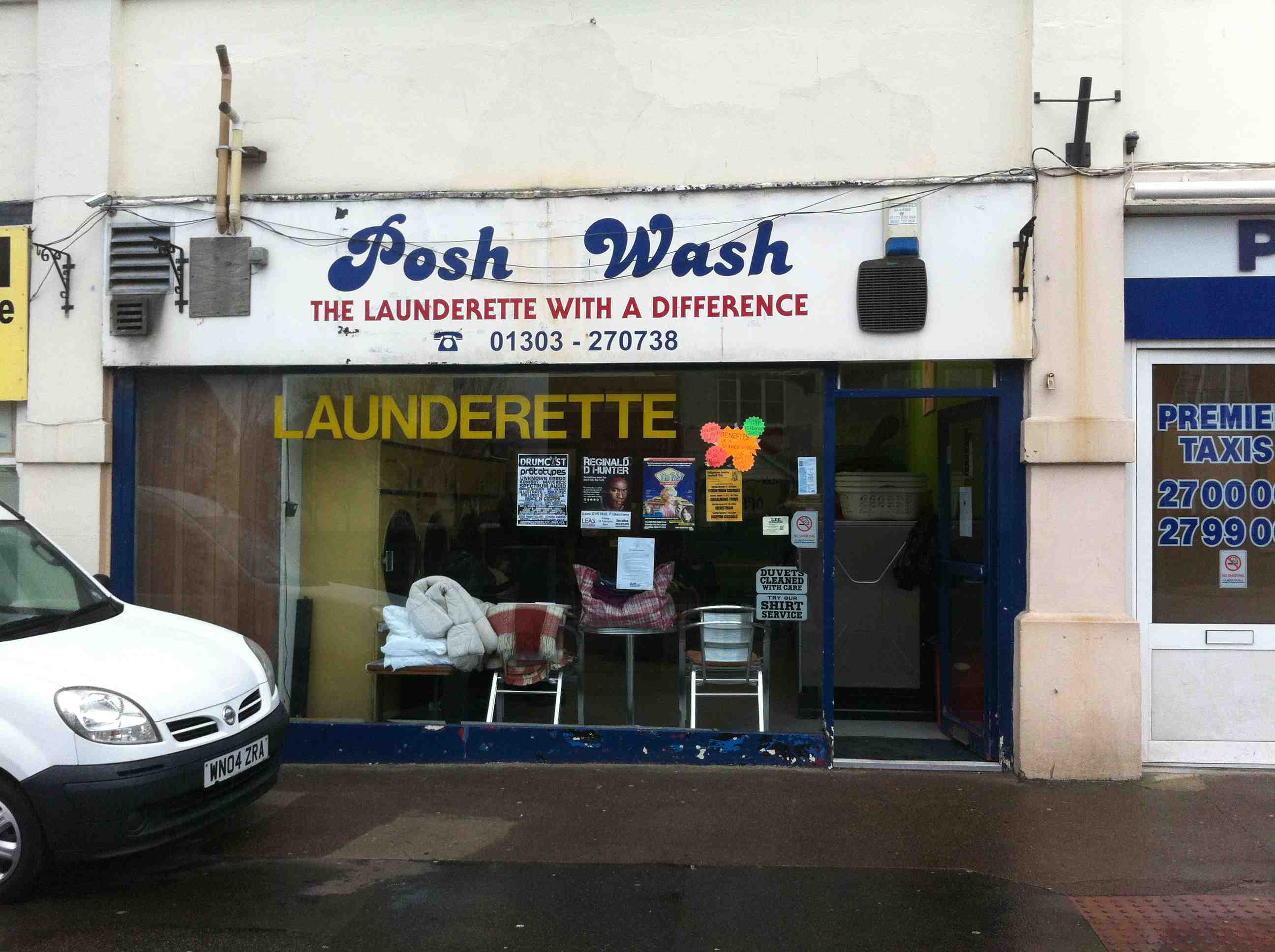
Posted by Cheryl Smith on January 27, 2012 at 6:53 amthe front of this shop is a mess…its the main face area that has vents galore …I wondered about a pan sign which was vented at both ends which could go over these things…anyone know anything about it or have any suggestions?
this is a really good ‘before’ picture…
thanks for looking
Cheryl
Attachments:
 Harry Cleary replied 12 years, 2 months ago 26 Members · 40 Replies
 -
40 Replies
-

Whoever named that place should be done under the trades descriptions act.
I think I would find myself too busy to quote for that one, especially as in my experience, launderettes are very bad payers and don’t have any real money to spend. -

A mess indeed. Personally I wouldn’t cover/box in the vents. Possible problems with trapping steam or chemical vapour – possible ingress back into the building causing damp/mould/rot in future, exposing you to a claim for damage etc.
I’d say, tidy up the cables. Paint around the vents in a med/dark gray generally matching the shade of the vents each end of the fascia leaving the central section (as in current use) for the signage. Could make a lot better use of that big window for display though.
-

You will restrict the airflow with your idea Cheryl.
I would push to see what their realistic budget is, as I can see you wasting time on this one.
If money wasn’t a problem I would do a tray with louvered type vents in the front face. At least then it could all be powder coated the same colour.
-

So long as your vents are the same area as the fan outlets you wont restrict airflow.
I would make a tray with a standoff brackets the depth of the two Pipes to the LHS of the "Posh", Put a full top and bottom return but leave the side returns off the wall by the 2/12 inches of the pipes.
Not having measures accurately but by the looks of it that would be a bigger area than the outlets for a ventThe one above the door is only a vent fan for the waiting area so definitely wont cause an major issues, If in doubt clad over it and leave the two on the LHS uncovered
-
 quote NeilRoss:A mess indeed. Personally I wouldn’t cover/box in the vents. Possible problems with trapping steam or chemical vapour – possible ingress back into the building causing damp/mould/rot in future, exposing you to a claim for damage etc.
I’d say, tidy up the cables. Paint around the vents in a med/dark gray generally matching the shade of the vents each end of the fascia leaving the central section (as in current use) for the signage. Could make a lot better use of that big window for display though.
I’d do what Neil says, i’d work between the vents and just tidy the rest up, by the state of the frontage and the sign they’ve got now it looks like they won’t want to spend too much 🙂
-

I agree with Peter my experience with these establishments is the budget is very limited.
I would be tempted to fit a sign between all the vents, and let them get someone else to tidy up all the other bits.
it would still be a major improvement on what they have.doh! that will teach me to read the posts above properly, sounding like a parrot, but still best idea IMO.
😀
-

Looks like a similar situation to the replacement sign I installed when the customers old sign got ripped down in a storm – it’s in the portfolio section.
Again if their budget is small you’re narrowing their options down. I always ask what the customers intended budget is on the first meeting. Saves me wasting my time putting some designs together, that they like, but wont pay for.
Obviously if they say £40 for an illuminated sign, I politely show them our portfolio, the work we’ve done, and explain approximate costs. They either go else where, or their budget grows.
-

I’d also agree with the above comments,
Paint the whole lot – or get a deco man to do it properly, then fit a tray in the middle, simples!
I bet £10 to a £1 that they’ll offer you a budget that barely covers a flat face fixed bit of composite! last launderette I quoted for (two year ago) still hasn’t been done, similar size to yours here and no vents on the front to worry about, iirc it was priced for a 2m x 0.5m compo tray with basic vinyl text/drop shadow, about £300 fitted, they seemed ok with it until I said I wanted the invoice paid pro-forma – i’m glad I said that now.
-

😮 😮 Isn’t it extraordinary how planning officers will pontificate about the higher points of maintaining castles and country estates etc but will allow things like this to happen? It’s a pity they wouldn’t pay some attention and sort out the areas we mostly live in!
Rant over! 🙁
-
 quote Harry Cleary:oops double post.
put the cap back on the bushmills 😀
-

Definitely go with what Neil says, leave the sides and just work on the area in the middle.
Tell them up front ‘single colour vinyl on 2mm thick PVC nailed to to the face’ as it’ll save you time when they give you their budget !
Cheers
Macky -

Yup
If the budget is "tight" I would just string a banner up between the two hanging basket brackets 😀 😕
-
 quote Ian Johnston:So long as your vents are the same area as the fan outlets you wont restrict airflow.
I would make a tray with a standoff brackets the depth of the two Pipes to the LHS of the “Posh”, Put a full top and bottom return but leave the side returns off the wall by the 2/12 inches of the pipes.
Not having measures accurately but by the looks of it that would be a bigger area than the outlets for a ventThe one above the door is only a vent fan for the waiting area so definitely wont cause an major issues, If in doubt clad over it and leave the two on the LHS uncovered
I think Ian is on the money, but I’d get an idea of budget first. Even Laundries here go for the cheapest quote as they never have any money, which explains their poor job in the first place.
-

I was asked to do a quote for them a number of years ago, and if memory serves me well the budget was way too low to do anything (i.e. unreasonable) so I walked away from it. If the job cannot be done properly I’d rather not do it.
-

Brilliiant ideas here for me to consider…thanks for all the imput…ill let you know how it goes….
again…THANK YOU!! 😀 -
Cheryl,
If my 2p is still allowed…. 😀
Despite wot the rest said, the only way to do a "good" job there is to cover the whole fascia with a boxed design. Ally frame, DiBond panels. Close all sides, but cut ventilation holes in the top. If you box it 300mm deep, cut the ventilation slots the full width at 150 wide, and put a "roof" over the slot about 200mm wide. (just 1 or 2 cm high)
The front panel can be made to overlap the box by 10cm or so on the top – that way your ventilation fixings on top will be invisible.
It could become pricey, but I love this kind of job! I actually find myself quoting low prices just to get the job. Nice to build experience and confidence, and NOT the same old same old I have been doing for close on 20 years now. 🙄
But, looking at the area (is that Pakistan somewhere 👿 ) I would also take a bet that they will at most go for "Paint the Fascia and put some Vinyl lettering on it. Is it extra if we use coulour…?"
-

If you look at Dave Rowland’s street view post you can see the building is not that bad in a nice area. A nice clock on the wall above the shop. Next door’s signs are terrible and you would think planning would say something. A shame it is not going to get a nice sign, have you ever seen a Launderette with a nice sign? It must be a poor business.
-
under new ownership….just waiting for the go ahead…no noises about not affording it at the moment and they are very nice people…
will just have to wait and see…should be an improvement whatever I do…. -
looking at doing something like the attached….
no budget for high end pan signs tho….!
Grey paint at the ends
Attachments:


-
Hi Cheryl
Really like the style and idea for that type of shop, hope they go for that.
Cheers
Macky -
Looks brilliant…is there such a thing as a 1000% improvement? 😀
-
quote Jon Marshall:I think there’s a bit too much text on it.
I agree, but its what they want
order for the van..this week
order for the shop in the next two weeks….
will post picks when done….
I do like a cheerful colourway! -

Judging by the number of Gurkhas I see in there everyday didn’t they want some Nepali wording in the window too!
(Kantipur font is a nightmare – avoid!!!)
looking forward to seeing it..
John
-
Vast improvement, I hope the shop doesn’t cause any planning issues?
-
Looks good Cheryl. The only thing I would do is make the top sign a bit bigger.
Just looks out of centre. 😉 Looking forward to seeing the finished job. -

well as said too much text on van… dont mind window…
Always push towards bullet-points
-
well here we go…van and shop…
Shop needs some paint to finish….
they are great customers and even paid up front….
Just goes to show.!!
Thanks for the comments and pointers…well put to use..and I do like a colourful job to raise the spirits
Attachments:


-
I absolutely love it Cheryl…well done my girl.
Did you design it for him? I take it you did. God knows what a design agency would have charged for an image like that, it’s just so vibrant and funky.
A lot of writing as has been said but still works well.Top stuff!
-

Very Nice Cheryl. I would shoot them for the opening times though 👿 😉
-

Love it Cheryl – one womans mission to single handidly improve Folkestone – beats government regeneration anyday 😀 :thumbup2:
-
I really like it but it i think it looks too much like a hairdressers (with the big hair) rather than a laundrette, very good job though, i love the colour scheme.
-

Just need to sort out the rest of the street now Cheryl :lol1: :lol1: :lol1:
-
thanks loverlies…oh you do make me chuckkle….
it did look really horrible…the shops next door have at least taken my card and my husband should have the job of finishing it with the paint….
opening hours are yet to be decided so that is their ‘temporary’ sign.
great before and after for the portfolio!
As far as improving Folkestone….I could fill up the rest of my natural life doing so if given the budget!
(its not all bad tho) 😀 -
Astonishing transformation. Love it. File that under ‘Silk Purses from Sow’s Ears’! 🙂
Log in to reply.
