Activity Feed › Forums › Sign Making Discussions › General Sign Topics › Views on Warburtons Bread new corporate brand?
-
Views on Warburtons Bread new corporate brand?
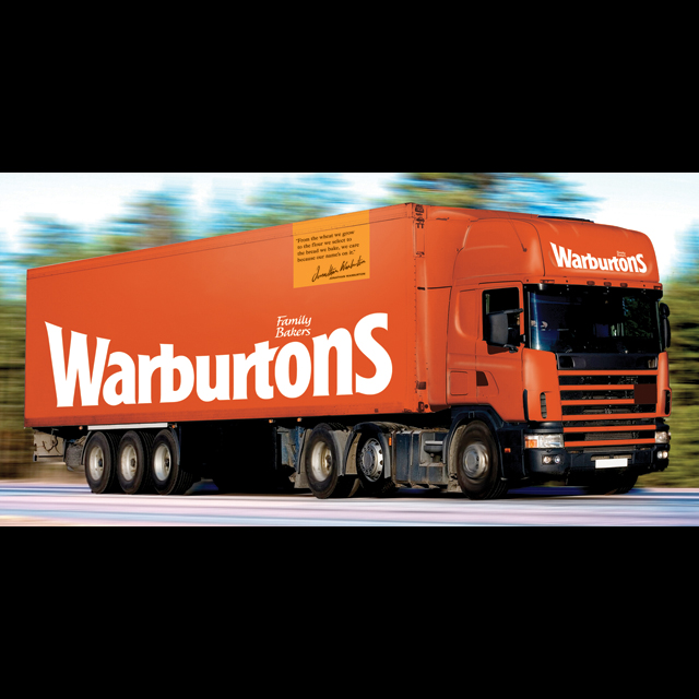
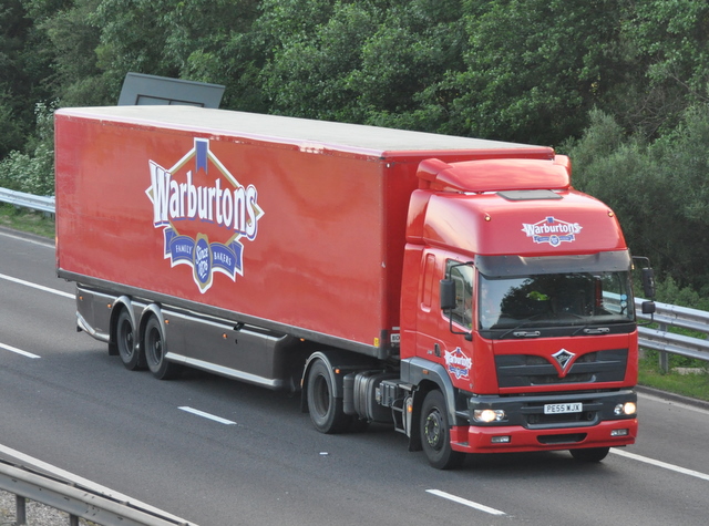
Posted by Nicola McIntosh on April 1, 2011 at 11:14 pmwell dont know if you’ve all noticed warburtons have a totally new identity? gone is the red and traditional signage, and in is the full orange coverage with plain white lettering? i personally do not like it, from the point of being too plain and a drastic change over….(but then as everyone eats bread they will relate to it quick)?
what are you thoughts on the new look?
nik
David-Foster- replied 13 years, 1 month ago 12 Members · 13 Replies -
13 Replies
-

I didnt know they had switched brands Nik.
I did about 15 large Warburtons Trucks a few years ago using the old traditional diamond brand.
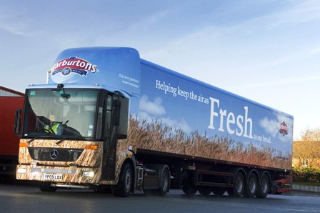
Google them i have found a new wrapped Warburtons truck too…
though i know you are basically meaning the bulk of their fleet being changed to Orange with white text.I will reply again a bit later… at 4.35am i think i better get some sleep! :lol1:
At a Glance though, the new Brand reminds me of " Woolworths "
.
Attachments:
-

The trucks looks similar to Sainsbury at a glance due to the orange
-

I understand the reason for updating and modernising but it wasn’t done with much style was it? Very brutal treatment imo
-

Let’s face it, a whole department would be out of a job if there was no "re-branding".
They’ve probably worked on this design for a year or so, done plenty of blue sky thinking (outside of the box) and some overpaid whizz came up with that brilliant and clever design.
You’ve just got to admire these people who can get away with charging the sublime for supplying the ridiculous.
Is it a colour related to bakery foodstuffs? NO
Does it reflect a traditional product? NO
Is it better than the previous design? NO
Does the "Family Bakers" look like a "where can we stick this bit" afterthought? er, YES
Has this colour scheme been used for any other large companies? Well, er yes.
Did it cost the Company many thousands of pounds to re-brand? Most definitely.
Worth it? Well someone thinks so. -

I can just imagine the next TV advert.
"That’s him!"
"Who?"
"Mr Warburton, the baker"
"Ohh yeh, the one with the shit branding"
"Hey I’ve an idea for you Mr Warburton, sack your marketing department!"
:lol1: I might find him and suggest it
Steve
-

I like it…..I don’t advocate change for the sake of it but if they felt they needed to move on I personally don’t think they’ve dropped any clangers
-

Haha, read this guff without cursing…
Quote…
"Bolton-based bakery brand Warburtons has refreshed its identity to communicate its "superior quality" and improve its appeal on shelves.
The new look was designed by Smith & Milton, which aimed to simplify the look and enhance recognition of the Warburtons family name.
It will start to roll out this month on vehicles and signage before appearing on a refreshed range of packaging from January onwards. All products are scheduled to bare the new identity by next summer.
The new look will also feature on all marketing communications from the beginning of next year, as well as sampling and point-of-sale material.
A new marketing campaign including TV advertising, digital communication, promotions, public relations, sampling and in-store activation will also appear from January.
Richard Hayes, marketing director at Warburtons, said: “Warburtons’ investment in this brand refresh is a tangible demonstration of our continued commitment to driving brand and category value growth. We’re confident the new look will increase consumer interest and simplify navigation of the bakery category at fixture where we are a ‘sign post’ brand for consumers.
“The refreshed logo and range packaging present our brand’s established strengths in a more compelling fashion and rejuvenate rather than reinvent our look, because our company values and brand proposition are unchanged,” he added.
“Warburton’s family name remains at the heart of our identity and this evolution communicates it in a clearer, more confident manner. Evolving our corporate colour from red to orange presents a warmer, more contemporary expression of our brand personality, drawn from Warburtons historical company colours.
“The new look delivers a stronger range identity, better communicates our key strengths of quality and care and will enhance stand out on shelf. It presents a positive opportunity for our retail customers to capitalise on the enhanced consumer awareness and interest the brand refresh will deliver.”
-

I quite like the work on the new packaging.
Agree the truck need some work, reminds me of B & Q. -

I never did like warburtons bread anyway, mass produced, just like the others, branding does not enhance the product,
Peter -

surely the people who normally buy the product, will miss the point and will not find what they are familiar with on the shelves and buy the nearest loaf of bread, thinking warbertons don’t do bread anymore 🙄
Lynn
-

The new design looks bland and boring. Designed probably by someone with a diploma in design. If the products they make carry the same branding will these then look like a cheap happy shopper brand?
-
Suppose when you see it on the bread is does look ‘fresher’. 😳
Attachments:

Log in to reply.
