Activity Feed › Forums › Sign Making Discussions › Graphic Design Help › Views on Logo Design
-
Views on Logo Design
Posted by David-Foster- on May 18, 2011 at 6:40 pmJust looking for your opinions please?
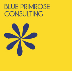
A Company had this yellow square logo below. I thought it was quite good, simple, 2 colour, blue and primrose flower logo to go with the name. It may need a better font though.
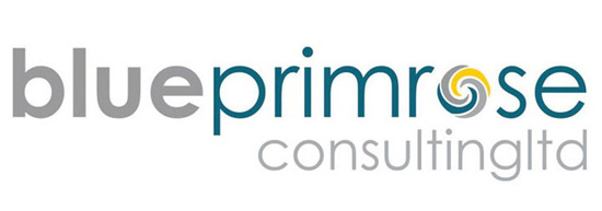
A graphic design company has ‘made it over’ and I felt he has wasted his money. The new logo is busier, the consultingltd doesn’t read right because no spacing, and the ‘o’ in primrose looks like another companies logo.
Have I missed the point and it IS better?Cheers
Attachments:
 Harry Cleary replied 12 years, 11 months ago 7 Members · 7 Replies
 -
7 Replies
-

I think there are pro’s and con’s in both designs. but that’s maybe just my personal view.
Both work in their own way…
but i think the image they are trying to portray may come into play here.The bottom looks a bit fresher due to the colours used, perhaps more modern and corporate. which being a consultancy firm will tick boxes.
however, i dont like their flower in the logo nor do i like the size and the way the text has been closed on the words consultantsltd. both the flower and the closed text as well as height of second line of text just gets too busy for me. may work well in different designs but two many focal points in one design for me…
i do like the font and the grey/teal colours on white though.
i think where it goes wrong is the consultansltd. if that was smaller with decent kerning etc it would be much better.difficult one when not faced with the customer brief or knowing a bit about the company.
-

I like the bottom one hands down for many reasons but one main reason its modern the top logo reminds me of the 1980’s era which I’m guessing was when it was made.
-

I’m with you, I prefer their old one.
The new one is busy, trying too hard, and very cookie cutter.
I would have taken their flower and used in as the O in primrose with their old letterstyle.
Love….jill -
 quote David-Foster-:Just looking for your opinions please?
A Company had this yellow square logo below. I thought it was quite good, simple, 2 colour, blue and primrose flower logo to go with the name. It may need a better font though.
A graphic design company has ‘made it over’ and I felt he has wasted his money. The new logo is busier, the consultingltd doesn’t read right because no spacing, and the ‘o’ in primrose looks like another companies logo.
Have I missed the point and it IS better?Cheers
i’m with you Dave,
new one looks a bit like a vistaprint template!
I would have built upon the original, maybe tidy up those petals, add some depth using a little feathered shadow and some gentle curved bevelling too,
the background needn’t have been so in your face as the yellow, and I agree, I think i’d find another font, something a little more modern looking.
as for the new one, Im with everyone else on the kerning, looks awful, worse still… as you try to decipher it, you’re distracted from the main name of the business.
jmho, not worth a lot!!
-

call me old fashioned I like to see the word blue in blue and primrose in yellow for starters – Hugh’s analogy to a vistaprint template is harsh but funny you’d expect more from a company charging for design
john 😀
-

Thanks Rob, guys and gals 😉 glad I wasn’t too far away in my thoughts.
The consultingltd was the worst bit I thought. Anyway, they have gone with the new one :lol1: . The customer is always right. -

That consultingltd is a wind up right? The candid cameras where there when they presented it to the client…right? Where’s the youtube link?? 😀 😀
First one for me too with a bit of work.
Log in to reply.
