Activity Feed › Forums › Sign Making Discussions › Gallery › Vehicle Wrap: Beard/Mint
-
Vehicle Wrap: Beard/Mint
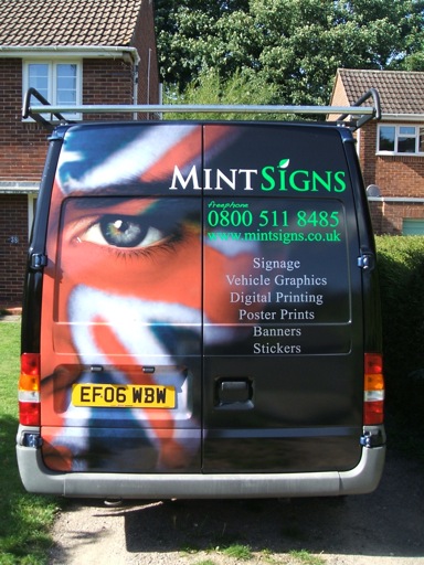
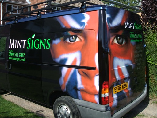
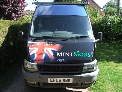
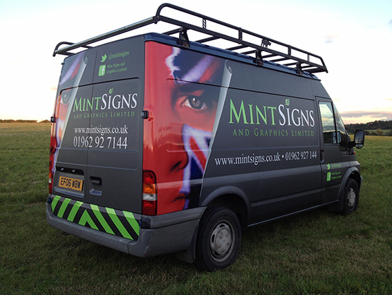
Posted by Warren Beard on August 3, 2009 at 7:22 pmSpent the last 2 days getting this done, I haven’t done the roof yet though and have to re-do the doors as I used a different black and you can see the difference between them so am going to replace it.
Cheers
Warren
Attachments:
 Martin Cole replied 11 years, 7 months ago 35 Members · 49 Replies
 -
49 Replies
-

Well done Warren – a spectacular advert for your abilities. 😀
-

cheers guys, as for the flag I would have thought a foreigner with a large Union Jack on his van would go down pretty well 😉 :lol1:
I’m sure my accent on the phone would put off more people than the flag on my van 😕
I wanted to do something bold yet subtle and cleaner than the big bold bright colours I had before, I think this looks more professional.
cheers
Warren
-

Looks fantastic Warren! What a great advert for your business, very eye catching and smart. Inspirational, hope we can wrap our van to such a high standard one day 😀 And personally, as it’s been mentioned, I don’t think there should be any issue with using our national flag on your van, though I can understand the points made. In fact, if it needs to be mentioned at all, then I feel it should be with pride. By the way, love the business name!
-

That looks the dogs Warren. You should be proud mate. Well done. 😉
-

Really nice! If that goes unnoticed the I don’t know what to tell you.
-

Fantastic job Warren………Proof positive that less is more….. :lol1:
Very clean, eye catching and visually head turning.
-

Great Job Warren,
Did you do the face painting yourself?Peter
-

ah the black issue… think u got away with it but only looking at photos and not the real thing.
The mint in green looks much better then what I saw before, that works really well.
I like it… great.
-
Snap 😛
Obviously great minds think a like !!
John
Attachments:
-
First glance, thought it said Guildford………close to Warren :lol1: Then I opened the file…….few miles away.
It is a very mesmerising visual………"Look into my eyes"……."you want to buy a sign" :lol1:
-
quote Dave Rowland:ah the black issue… think u got away with it but only looking at photos and not the real thing.
The mint in green looks much better then what I saw before, that works really well.
I like it… great.
I didn’t actually get away with it and will be re-doing the front doors, I had some extra printed black wrap vinyl from the last wrap I did and used that on the doors next to a solid black vinyl (KPMF), there is a slight difference between the picture and the solid black but the doors almost look purple in the sunlight 🙄
While on that note I must say I really like the KPMF – K7000, it’s the first time I have used it and it’s very nice to work with and has a great finish.
Also the green is much brighter as I have used a flourescent green with a matt white, it does look good though and although it has a limited life I am willing to change it when it begins to fade as it looks too good.
cheers
Warren
-

Nice job Warren. I think I’d have put the contact details under the laundry list on the back, but that is just me 😀
-
Warren,
Why dont you put the Souf Affrikin flag on the van. You outnumber the pommies that side of the pond anyways!
I like the Lime green on Black. (It is our company colours as well) As soon as the August sand storms are over, I’m going to wrap or pick-up as well.
Top Job, mate!
-

Well done Warren, lovely job.
Green on the black is very nice.Like Harry I would have laid the back out slightly differently,
but a fine job and should lead to plenty of similar work hopefully.
Martin
-

warren top job cant add to whats been said well done m8 :appl:
-

yours and John’s vehicles both look great. excellent concepts. well done to you both.
-
Sos Shane but haven’t got around to putting the stars on yet 😀
Cheers
John -

Warren, you have come on just great I love your van, cracking design, a very well done mate.
😀 😀 😀 😀 😀 😀 -
Thanks everybody, it’s taken me a while to find a picture that I liked and would work as a concept.
I decided to put my details up so high as it is above a normal car level, whenever I am parked up in a parking lot you can see the company name and contact details over the cars so can be read at a distance and details taken as well with out having to look behind obstacles etc.
I wish my prints had of come out as bright as John’s though 😕 that’s what happens when you have to buy from a trade printer, no control 😥
I was/am considering putting my logo randomly around the "empty" areas in a matt black just to create some added effects but keeping it subtle, it’s still under consideration though.
cheers
Warren
-

Good job mate. Will be doing my van soon & seeing yours has given me some more motivation! I too have to buy prints in from the trade & am always annoyed that they’re never as sharp of full of colour as their own! Hmmm…
Trouble is, when you insist on 8 pass printing, they’re always reluctant to do so. Do you want the work or not? :lol1:
-
quote Gwaredd Steele:😛
Trouble is, when you insist on 8 pass printing, they’re always reluctant to do so. Do you want the work or not? :lol1:
Interesting comment. I do 8 pass prints for all my wholesale clients whether they ask for it or not (depending on the end use)… might explain why they keep coming back I guess 😛
-

D’oh! if only international postage wasn’t so slow and expensive!
Before I knew what to ask for I got caught quite badly with print quality, I have found that some companies use ‘budget’ type setting as standard unless you stipulate otherwise.
Could be different now of course, that was a wee while ago.
-

I agree everything is either 8 pass or 16 pass around here. All our profiles are built utilizing these settings so we can achieve a wider colour gamut. Even banners are 8 pass.
-

hi guys,
printing from versaworks, how do you tell?regards
Dan
-
Dan go into media explorer. click the profile then the appropriate setting it will tell you how many passes.
-
cheers fella, been digging around but couldn’t find anything!!
thanks
Dan
-
Am I looking in the details section: Total passes? 16?
I always print at standard or high quality never for speed?cheers
Dan
sorry i’m changing thread!!
-
quote Dan Osterbery:Am I looking in the details section: Total passes? 16?
I always print at standard or high quality never for speed?cheers
Dan
sorry i’m changing thread!!
Tha’ts right Dan. Pretty sure 720×720 is usually 8 pass. 1440×1440 is 16 pass well in Versaworks it is.
-
i so hope you dont start thinking about changing ur company name again lol
-

that is the business..very nice indeed Warren and well done.
cheers
Ade
-
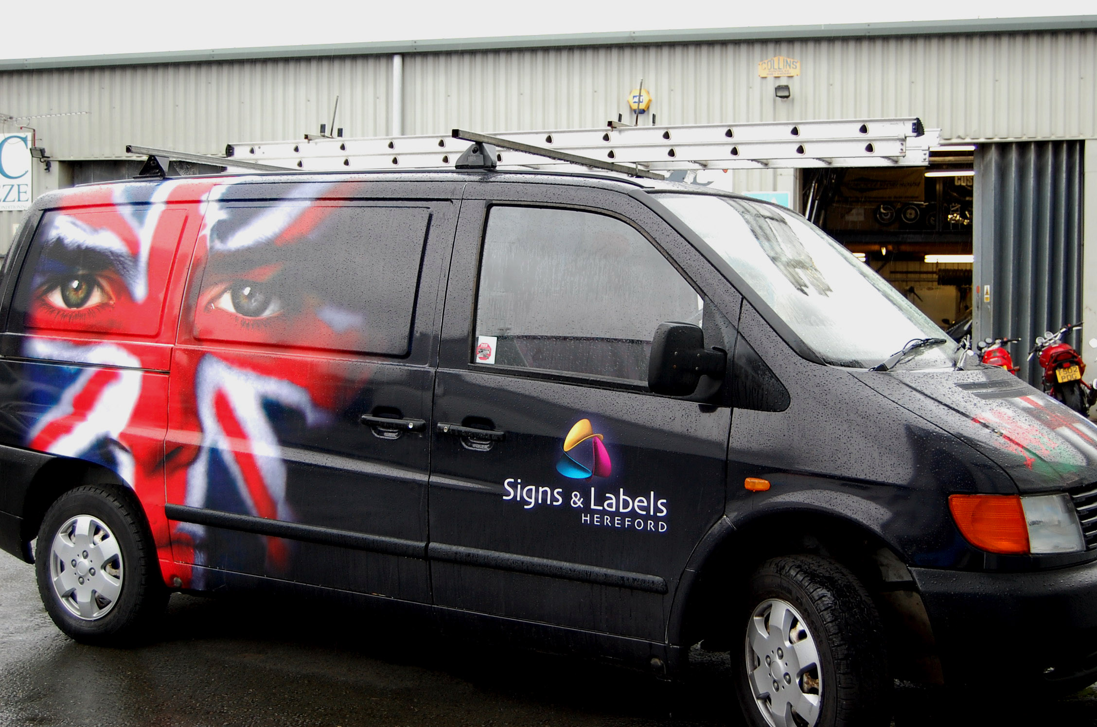
3 years on and eventually got a chance to re-wrap my van, I never did change the black vinyl to match the printed and the "Orange" looking print bugged me for a long time but time was always an issue to get it re-done so it stayed like that for 3 years. Now I have an employee so got him to strip and clean the van and yesterday got a chance to apply the new wrap. Branding has changed slightly in the last few years as I am now a limited company and also have a dark grey background rather than black and more of a lime green rather than a grass green colour.
Anyway I am much much happier with this new wrap that I got to print at a decent quality myself and spent more time deciding what to go with and ended up using 3m dark grey matt along with a gloss print (my business card is the same matt and gloss)
Hope you like.
cheers
Warren
Attachments:
-

Looks mint Warren, we’re in the process of re-doing our van at the moment and are going with the Matt with gloss effect.
Your van projects a great professional image.
Log in to reply.
