Activity Feed Forums Sign Making Discussions Gallery Vehicle Graphis : A Class Valeting

  • Vehicle Graphis : A Class Valeting

    Posted by Paul Goodwin on November 15, 2003 at 11:49 pm

    Hi Guys I did post this earlier but must have got it wrong 🙁

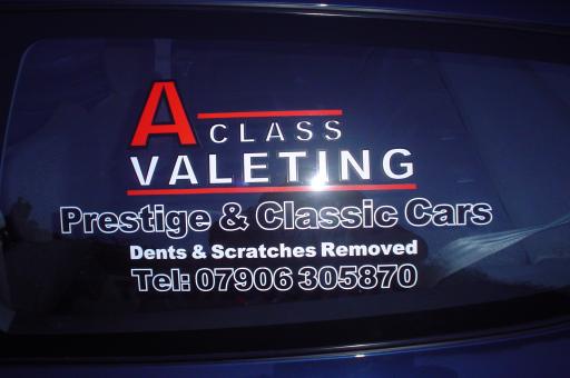
    Anyway, a chap poped into my workshop and asked for a design for his new company that he has just started doing car valeting, he only had 10 mins so i came up with the design below with the details that he had given me. He was happy with the design ( fitted to the rear quater lights on his civic. )

    On reflection now that i look at it ( and i do remind myself that it did only take 10 mins to design ) I could have done a few things differant.

    The black outline to AClass and Valeting should have been a different colour ( i did toy with yellow for the letters but as it’a blue car i went for white). and Class should have been a tad bigger with maybee wider curneling. The wieght for A Class is a little on the small side too.

    But over all for a 10 min quicky I dont think it’s too bad, what do you guys think??


    Attachments:

    Paul Goodwin replied 20 years, 5 months ago 4 Members · 6 Replies
  • 6 Replies
  • Nicola McIntosh

    Member
    November 16, 2003 at 12:09 am

    tidy mort!

    just a suggestion, make class bigger, to be inline with valenting!

    my view!

    nicola

  • Paul Goodwin

    Member
    November 17, 2003 at 1:12 pm

    Hi Nicola

    Yep i thought that after the job was done and i had a bit of time to reflect on the design.

    Thanks for the feedback though, it put my mind at ease on what could/should have bheen done better.

  • Mike Brown

    Member
    November 17, 2003 at 1:46 pm

    sorry Mort – should have had the decency to reply to this before now 🙁

    I concur (thaz a lovely word eh) that the ‘Class’ should have been larger etc. but apart from that I think it’s looks bloomin dandy! 😉

    A nice simple piece of signwork that you should be very very pleased with.

    more soon

    mikethesign

  • Paul Goodwin

    Member
    November 17, 2003 at 1:56 pm

    😮

    Thanks Mike, And i am very pleased with it apart from the Class bit.

    And the CD is great 🙂

  • Rod Gray

    Member
    November 17, 2003 at 4:32 pm

    Not bad Paul.

    Nice symmetry but it appears the outline has distorted the letters, particularly the A`s.

    Might wanna reduce the outline size a bit and/or chose a more suitable font

    Nice tho.

    Rod

  • Paul Goodwin

    Member
    November 17, 2003 at 5:37 pm

    Yep see what you mean Rod. To late to redo as it’s gone 🙂

    but will fiel for later referance

Log in to reply.