Activity Feed › Forums › Sign Making Discussions › Graphic Design Help › Vehicle graphics, what would you do different?
Tagged: design, graphic-design, vinyl-graphics
-
Vehicle graphics, what would you do different?
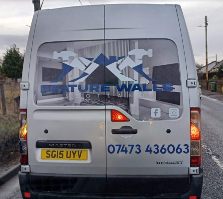
Posted by rob-lambie on April 11, 2023 at 2:30 amSo I sat behind this van in a traffic jam last week, and I do not know if it is just our industry, or if the same applies to every industry. But do you find yourself looking at work and thinking…
“Why didn’t they do this, and what made them think that works, blah blah!!??”
Anyway, what do you think could be done to better this van’s design? Jeff replied 1 year, 3 months ago 11 Members · 10 Replies
 -
10 Replies
-

well neither the text nor the image works on that ..the text is hard to read and is covering the part of the image needed to be seen .. its sometimes about stubborn customers ..sometimes designers..
me personally id lose the image if the lettering and logo has to be on the panel but if the customer insists on the image i would of moved the lettering off the image onto the van or contoured it to make it stand out …
-

The logo’s poor to start with, looks to be a stock logo, more suited to a builder than what I am assuming is a media/interior wall company?
The image adds nothing either.
I’m all for less is more, but it needs to clear and to the point.
The mobile number is certainly maximising the space available.
In my personal opinion, it needs starting from scratch.
-

the colours are not good and everything seems to merge into each other.
the Scotland flag thru the logo just makes matters worse! -

if the image& logo are dead set necessary; then I’d fade it out a bit and add a contrasting outline around the text. Possibly leave as is but with a white transparency strip behind the text, or just douse with petrol and throw matches at it.
-

I am no expert on actual “vehicle” graphics, but as a designer, I would say that is poor!
I do look at signs, vans and all types of graphics work on a daily basis and I am judgmental of many. not because I think I know it all, but because you just know what works and what does not, and this design does not. 🤓❤ -

All it needs is to add a white outline to the lettering “Feature Walls” and it would look OK
-

The text is unreadable. The design is unfathomable.
I spose thats a picture of the blokes work, so keep the pic, remove that mess of a design, and write FEATURE WALLS in a contrasting colour, or as Phill says, outline it so its at least legible. -

the logo does get lost against the picture and the phone number is too big.
i think an outline of white or black around the logo would make it work better. -

Loose the hammers and roof bit, move the Feature Walls to the panel above and smaller phone number.
And never got involved in the sign business😂
-

just my opinion but I think the minute you drive up behind the van and have to squint your eyes to distinguish what the company name is and/or what the photo is showing, tells you the design is not working.
🤨
Log in to reply.