Activity Feed › Forums › Sign Making Discussions › Gallery › Vehicle Graphics : Taz & Bob Rabbit
-
Vehicle Graphics : Taz & Bob Rabbit
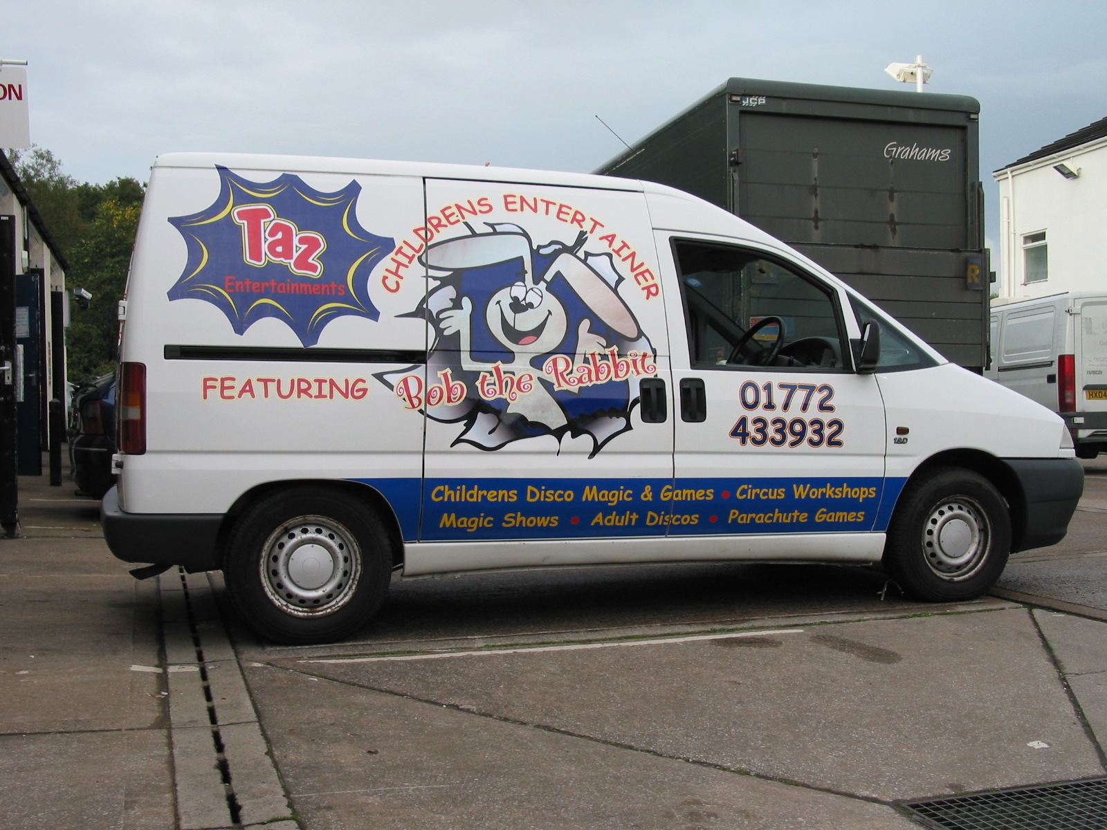
Posted by David McDonald on October 12, 2006 at 12:57 pmHi All
This guy wanted a busy and bright design to fit teh nature of his business. Designed the bunny bursting out of the van from scratch.
Hope U like
Cheers
Macky
Attachments:
 Cheryl Smith replied 17 years, 6 months ago 10 Members · 18 Replies
 -
18 Replies
-

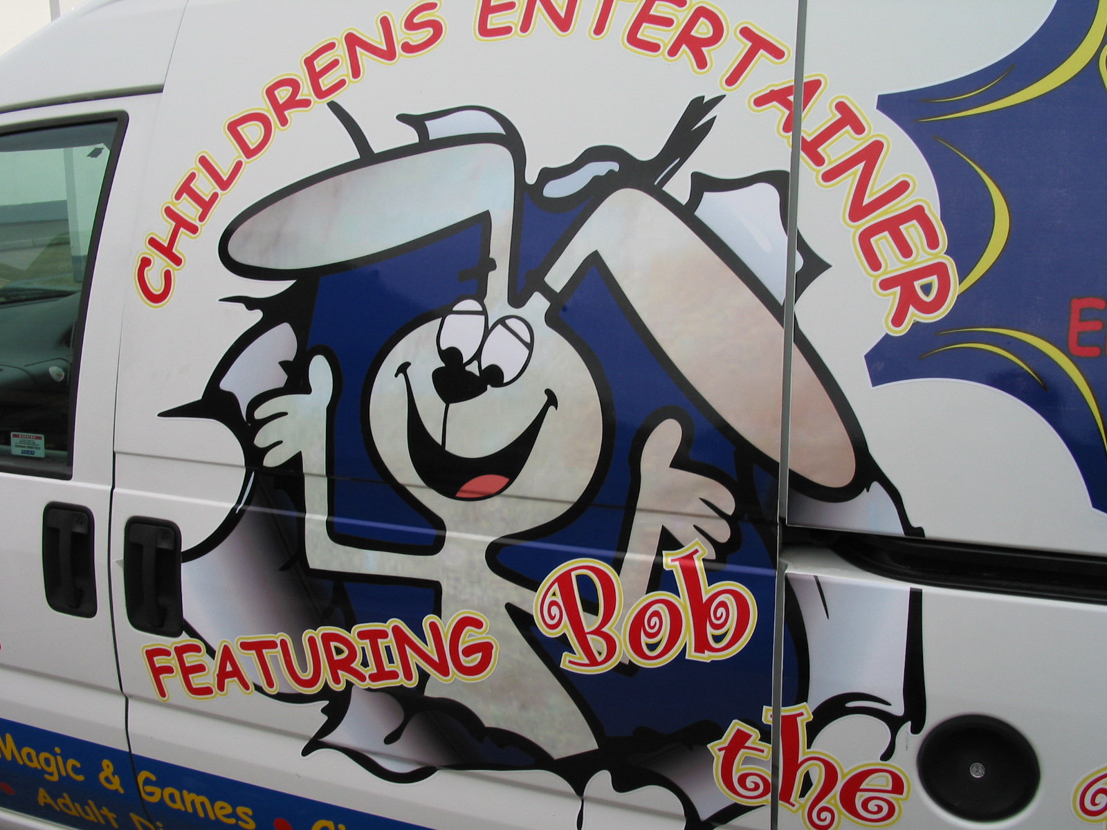
that’s pretty "magic" macky funnily enough we had a childrens entertainer in the other week he hasn’t made his mind up yet
Lynn
-

That looks really good………………………….
except………………………..
……………….RED on BLUE…………. 😮 😳 🙄 (:) (splat) :sigh: :no1: :no1: :no1: :no1: :no1: :police: :thumbdown: :doh: :blush:
-

Red on blue? ok allegedly not the thing to do, I find it depends on which red and which blues, some look fine, so why not?
Mike why is it such a No No, Can you explain, and what are the other colour combinations to avoid?
Peter
-

I’m not sure why reds and blues don’t work together, I think it’s to do with physics 😮
When I was a teenager I had a Blue sweater with red stripes – at night time when I was roaming the streets I noticed you couldn’t see the red stripes under amber (sodium) street lights. The Sodium street lights give out visible light in a limited part of the eletromagnetic visible light spectrum – which resulted in the two colours (red and blue which are at opposite ends of the visble light spectrum) merging together as one dark colour. Thus the stripes on my sweater dissapeared completely under lamplight. The same thing would happen with red and blue lettering on a sign – both colours will merge together unless (as Lynn had already pointed out) they are seperated by an outline (e.g white).
Colour blindness (red/blue-green defficiency) is the same thing – people that are colour blind cannot see the full spectrum of visible light – the range that they do see is similar to what people with "normal" vision can see under sodium street lighting (ok it’s not 100% true – but a good close analogy).
Any road up – the lesson to take on board is that you should never put blue and red together without separating it in some way 🙄
-
thanks for that partial explanation Phill. but which is worse, RED on BLUEor BLUE on RED
I know which I think to be the most undesirable,Peter
-

"Electromagnetic visible spectrum"…?
He’s making it up as he goes along! I don’t remember electromagnetism having much to do with visible light.
Van looks nice, by the way.
-
Sorry – I meant to say I really like the van, it does look really good apart from the small section where red lettering sits directly over a blue background.
Andy – Just because you aint heard of something doesn’t mean it don’t exist 😕 http://www.gcse.com/waves/emspectrum.htm
-

Blimy, cant wait to explain that to one of my customers…
-

Works for me.
Reds and blues may not "work together" but as said what red and what blue and how are they used together. I think this particular job looks great.
It was said never to use black for food packaging- things change take a look at the packaging in the supermarkets…. -

i dont have a prob with the red/blue thing, as some have said, it’s seperated with an outline and is perfectly legible, the bunny looks great too, wish i had a printer !
-
There is red on blue if you look hard enough.
There is a saying that I learnt the first week I started in the business,….
"Blue & Green should not be seen unless there is a colour between."
This also applies to red on green and red on blue but it doesn’t rhyme :lol1:
This rule can be broken if for example you use red on a light sky blue because you need contrast between the colours for legibility. But even that combination would not be my favourite either.We had a local brewery that had printed trays, Green trays with red lettering, we used to have fun with these trays because if you hold them up and jiggle the tray just ever so slightly it looked like the letters were bouncing up and down 😮 😛
And before anyone gets funny it also applies the other way round ie green on blue etc.. 🙄
-
A local (recent start up) sign company used to have a blue van with red lettering. But I thought it was great , I really loved the fact it showed how crap they were 😕
-
Another example, a local Renault dealer has some moron put dayglo orange lettering all over their white pro-mo van. Looked horrific, but if the company had put a black outline around the lettering it would have looked great 🙄
-
quote Phill:A local (recent start up) sign company used to have a blue van with red lettering. But I thought it was great , I really loved the fact it showed how crap they were 😕
lol! I know of a signwriting company which advertised Vynil Graphics!! lol
I am glad that someone else done it appart from me (when I started 18 years or so ago!!)
Log in to reply.
