Activity Feed › Forums › Sign Making Discussions › Vehicle Wrapping › Vehicle graphics – Straight or not?
-
Vehicle graphics – Straight or not?
Posted by Davy Stevenson on April 20, 2017 at 9:59 amHi, Looking for a bit of advice regarding to aligning vehicle graphics. I’m a member of Justin Pates "wrap institute" and have watched several videos regarding applying vehicle graphics. He always advises that they be fitted perfectly straight however I feel in some instances they have to be at an angle to match the lines of the vehicle. I’ve just bought a Bosch PLL360 laser level which has a self leveling feature but I feel some graphics just don’t look right when perfectly straight.
What do you guys think? Perfectly straight or at a bit of an angle to match the vehicle lines?
Thanks
DavyGeorge Elsmore replied 6 years, 12 months ago 11 Members · 14 Replies -
14 Replies
-

Full wraps laser straight where the vehicle lines are not as noticible.
Lettering etc I would match with the vehicle lines, otherwise it can look funny.I thinkyou are right with your observation if it does not look right laser level match it to the bodywork
-
That’s what I was thinking Neil. The problem now is my new level self levels every time I try to tilt to the side! A fine example of technology working against me. Trying to get laser that doesn’t self level is very difficult. I can get a basic one that only shoots the beams out the front which you have to manually level but then my workshop isn’t wide enough to have it back far enough for the beam to reach the length of the vehicle 🙁 Ah the joys of vehicle graphics
-
I have a leica that can lock the self level and its got a handy magnet holder, comes in very handy
Attachments:
-
How about old fashion spirit level? Multiple times cheaper and it doesn’t self-level :tongue:
We don’t always level things up – often it’s a matter of compromise between level and graphics/text agreeing with the main features of the vehicle and generally what looks right to us human beings – Afterall, it’s another human who will be judging our efforts, not an electronic device. Or em I bonkers? 🙁 -
Thanks for the links Neil & Noel, much appreciated. I only got the bosch level yesterday and didn’t have a proper play about with it until this afternoon. There is an option to lock the level if you want to do an angle with it but you have to tilt it a certain amount before this feature kicks in so to speak, that’s why I couldn’t get it to work properly. I think it should do my job nicely. I’ve attached a pic of the first job its done today. Excuse the slight gap, I forgot to set versaworks for a small overlap.
I know where you’re coming from Martin, sometimes an old fashion spirit level is just whats needed but can be frustrating when you need both hands to hold a graphic. I find myself fighting with myself times when applying graphics and have to stand back and decide if it looks right then it must be right. Sometimes straight just doesn’t work. Berlingo vans I feel are the worst.
Attachments:

-

9/10 times you run the graphics with the sill of the vehicle which spans the inside of front to inside of back wheels which runs "vehicle level".
A Spirit or laser level of any sort will not work on a van unless you first lock it’s level parallel with the sill of the vehicle to take the reading then move that up the van, which again just does what i have said above but makes life much easier.
What is happening is "you, the graphic applicator" is focusing on "where to run the text from" which is normally taking the easiest route/closest line to where you want to put it. But it does not work like that, you must look at the vehicle as a whole. Working panel to panel or contour to contour does not work.
When you provide the artwork proof on the vehicle. do you tip and rotate every line of text to suit the body contours?
Of course not, you lay them out as you type in the text. Experience should also tell you when designing for vehicles there is a lot to consider when laying out the graphics. i.e. positioning between contours, avoiding petrol caps on one side, as they do not exist on the other, just like sliding door zips on one side… or 3D dimensional areas unless using a wrap. the list goes on. this is why general graphic designers are crap at providing artwork for vehicles, they have no clue or experience because it takes knowledge of how the installation will have to work. its not just about making the artwork look all pretty.This is also why vehicle wraps with large abstract patterns, logos etc. are printed in one go and applied. Stretched and distorted into recesses and the like. But any small text like door legals and phone numbers are still applied "after the wrap" as it allows better positioning without the need to worry about getting it all 100% level with the wrap.
This is why in many instances wraps look so good too… because they are looked at "as a whole" image/advert. Not "oh look, that logo isn’t running with the aerodynamic lines of the vehicle!!"Do not get me wrong, there are times when minimal this or that on the side of a van looks much better with a tweak by eye. thats just part of "the game". but not day to day vans with multiple graphics, text etc.
"Rule of thumb, run with the sill of the vehicle".
.
-
A lot of new vans will just look completely wrong if you fit everything level, the big new Transit in particular. It adds a lot of time to the fitting trying to get them to look right.
-

I use two magnets and a piece of string, Run a plumb line the length of the van, levelling it till Im happy.
Fit all graphics level with plumb line. Its never let me down, hope Ive explained it properly -
There probably isn’t a straight answer to this as it all depends on what is going on to the van.
If it’s a lot of text then I tend to keep it level or in line with something prominent like a plastic strip or the roof gutter (as long as that’s level ish).
However if it’s just a block of text in the main panel which has no level lines then I magnet it on and stand back and adjust as nec, sometimes I get the customer to decide. -
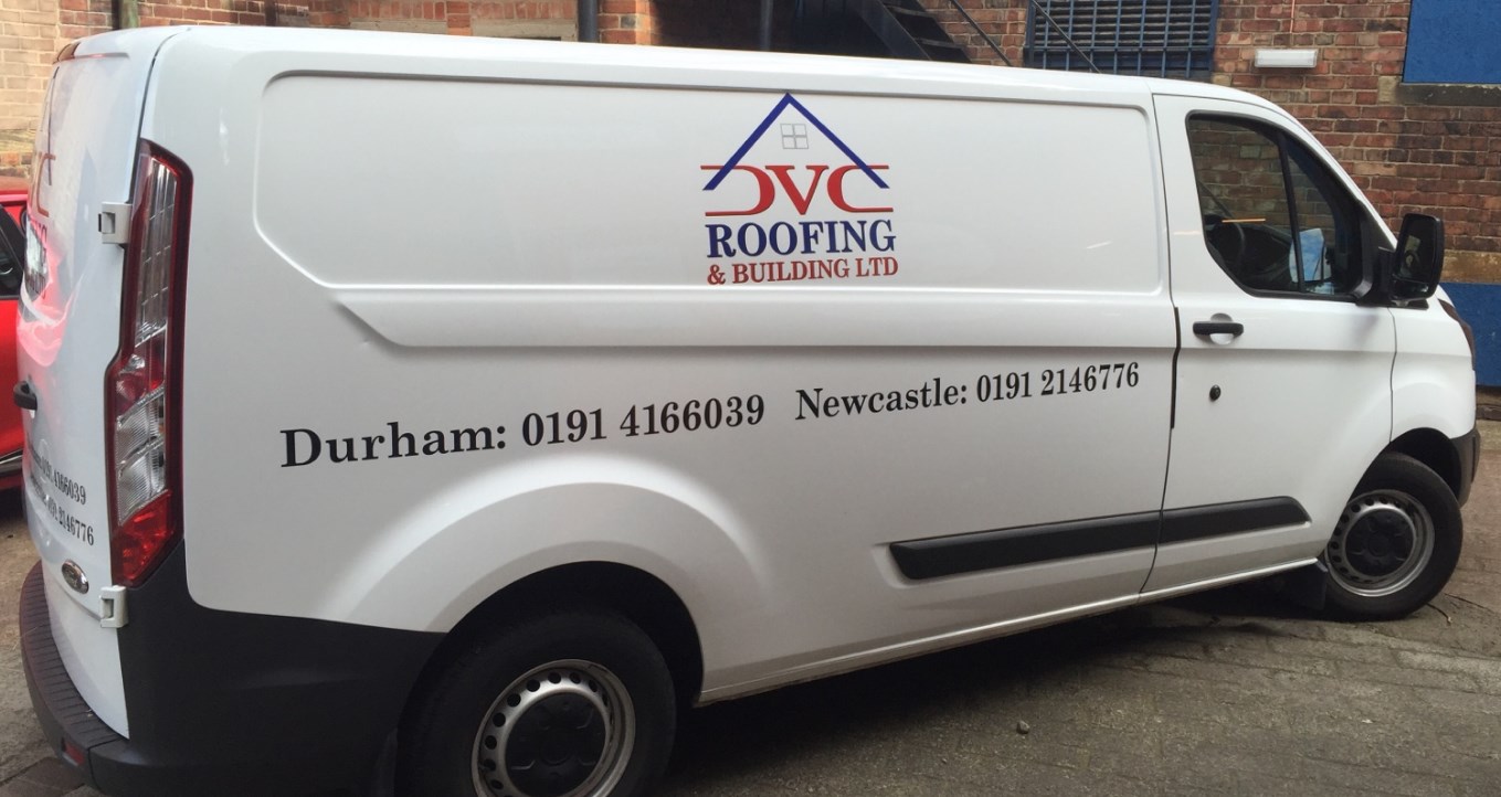
Two examples of our fitting. We always fit level with the horizon unless customer specifies other. Some vans do look weird at times but its better than having a van with two different angles in my opinion.
Attachments:

-
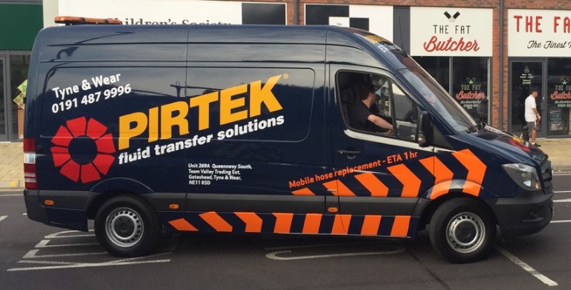
Sometimes we do get the odd multiple angle, however all the tilted angles are exactly the same. Everything else is levelled with the horizon.
Attachments:
-

Thanks for the advice guys. Seems a case of what looks right is right 🙂
-

I agree new transits are a ball ache to get the right look :shake:

Log in to reply.
