Activity Feed › Forums › Sign Making Discussions › Gallery › vehicle graphics: sensible tvs
-
vehicle graphics: sensible tvs
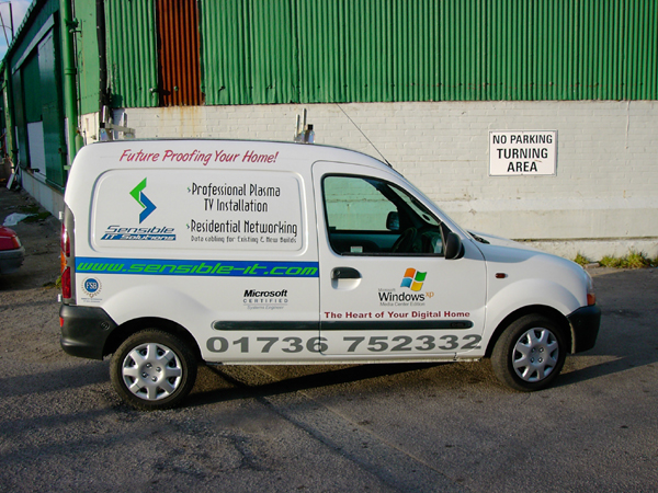
Posted by Paul Rollason on March 12, 2005 at 6:18 pmQuite pleasent afternoons work in the sun
Paul R(Mackerelbus design)
Attachments:
 Paul Rollason replied 19 years, 1 month ago 11 Members · 25 Replies
 -
25 Replies
-

Nice one Paul, simple and it says what it means, think I would have put the wording the other way round though.
TURNING AREA
No Parking:lol1:
Just kidding. Nice job personally I don’t like that font for most of the writing, but the van looks good. How do you go about getting permission for using the Windows logo etc?
Thanks for showing.
Dave
-

Nice work Paul,
All cut-vinyl except the windows logo?
-Marek -

Looks good but why do peeps insist on those horrible fill up the panel to the brim phone numbers. 😮 euuuugh!
-

Nice job Paul :thumbup2:
Not too keen on the green web addy on the blue.
Great seeing more of your work.
😀
-

Very nice paul, I’m with carrie with the green on blue, but if the customer is happy that is all that matters at the end of the day.
Well done mate.
Shane
-

nice job done paul!! 😛
cons. crit. too many different fonts..and colours, layout could be better!! 😀 when i look at the van it looks all scrambled…..(not together)
and the microsoft logo…. (?) anyway my opinion only mind!! 😉Nik
-

Hi all
Thanks for all your commentsThe blue stripe is reflective and was supposed to just have the url cut out of it but was changed by client.
The van is a little cluttered but this was the info I had to include according to the brief.
The microsoft logos are all cut vinyl including the shading on the xp logo
The reason for the windows xp logo are the fact that the guys entire business revolves around the new windows xp media center edition that microsoft are about to invest billions on marketing over the next year and so the client wanted to take advantage of this advertising.
Most people have not heard of windows xp media center edition but they darn sure will have in a couple of months.
Permission was granted for the use of the logos.
The client was 100% over the moon with the results.
Paul R(Mackerelbus Design)
-

Nice job
and I actually like the green with the blue 😮 it’s very, oh what…70’s kind o’ colors. Next time maybe just make a small white outline (reverse it out of the blue panel so it’s a bit larger than the green text) around the green lettering so it pops off of the blue a bit better…maybe?nice work
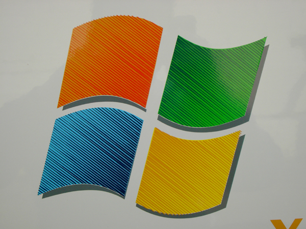
so is the shading on the MS logo paint on vinyl then or was this printed?
-
I like your idea of a white border around the green, it would make it clearer.
To be honest the van looks better in real life than it does in the photo.
The shading on the microsoft logo is all done using two different shades of vinyl, a darker one in strips over a lighter one.
Paul R(Mackerelbus design)
-

Nice work Paul 😀 The fact that ppl are asking whether the Microsoft logo is printed or painted means you pulled off a clever one with the cut vinyl, it really does look like its been printed, nice one!
Thats one big phone number though, I doubt anyone will miss that! 😀
Cheers, Dewi
-
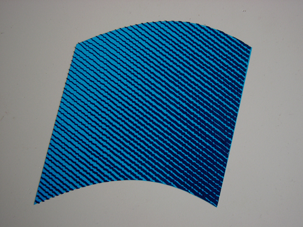
Cheers Dewi
Here’s how it’s done.
You loose the effect up close but when you stand back a little it really works.
ps: it is a big phone number 😳
Paul R(Mackerelbus design)
Attachments:
-
Blimey, I wouldn’t have thought it was done like that, how did you come with that? Has it been a trial and error thing or do you have a shading technique to help you? As you say, up close it looks a little strange, but the effect when you’re at viewing distance is brilliant, and thats what counts!
Cheers, Dewi
-
You did a good job there Paul …… I agree with Dewi loks a little strange close up but when looking at the pic from a distance it does look to be printed.
😀
-
That is brilliant Paul thanks for showing us, must have a go now.
Cheers
Dave
-
Dewi
I took one of the window shapes and applied a grduated fill in corel then rasterised it.
I then opened it in corel trace and using the woodcut feature it recreates the fade with lines.
You have to fiddle about with the settings a bit to get the effect your looking for.
Then saved and opened in corel for final editing etc
Paul R(Mackerelbus Design)
-
Thats a really cool idea! 😀 I’ve just been having a play, but as you say, I may have to fiddle a bit as I’m not getting the same effect yet.
Some cool vinyl effects being used recently though, this being one of my favourites! 😀
Cheers, Dewi
-
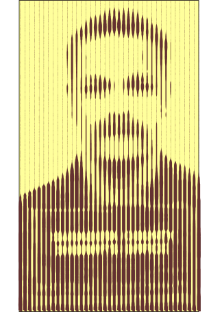
Dewi
This is what it looks like if you don’t use node reduction
I think it looks better but it takes an age to cut.
Also I would have used closer shades of vinyl but it was a weekend job and i had to go with what I had in stock.
Paul R(Mackerelbus design)
Attachments:
-
Nice one, thank you for that Paul. So if you’d used a dark blue say, instead of the black, it would look better close up as well as from a distance? I’m still trying to work it out in Corel, but I think my brain has taken the day off 😳 When I take it into CorelTrace, it seems to go all over the place 😕
Cheers, Dewi
-
Dewi
You want to choose an angle so that the lines travel in the direction of the fade.
Also, don’t worry to much if corel trace picks up a lot of the background as well. When you take it back into coreldraw you can over lay it onto your original shape and use the intersect tool to cut out just the bit you need.
Paul R(Mackerelbus Design)
-
Thats the bit I’m doing wrong, or rather the bit I’m not doing at the moment, most probably why its not working. I’ll have another lash tomorrow 😀
Cheers, Dewi
-
Dewi
this was my first attempt at it so it’s not that good but if you stand right at the back of your shop and kinda squint your eyes…. 😮
Well you get the idea
Paul R(Mackerelbus design)
Attachments:

-
Thats pretty good, although how you got a picture of my grandfather I’ll never know. Look at the similarities! 😮 😮
Cheers, Dewi
Attachments:

Log in to reply.
