-
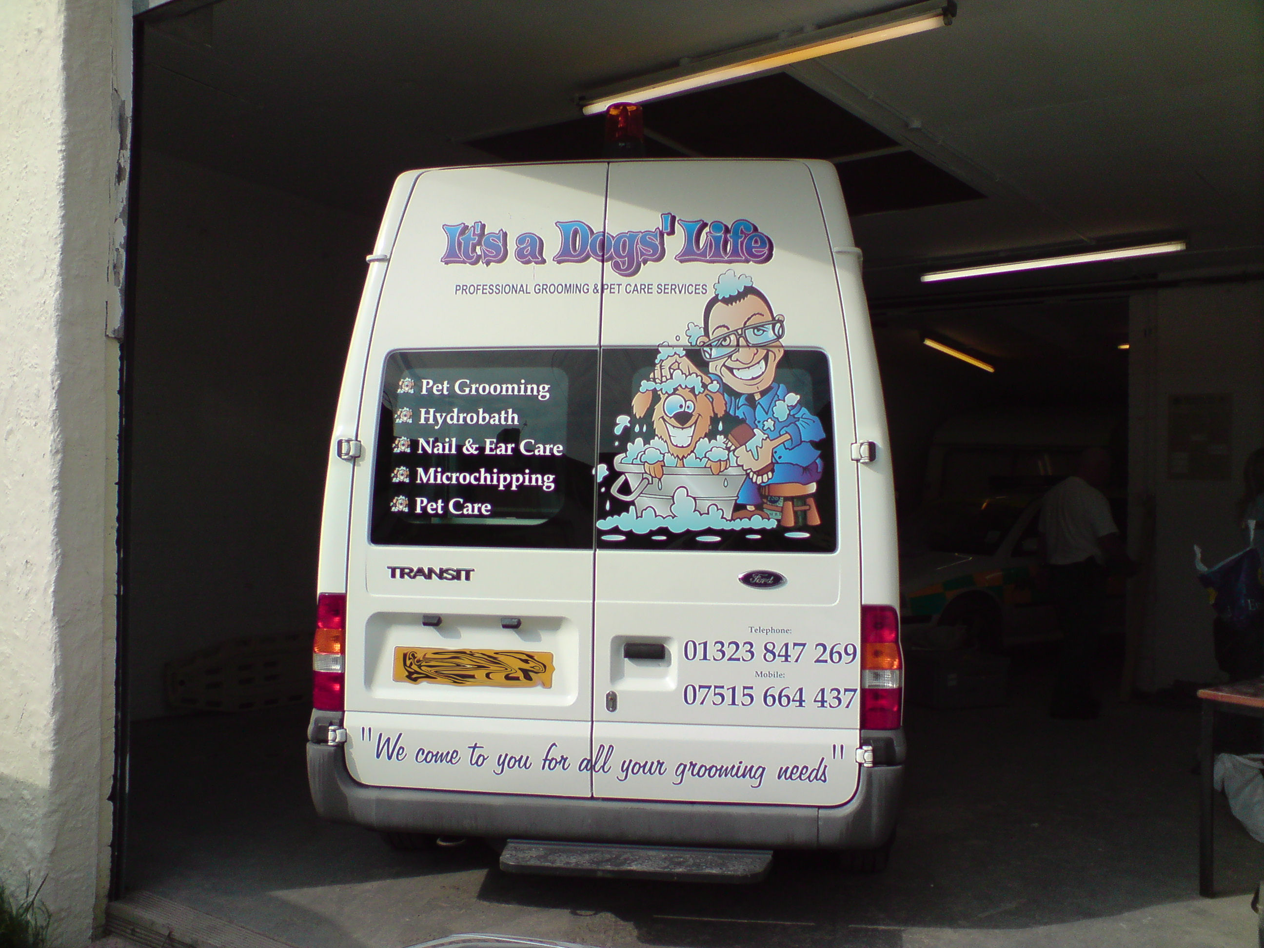
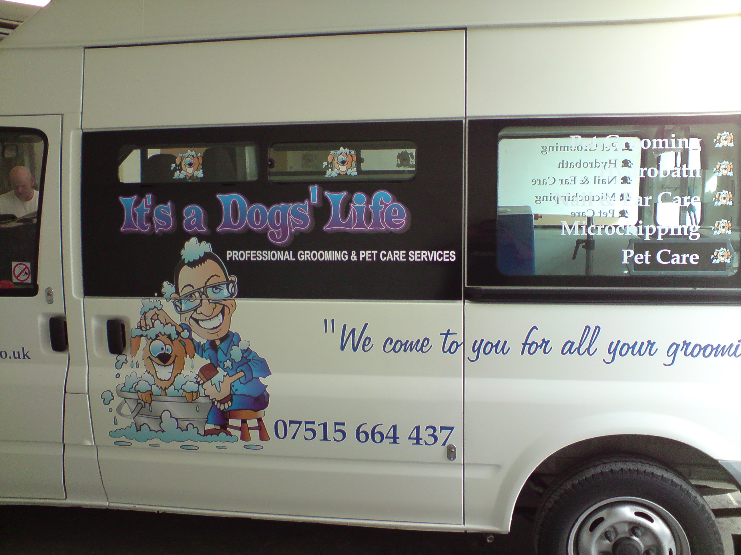
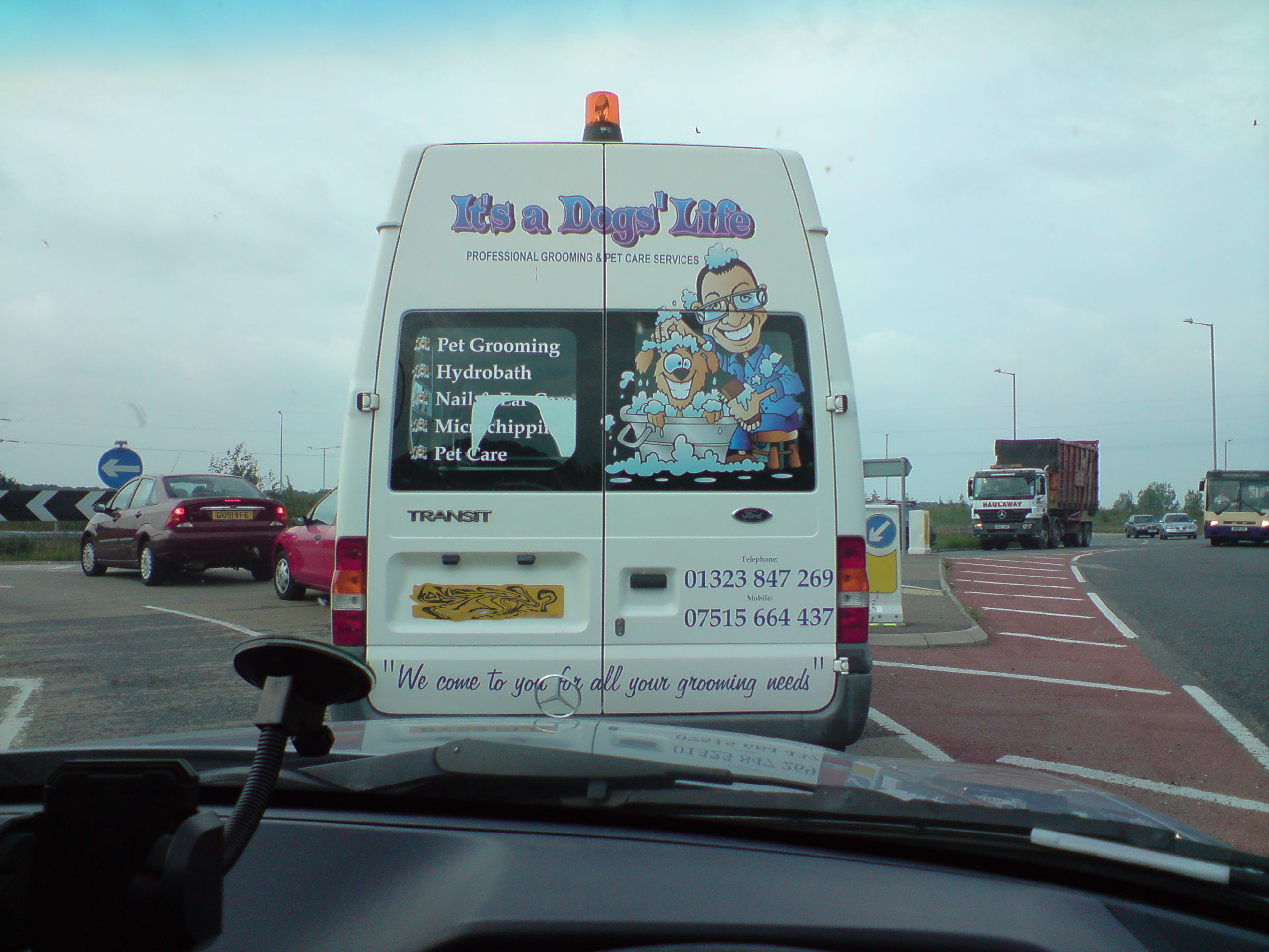
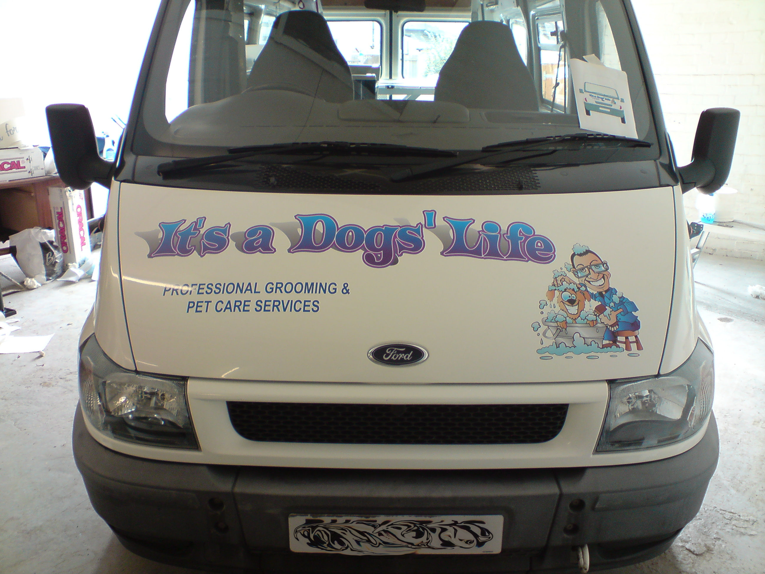
vehicle graphics, "it’s a dogs’ life"
Hey all,
been a while since i’ve done owt worthy of sharing!really enjoyed doing this one,
thanks go to Jill for helping on the final idea’s for the layout, also for recommending John of toonfactory.com in the states, who turned my vision – a happy looking dog in a tin bath, characature of the customer, and soap suds everywhere – into reality via a sketch, and then into workable artwork. I can’t recommend John enough, despite a family crisis, he still managed to turn the job around from concept, to finished article in good time, and at a fantastic price.
Pete and Lynn who did the prints for me, and as usual, had to tweak all my little ‘invisible’ cutlines out, etc!
all oracle vinyls, 751 and orajet(?) laminated prints. fitted in around 4-5hrs in the comfort of one of my other customers new warehouse down the road!
over-all i’m happy with it all, other than the white text on the glass being a little lost when viewed from certain angles. some of the sizing is slightly out too, must remember to leave more space when using the vehicle outlines!
the only thing i could have improved was the price, the customer had a fairly strong budget which let me do a much better job than the normal "cheap as please mate" we’re all used to 90% of the time! in reality it worked out around 30% more on my normal rates/ mark-ups, but, i know this job will bring in more, the customer is over the moon and already singing my praises, so worth sticking to the budget in the long term!
any crit is welcomed, i can take it!
Attachments:
Log in to reply.
