Activity Feed › Forums › Sign Making Discussions › Gallery › Vehicle Graphics: Power Base
-
Vehicle Graphics: Power Base
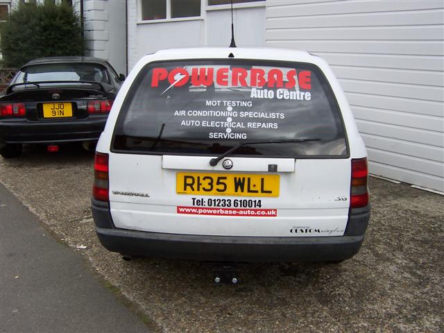
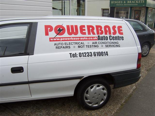
Posted by Lee Ballard on September 22, 2005 at 4:55 amThought I’d show a few pics of a van done earlier this week. Customer was very happy, gotta do the courtesy car on friday now.
All text etc was customers spec and main name logo was already established.
Attachments:
 Simon Clayton replied 18 years, 7 months ago 12 Members · 15 Replies
 -
15 Replies
-

looks pretty neat to me dude !
is it me ? or does anyone else find that the non parallel lines on these kinds of vans, make you measure everything about 50 times cos it doesnt look quite right !
-

looks good, if the customer is happy, then thats all you really want.
I would have used the bottom line on the blank panel to line up with tho, but that is just my opinion.
thanks for sharing
-

In the end after lots of measuring and mocking up the customer and I opted to go for a ‘level’ line as nothing on the van was level and yes Hugh you’re right, took ages til we were happy with the look due to all the odd lines on the van though it’s nice to know how others would have done it though.
-

I agree, if the customer was happy – then there ya go
Think it looks good.but mostly I wanted to sneak in this post because your name is
Lee Ballardbefore I was married my name was
Leigh Ballard F…last name
😀yeah thought it was neat that’s all 😉
I never met another L. Ballard -

But you’re cuter, Leigh!
😉
Nice van….I would have used a level line too.
No matter what you do, it would look crooked to somebody!
Love….Jill -
 quote :No matter what you do, it would look crooked to somebody!
sorry but my pet hate is it lined up with the top.
on the drawing that is how it is in real life driving down the street it looks so wrong.we split the difference between the bottom and top line of the panel then the other text in the waist line level flows with the van better. sorry to be a bit down but hope it helps in the future.
chris
-

i would have lined it up with the black line because that’s the most striking
I just hope i used the right english terms for what i tried to explain 😳 😳 😳
bart -
i made a 4ft long by 2 inch fomex strip with mag material stuck to the back so i can put that on the van then stand back to see the angle.
customers often bring it back a few days later with it still on the roof
chris
-

Chris
Brilliant! I’m going to make one too-will be good to measure off of too.
Thanks for that 😀 -

Lee the layout is fine and at the end of the day if you discussed it with the customer and he was happy with it like this then you have done it right.
There aren’t a lot of vans around that cause this sort of problem fortunatlly and I think personally each one needs to be looked at individually.
On the astra vans I think it makes a difference if you have long lines of text or graphics and less text.
I always explain the difficulties with these vans to customers and where I can show them how it will look at the different angles just in case they have a preference -

Good idea that Chris…
Then there’s the dreaded new shape vito, whatever you put on it, it don’t look right, horrid vans
Simon
-
 quote :i would have lined it up with the black line because that’s the most striking
bart Im with you I find lining up to the bump strip is the best option
and simon yes ive done a new vito too -pain in the proverbial 😕
John
-
 quote Bart Van Wassenhove:i would have lined it up with the black line because that’s the most striking
thats what i do..but one customer asked me too change it 🙄
its what he wanted..but i charged him for it 😉nik
-
quote Simon C:Good idea that Chris…
Then there’s the dreaded new shape vito, whatever you put on it, it don’t look right, horrid vans
Simon
🙁 guess what I just bought!
hardly a straight line on the damn thing!
-
Horrid Vans to sign write Shane, nice to look at… 😀
Simon
Log in to reply.
