Activity Feed › Forums › Sign Making Discussions › Gallery › Vehicle Graphics: Pet Centre
-
Vehicle Graphics: Pet Centre
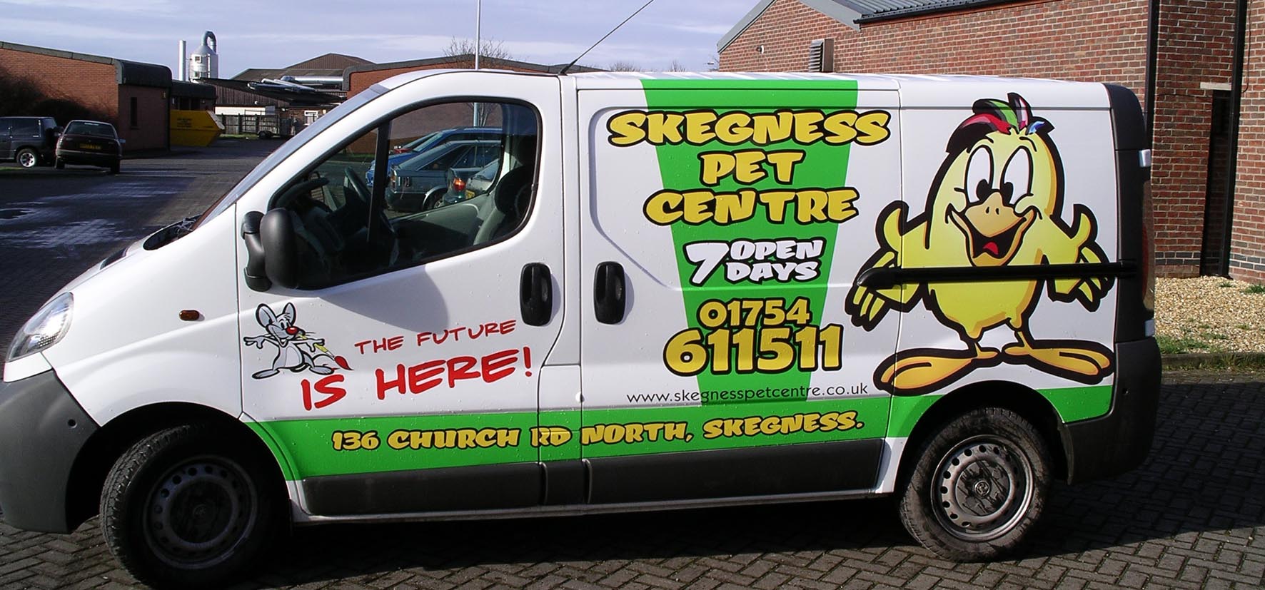
Posted by Pryam Carter on March 22, 2006 at 6:10 amThe last job for the Pet Centre, customer was well chuffed with the finish.
Attachments:
 Pryam Carter replied 18 years, 1 month ago 16 Members · 22 Replies
 -
22 Replies
-

Fantastic it’s full of life and has a big pick me up feeling, I wish I could think that way when looking a new vehicle job. Skeggie is just great I miss the pitch ‘n’ put, REAL FISH ‘N CHIPS and saucy post cards. We only lived a few miles away and would often come down in the evening with the kids.
I agree with shane I just love it.
Russ
-

Great work – I commented the other day on the van that Marcella had done – how it was clean & understated….but if you want a “hit you in the face” style image, I reckon thats how it should be done.
Spot on. 😛
-

I like this too, what font did you use for the ‘Skegness Pet Centre’
Alan D -

Nice work Billy, certainly stands out from the crowd.
😀
-

i really like the overall look of the van, great job really it is,
but (here comes the but) on the hand of the chicken, at the point where the rail ends on wich the door slides, it seem to me that you have cut it where you should have worked it in, (i can see the white of the van)
if it’s just the picture it’s nothing but if it is what i see you might have considered to first work it in and then cut it deep in the recess.it’s the same when you have a graphic that is on the side and covering the side baguette (black stripe on the door of most cars) it looks better when you remove the baguette, apply the graphic an then putt the baguette back on, it just gives you a better finisch.
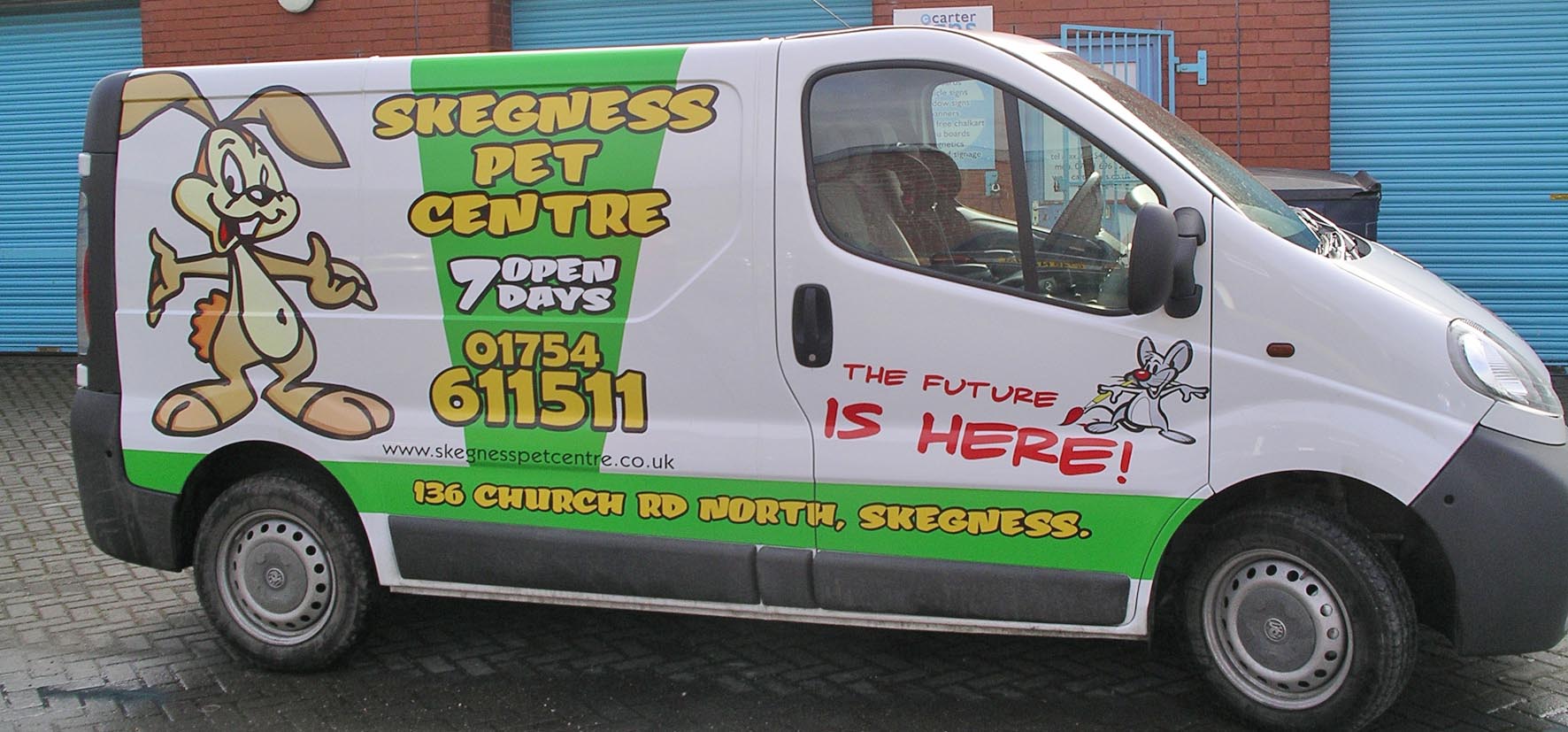
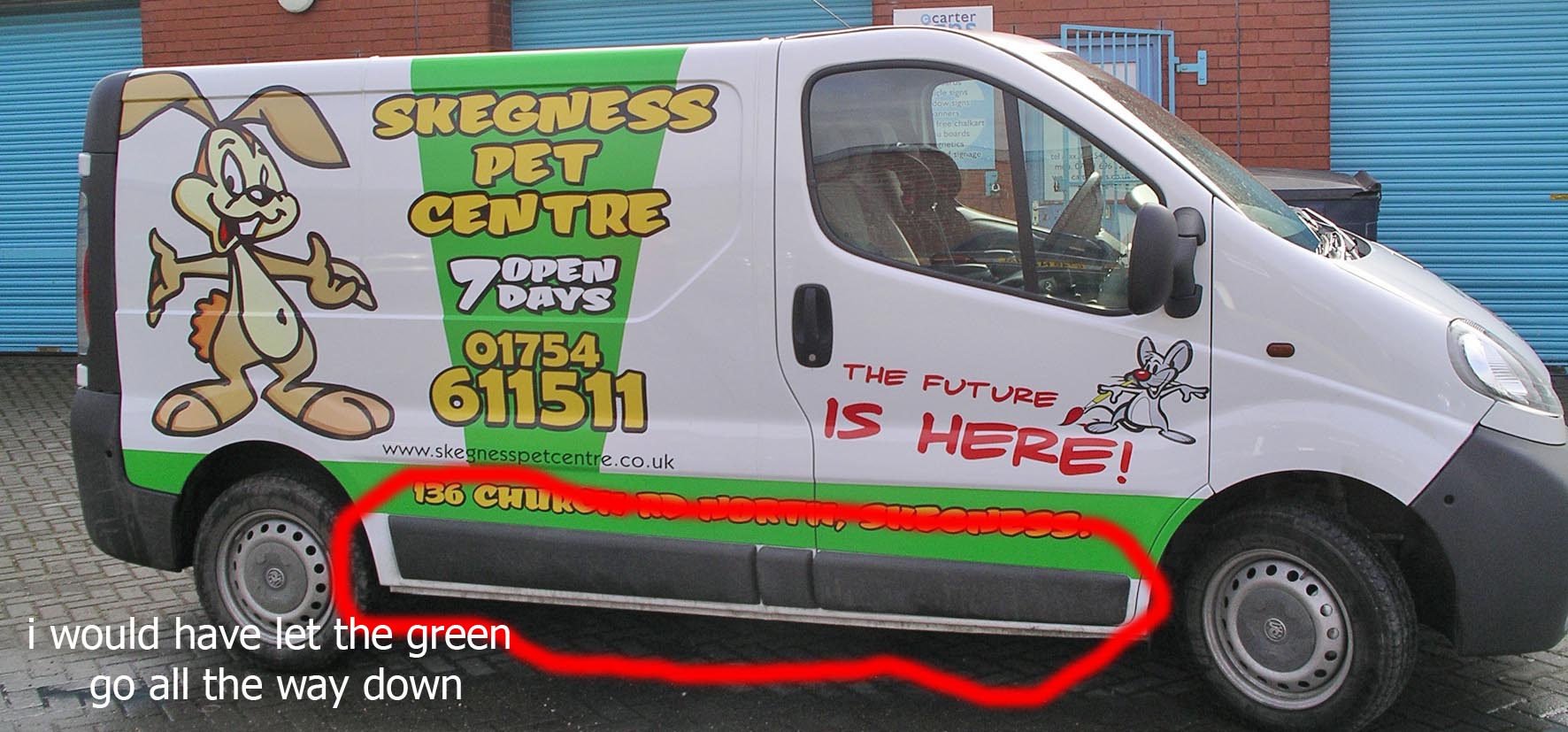
(but then again proffesionals(i hardly dare to call myself that) see things that custumors will never see) i do think that it is the little things that make you better then the others.also on the bottom of the van (on the green and slightly above) are those raindrups or does the van have a serious carroserie problem?
they cant be bubbles cause there also on the white of the van just above your green.the last opinion would be that i would have made the green on the bottom al the way down.
i’m not basching on your work here, i’m just telling you that i like it but have some constructive critics.
would be so kind to share the font, i really like it
i’ve also attached a picture to show you what i mean
kind regards
Dennis
Attachments:

-

The standard of work posted on sign forums never ceases to amaze me but every now and again a piece of work really stands out from the crowd and this is one of those pieces.
Bloody good work mate, I Love it
dreckly
paul r
-

WOW guy that is a GREAT job you did there!
Would catch my eye in a min.
after people see that – they will continue talking about it…and that’s just what you want for your customer right!
what a great job.
Really stands out. -
reading all the posts here i feel guilty, so here something to ease my mind:
:cheer: go billy go :cheer:
who the man?………you the man :praise1: :praise1: :praise1: :praise1:
:2thumbs: superb job :2thumbs: -
Dennis, Im sure Billy does not mind hearing your constructive comments, its good to hear others views on possible improvements or alterations etc. 😉
😀
-

Russ
quote :Skeggie is just great I miss the pitch ‘n’ put, REAL FISH ‘N CHIPS and saucy post cards.Yeah but the fish N Chips are bloody expensive now!!
quote :what font did you use for the ‘Skegness Pet Centre’It’s a Letterhead Font, i think it was called FAT TONY. I aquired it from another job from a graphic designer, lucky really!!
quote :but (here comes the but) on the hand of the chicken, at the point where the rail ends on wich the door slides, it seem to me that you have cut it where you should have worked it in, (i can see the white of the van)
if it’s just the picture it’s nothing but if it is what i see you might have considered to first work it in and then cut it deep in the recess.This should have been worked in to the recess, we made a slight mistake when fitting it. It was icey cold and the vinyl tore when we applied it, thus we decided to cut it above the recess.
quote :also on the bottom of the van (on the green and slightly above) are those raindrups or does the van have a serious carroserie problem?Yes, it’s water. I swilled it down to photograph it. I forgot to get a smudge when we finished it so l asked him to bring it back in. He did but it was filthy!!
I never even thought about continuing the green under the trim at the bottom, i suppose it would look a bit better to the critical eye 😀 -

love your work billy, i bet the client was well chuffed 😀 😀
i wish my clients had the bottle to have this sort of thing but all i seem to get are the boring corporate logos etc…
is the font that you used a free ttf or is it a font you have to purchase??
i got a job that will look great with that lookroffs
-

Looks good Billy lively and fun in, reality you couldn’t have taken the green to the bottom is the blaclk/grey a rubbing strip 😀
Lynn
-
quote :is the font that you used a free ttf or is it a font you have to purchase??
i got a job that will look great with that lookIt’s a purchase font. There are some fantastic ones at letterhead fonts. Like l said l was lucky enough to aquire it!!
-

hay billy,
thought that was spot on my friend!! excellent work. what machine did you use for the graphics, are they printed? -
those are just details, your custumor won’t see it, he/she sees the entire van, we see the van and then go into the details,
it’s done great, and in the end it’s the custumor who pays for the work so if he/she is happy then the job was a succes.
-
quote :hay billy,
thought that was spot on my friend!! excellent work. what machine did you use for the graphics, are they printed?All the graphics were printed on my little versacamm sp300.
thanks to everyone for your generous acclaim and of course your critique.
it’s all been taken on-board.


Log in to reply.
