Activity Feed › Forums › Sign Making Discussions › Gallery › Vehicle Graphics: Painter & Decorator, Robert Floyd
-
Vehicle Graphics: Painter & Decorator, Robert Floyd
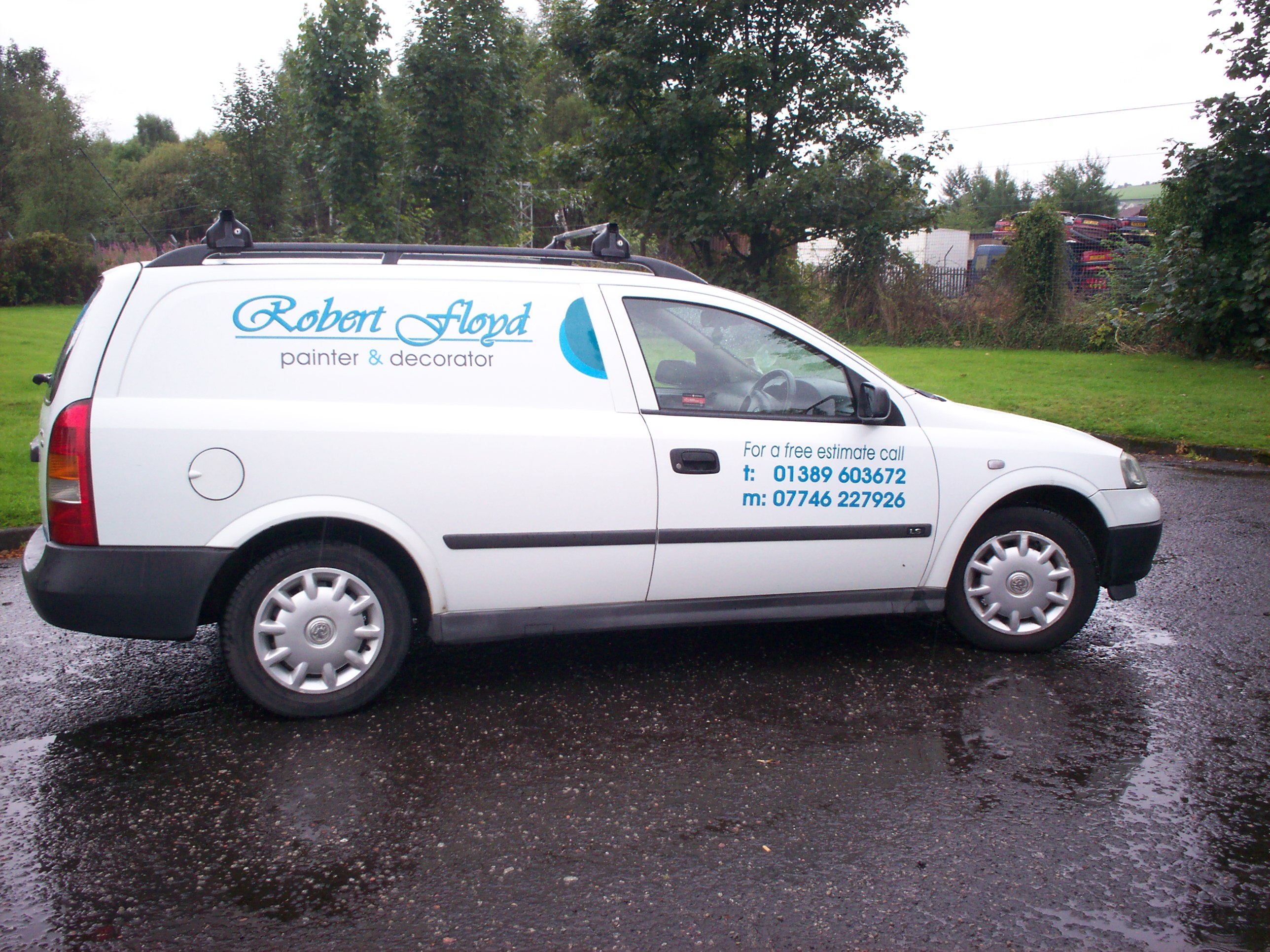
Posted by John & Dawn Roddick on September 4, 2006 at 7:36 pmThese are a couple of pictures of an Astra van we completed at the weekend. There’s not a lot going on, but I liked the understated look it has. Any opinions welcome.
Dawn
Attachments:

 John Singh replied 17 years, 8 months ago 9 Members · 17 Replies
 -
17 Replies
-

I think that looks nice Dawn, I like the choice of font for the name.
-

Thanks Marcella. The font is Vivaldi (though you probably knew that already, being a bit of a font anorak)
-

i was gonna say exactly the same as marcella… only with a different accent !!!!
-
quote Hugh Potter:i was gonna say exactly the same as marcella… only with a different accent !!!!
…. and hopefully not wearing a skirt
-

Love the font and colours, but I would always keep the baseline of the text level, maybe thats just me. 😀
-

It looks good Dawn – Well done 😀
Hugh – I thought it was black leather on Friday – Skirts are Saturdays attire surely 😳
-
quote Phill:It looks good Dawn – Well done 😀
Hugh – I thought it was black leather on Friday – Skirts are Saturdays attire surely 😳
jeez phil, i dunno, stockings n suspenders on a tuesday (under me fishing suit), leather on a friday, pvc on a thursday and skirts on a satuurday, i get so mixed up these days,
-
And all the "chaffing" in the recent hot weather – Honestly Hugh sometimes I wonder is it really worth the effort 🙄
-
i know what ya mean mate, btw, can i have my heels back please, they’re so much more classy than me flats, plus dave r wants to borrow them !
J&D, i dont mind the slanted text !
-
quote Harry Cleary:Love the font and colours, but I would always keep the baseline of the text level, maybe thats just me. 😀
After John had fitted and delivered the van to the customer, he decided the same as you Harry, but the customer was very happy.
-
I usually align these things level with the sill or the bump strip. You really can’t go wrong if you do it that way 😀
-

looks clean and tidy, well done J&D. I am a ‘less is better’ sign guy after all 😉
Hugh & Phill…. total nutters! :lol1:
-

Lookin pretty classy there folks!
(not Hugh in a skirt, that’s just wrong)
love….Jill -

100% very classy looking
love the colours and the font and love the less is more lookrich
Log in to reply.
