Activity Feed › Forums › Sign Making Discussions › Gallery › vehicle graphics: Mortons Optician
-
vehicle graphics: Mortons Optician
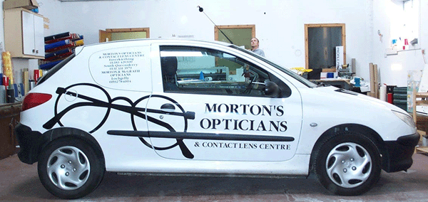
Posted by Martin Pearson on September 2, 2002 at 12:14 pmThis mornings effort, one of those days, nothing would send to plot and we had to do the design again before we could start. Thank goodness it wasn’t a complicated job !!!!
Terry Bull replied 21 years, 7 months ago 8 Members · 9 Replies -
9 Replies
-
WOW! – now that’s good!
what impact it has – you can see this one turning heads as it goes down the street…and it’s a good example in responding to those people who would say “black and white signs are boring”…yeah right!
Only niggle would be that the small group of text and the main title text fight each other a bit as regards ‘what’s level?’….one of those live and learn things I think…
anyway, super job – really punchy for such a simple design…well done!
more soon
mikethesign
-
Great job… clean crisp and simple!! spot on !!
Its obvious WHO THEY ARE, and WHAT THEY DO,…. but i cant see HOW TO GET HOLD OF THEM !! … ive always beleived these to be the three esentials (i may however be talking utter rubbish) but passing it in the street at the distance in the photo i can see what they do, but its no good if i cant call them or pop in to see them!!
😀 -
brilliant stuff martin, realy professional, 🙂 🙂 🙂 eddie
-
VERY NICE MARTIN!
I’m with mike on the level thing but I’ve done it myself in the past 😆 .
I really like the spectacles and the main text but the small stuff is a bit lost……
Still a really sharp design….It’s nice when you have the talent to do in one colour, something the competition can’t do at all.
Excellent!
PS….how much….I’m guessing at about 190ish????
cheers
joe -
The small text is the location and telephone numbers for three practises that they own, I have to agree with both Mike and Joe about the level issue but what do you do?
I would really like to know as we thought about this but could see no other way to do it. The name looked silly when put on level so we felt it had to follow the lines of the vehicle. The small text when alligned with the name looked even worse as the panel lines go the other way.
I am really interested as to what other people would have done, after we had done it Jon and I said right we will add peugeot 206’s to the list of vehicles we refuse to graphic as they cause you all sorts of problems !!!!!!
Joe I wish we could have got £190 for it, as I have said before people up here have deep pockets and short arms. We charged them £120 for it but I think it is worth more. -
The worst comes to the worst I take my level from the bottom of the sill between each wheel
Its not perfectly level if you look at it but draws a happy medium to get you started…
Your right cars like theses never look straight but out on the road if you go with a coach line, a rubber seal, window whatever it will stand out a mile…
Another good one is the bottom of the door…
Take a tape clip it under the bottom of the door and come up say 25 inches. Then move along the door & come up 25 inches. Then take a chalk line and ping a line right through these marks right out to the back of the vehicle.
Thins will give you an expectable level to take all other measurements from…Hope it helps
-
Deleted User
Deleted UserSeptember 10, 2002 at 5:07 am😀 MAn Thans neat Loking Kat!
Its An EYE catcher! 😀 😀 Get It !~ Eye catcher Okay Being Working To Much NEED SLEP NEED SLEEEP!
Its cool 😎 -
I don’t think Oreo’s jokes can get any worse Gray, still I appriciate the comments. Thanks Oreo.
-
Nice work Martin -very visual for such a small motor
With the level thing its often a challenge on the new vans out I usually line up with the most visual line on the side as you have, the rub stripThe small copy I would have put at the same angle but then you tried that and it also looked odd -cant win
Regarding what you got for it id have thought at least £150
They see you coming …but then THEY would wouldnt they HE HETerry
Log in to reply.


