Activity Feed › Forums › Sign Making Discussions › Gallery › Vehicle graphics LP signs
-
Vehicle graphics LP signs
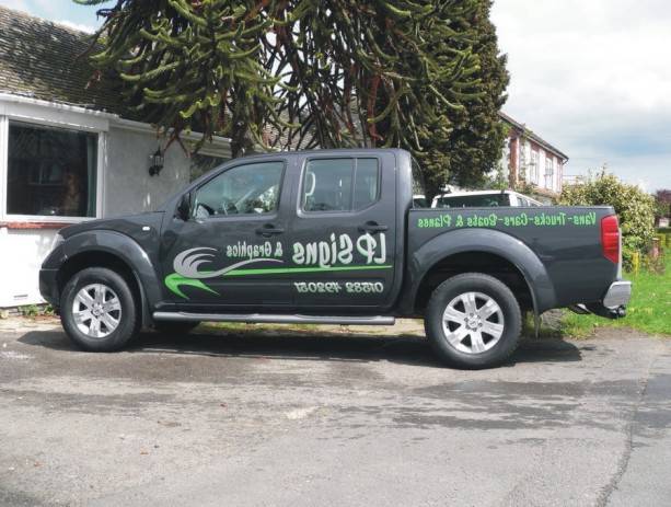
Posted by Peter Normington on May 1, 2006 at 12:14 pmIt took us a month, but finally got round to doing our own truck.
Not sure if I am entirley happy with the design, But we had to get something on there! We can always change it though,Peter
Attachments:
 Martin Cole replied 18 years ago 13 Members · 22 Replies
 -
22 Replies
-

3 actually, and a helicopter, they were all small private aircraft.
Peter
-

Nice, i’d have like to have seen pictures of them. How did youm go about pricing a plane up? i have trouble with bloody cars. 😀
-

I like the colour scheme Peter. Looks nice.
Is that a Monkey Puzzle behind it? Nice foliage. 🙂
-

thanks for that Andy yes it is a monkey puzzle tree
Lynn
-

Good work Peter and Lynn – Nice pick-up and a good advert for your business. What does the other side of the vehicle look like?
-

Nice one peter and lynn.
not fussed on the hyphens between the text, and then the & at the end. Just my own personal taste, would rather a comma between each text if you are using a &, or a hyphen between each text and no &.
As I say, just my own choice. 😉
Bet you notice a difference from your little van, even just for the comfort levels. 😛
-
 quote Peter Normington:3 actually, and a helicopter, they were all small private aircraft.
Peter
I take it you have a very large set of ladders???
:lol1: :lol1:
-

Its simple design good colour combination and looks good to eyes.
-

nice work peter love the truck i have been looking at the new warrior
how do you find your truck ?? -
quote Richard Urquhart:how do you find your truck ??
Its normally parked near the front door, so I dont have much trouble 😀
I have pm’d with more detail.
Peter
-

Really nice to see no net curtains in this pic, design has a get up and go feel to it and a slight touch of hippy, will you be getting a ladder rack.
Russ
-
quote Russ:will you be getting a ladder rack.
Russ
No ladder rack, I have bought a little giant set of ladders, and they (almost) fit in the pick up bed and also have a trailer to carry anything bigger.
Edited to add this b4 you ask http://www.ladders-online.com/acatalog/ … der_system
click on the videoPeter
-

nice one peter & lynn 😀
i too would have ditched the hyphens on the wording and replaced them with different coloured dots…but thats my own prefrence, the colours look great too 😉
nik
-
OK, Nik, and Shane, Lynn wanted commas, I wanted dots, so we compromised, You are bot right, will see if we can find a sign maker to change it for us….
Peter, & Lynn
-
quote Lynn:same as that but the other way round 🙄
Lynn
But it’s a bit diffcult to read on the other side Lynn 😕
Attachments:
-

That’s one of Arthur’s fonts…he is a dear friend.
I think dots would have looked better than dashes and an ampersand.
I also think you should have made the phone number in the same font as the rest.
But it reads well.
Love….Jill -
Hi Jill I bought $200 worth from letterheadfonts.com well worth it,,
Peter
-

Very nice, love the font and the colours work well :thumbup2:
Log in to reply.
