Activity Feed › Forums › Sign Making Discussions › Gallery › vehicle graphics: jim leamy plant hire
-
vehicle graphics: jim leamy plant hire
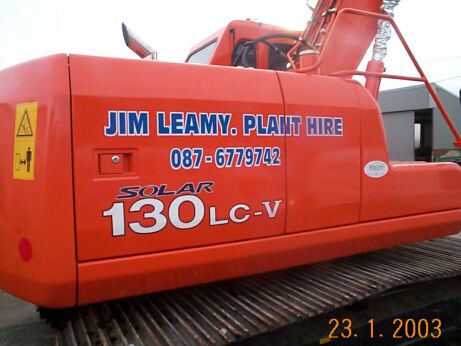
Posted by eddie cotter on January 26, 2003 at 4:38 amanother job where i was told what to do 😡 the owner said, plain letters
blue with white out line…….not as big as grays one 😀
Attachments:
 eddie cotter replied 21 years, 3 months ago 3 Members · 5 Replies
 -
5 Replies
-

yep nice and clean as gray has said mate 😉
can i give you a tip.. and yes it is another kerning one 😆 😆
but one i think should be used when applyng oulines and shadows..
if you are going to create an outline on text.. try opening the kerning to about 115%
then apply the outline. the outline should not touch the outline of the next letter. nor should it in most cases “close a letter”..
it all makes identifying letters easier. if the outline is heavy or the kerning is kept the same. then this becomes a type of halo. it can still look good but when it is an “outline” you are looking for i would suggest what i have said above.
somtimes if a letter closes because the prefered thickness of an outline is applied. it is somtimes better to apply a slightly thinnner “outline” but then a slim “Inline” then delete the original text. it gives you the thickness of outline wanted but doesnt close the letters…
hope this made sense..
thanks for sharing mate… -

thanks gray! robert you have pointed this out before to me!!!
i obviously didnt listen to you mate, point taken 😀 eddie -
I think its plenty legible Eddie, though they’re some
wise words from RobertWhites not a favourite of mine for outlines -not too bad on a yellow base and Ive never used white as a colour for block shading
its a personal thing ..
-
your right terry it is very ledgible mate.. i kind of just mean in general. i guess i just used eddies work as the promt to say it. 😆
i see only too often work, not neccessarily on this site but out and about.
text with outlines and shadows.. they start with somthing like a white background & red text.. then apply a heavy black outline and then black shadow.. the end result is an almost unreadable word that could look very good if the kerning had just been right.
i do tend to rabble on about the kerning eddie. i guess its my pet hate.. sorry if i repeated this to you. i say it so much on this site i forget who i said it to already.. 😆 😆i just think that when designing and lettering vehicles. kerning is one of the biggest non-used functions. but can make a whole difference to a design and its ledgibility.. ok ill shut up.. sorry im away for a cuppa tea 😳 😳
-
no rob, youre 100% right, you dont miss a trick 😀
sometimes when i am doing a job i seem to want to get the lettering up on the van or machine !! when i should realy take a bit more time &
check the layoout first, i have even done jobs in script & forgot to weld
the letters to each other, thanks eddie
Log in to reply.
