Activity Feed › Forums › Sign Making Discussions › Gallery › Vehicle Graphics: Hardwood
-
Vehicle Graphics: Hardwood
Posted by David McDonald on August 9, 2005 at 10:52 amHi All
Thought I’d post some recent jobs whilst downloading them from my camera.
Macky D
David McDonald replied 18 years, 8 months ago 14 Members · 37 Replies -
37 Replies
-
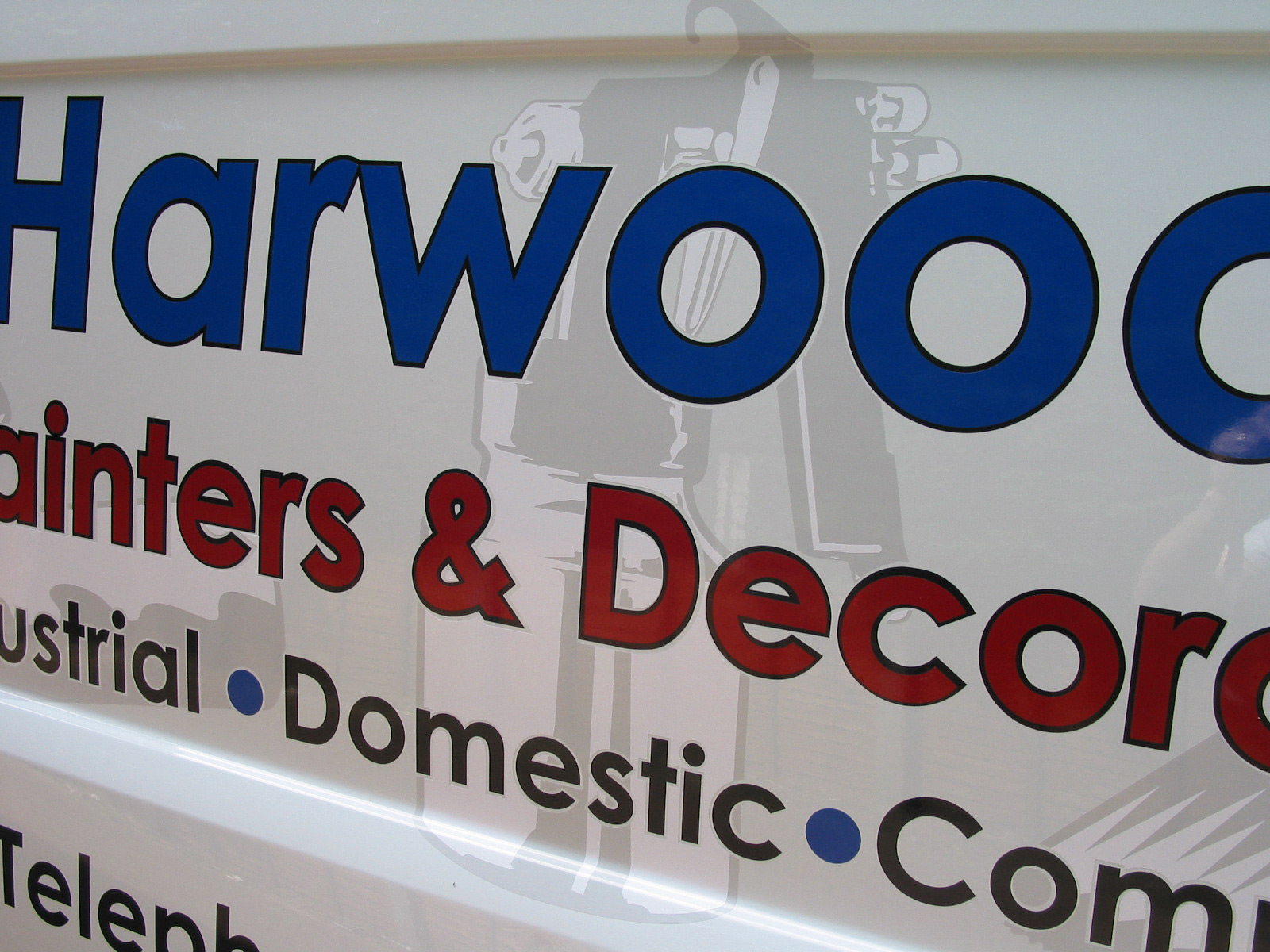
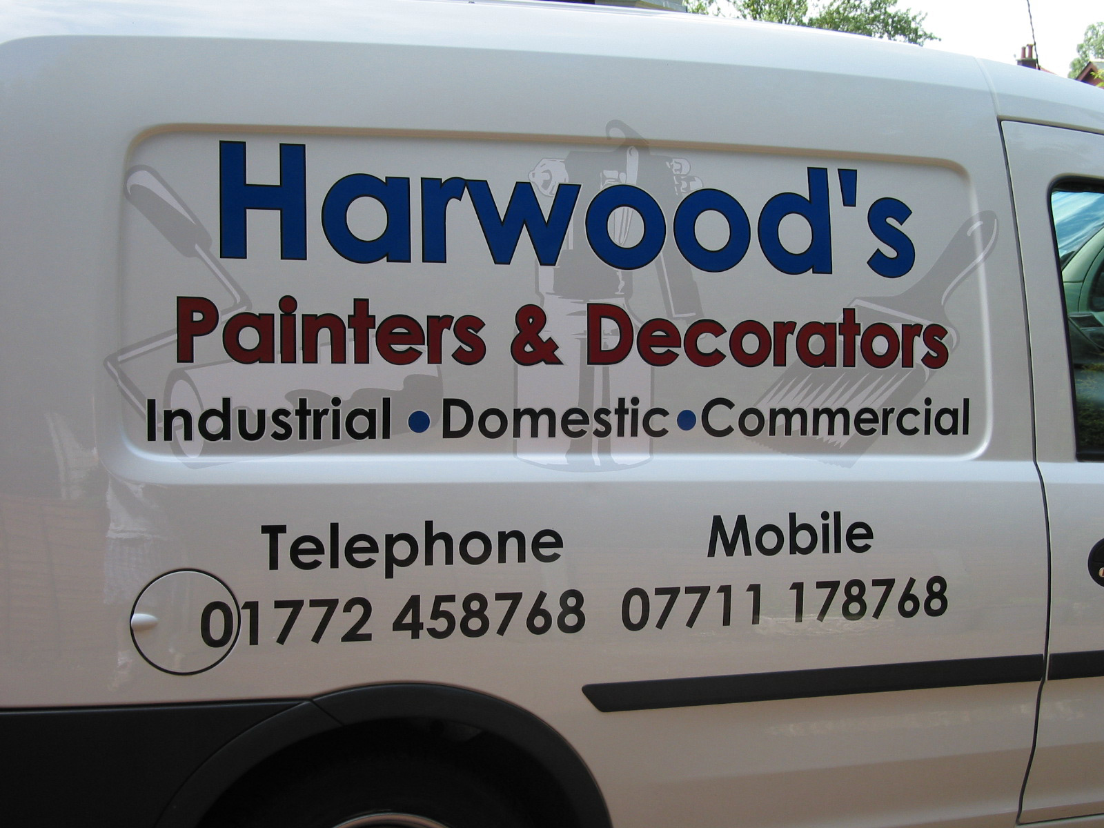
Nice design Mack especially the shadow behind, But if no one else is going to mention it then Iam afraid I will. One thing that defines a good sign maker is Kerning (Letter spacing).
I Don’t know what programme you use and sorry to be negative but the kerning needs serious sorting. For example look at the no 1s in the phone number and the R W. -
Love the top design great work, as for the kerning, I would say its not the RW but the AR need a little more space, when i was taught about spacing it was to take a line through the centre of the wording and arrange the spacing that way, if you open up between the RW it would look too large a gap??
Simon
-
got to watch out for horses ‘jumping’ the signs! (hot)
nice work
-
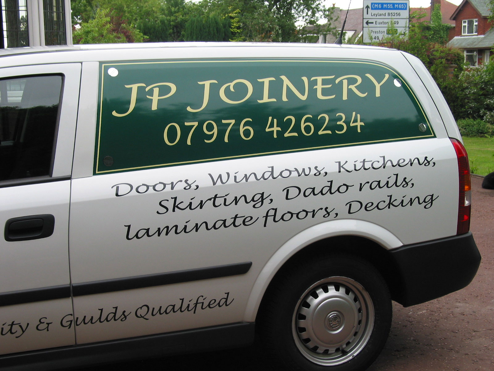
personally I don’t have a problem with any of these designs, sometimes fonts vary in appearance it could also be the angle of the photograph i think they are all very good, well done.
Lynn -
well done Mack, the only slight problem i think is the word “Telephone” & the number underneath, you have forgot to vertically align as you seem to have done the mobile OK.
L JPS don’t like the checkered shorts tho 😮
-
Nice work …… thanks for showing us 😀 Always good to get a bit of constructive advice from peeps here aswell I think 😉
-
:lol1: Lynn …. if you look at the refelection on the back end of the van in the second pic you should see what LJ is referring to.
-
Hi All
Thanks for the comments. Take on board the pointers abour kerning – I will have to tweak this in future.
As for my lucky sign making shorts – I thought all sign makers had a pair? I wear them just on the off chance it will stop raining – mostly it doesn’t.
Cheers
Macky D -
Darn it, I can’t see the shorts.
I am anal when it comes to kerning.
So many people just type things out.
I tend to fiddle with every letter till it looks “right”.
But I do think you have an eye for design, and I like your color choices too.
Love….Jill
(everyone here loves that one font too) -
Jill,
2nd pic, on the fuel cap, but open jpeg & zoom in.John
-
quote Jillbeans:I am anal when it comes to kerning)
Jill, is this another case of American meaning to an English word having a different meaning to us Brits. such as “Gas” & “Fanny” to mention just two?
L J
-
i saw jill write that a word few weeks ago too .. my mind boggled!!
-
Short for anal-retentive…you gutter brains!
Love….jill -
When you have 5 minutes to spare Jill perhaps you could do 2 or 3 designs explaining the idiots guide to kerning. Showing how tweaking things can just add that final touch…..I for one would be interested in anyones approach or views with some images to show there point.
Tim….
-
I thought it was maybe a preference you were stating :lol1: :lol1: :lol1: :lol1:
Goop
-
Nope, Forbie, never did like ******** much.
😳
Whoops! that didn’t get an “oops I swore”!!!!! -
:noeveil:
:lol1:
Isnt it amazing just how many topics get covered here at UKSB …… from vinyl to digital prints, correx to acrylic, kerning to anal things 😮 :lol1:
-
sorry Carrie, but i didn’t start it, it was her miss honestly it was her 🙄
-
I can’t believe this thing will let you type in ******* when it won’t let you say shit !
OK, back to the topic at hand & don’t blame me! I am the portrait of innocence myself.
j. -
Maybe this forum should be re-named.
Instead of show us your stuff – it could be called show us your fanny and I’ll show you my willie
-
Here’s my
:booty:
and my
:bigwink: :bigwink:
Now let’s see your
:dance1: -
Hi Macky D,
Excellent work again, I’m not in the sign business so personally I can’t see anything at all wrong with them, they look perfect to me!
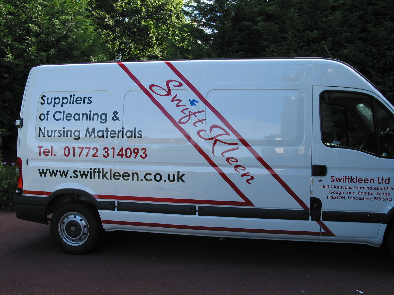
Just noticed that the area code for the vans that you have done are Preston, not a million miles away from me. Sister lives in bamber bridge, she has a off licence and no before you ask she does not need any new signs lol!
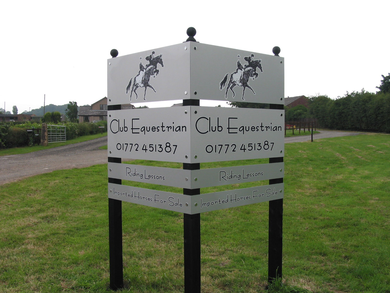
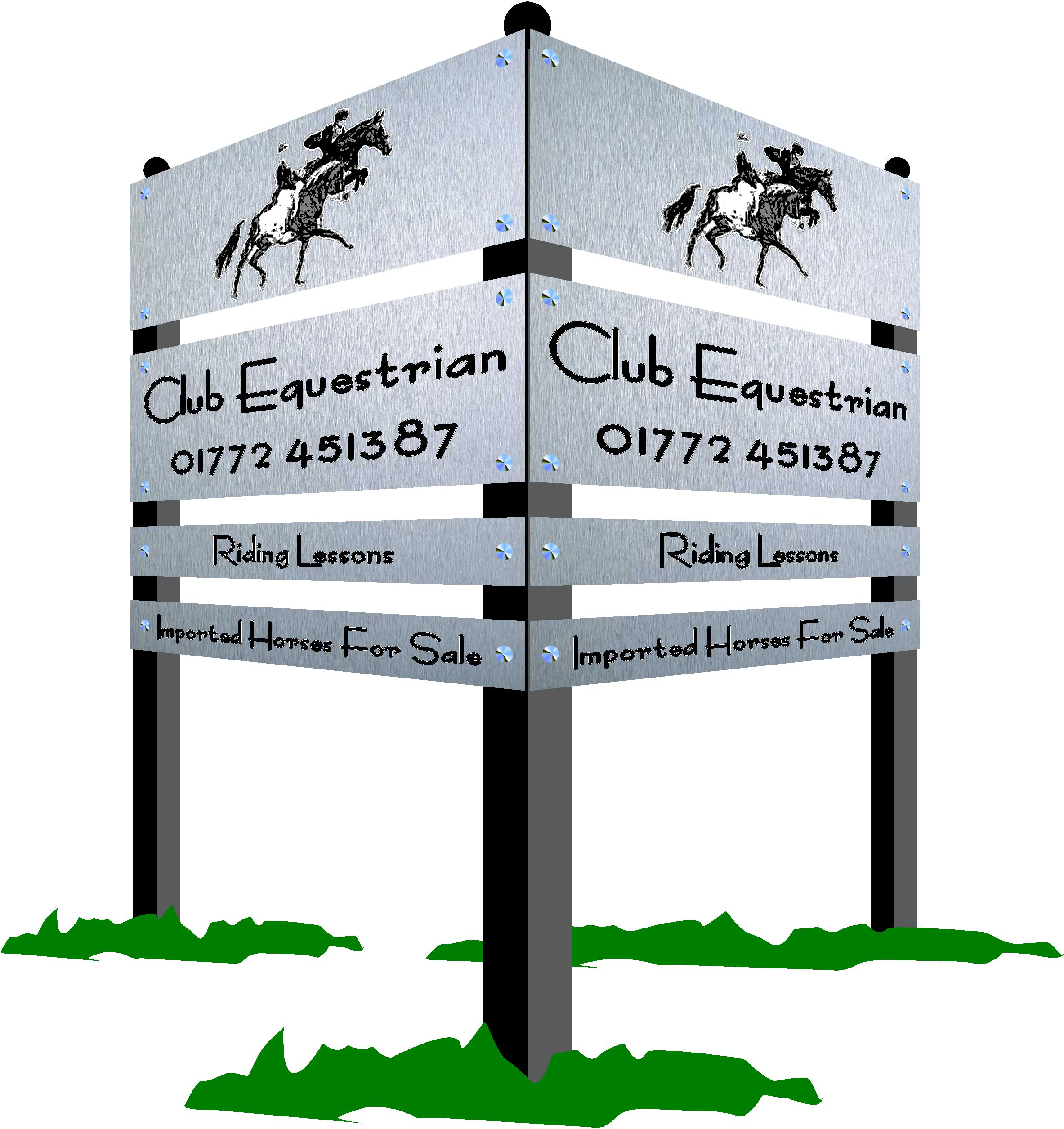
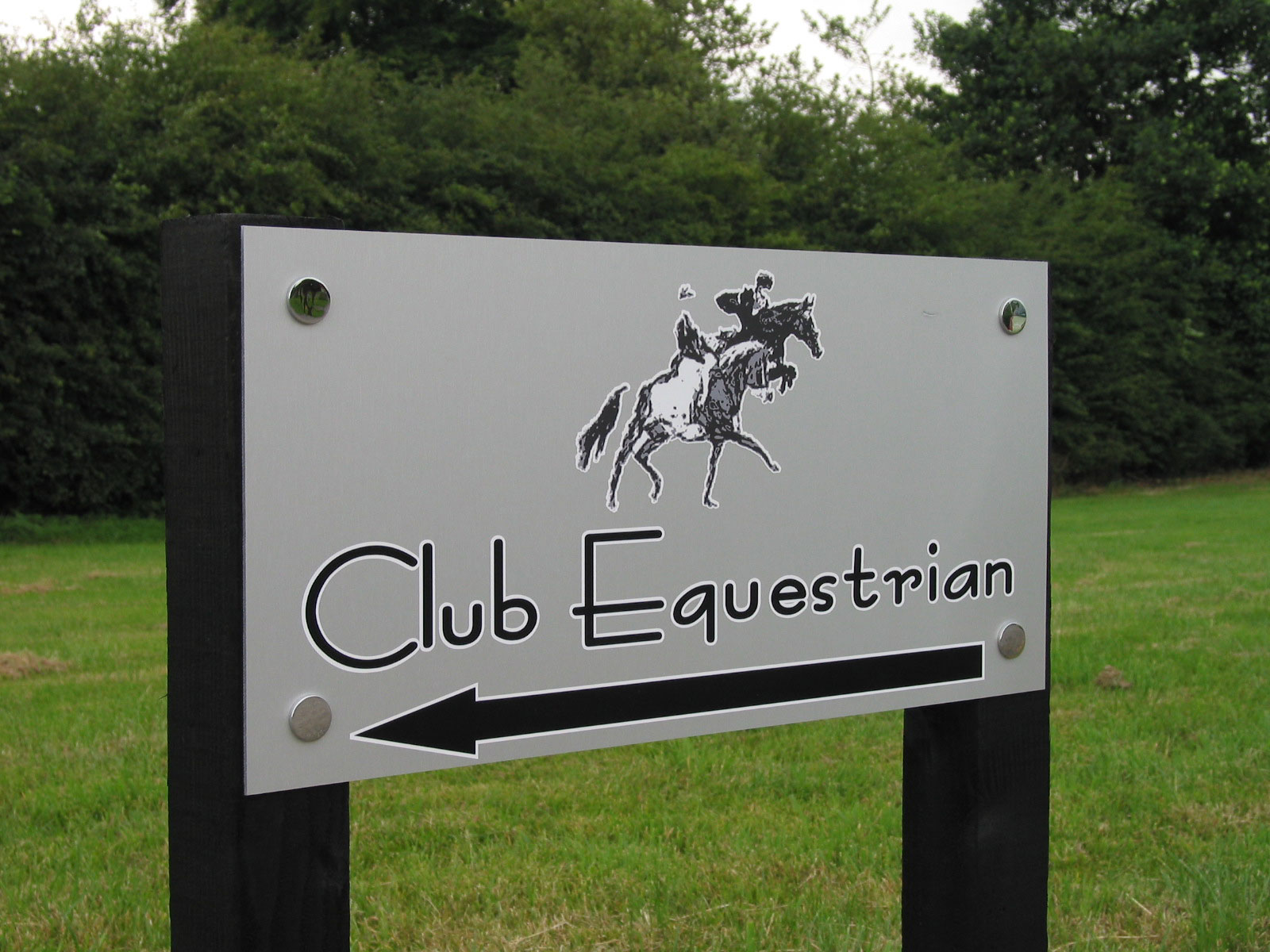
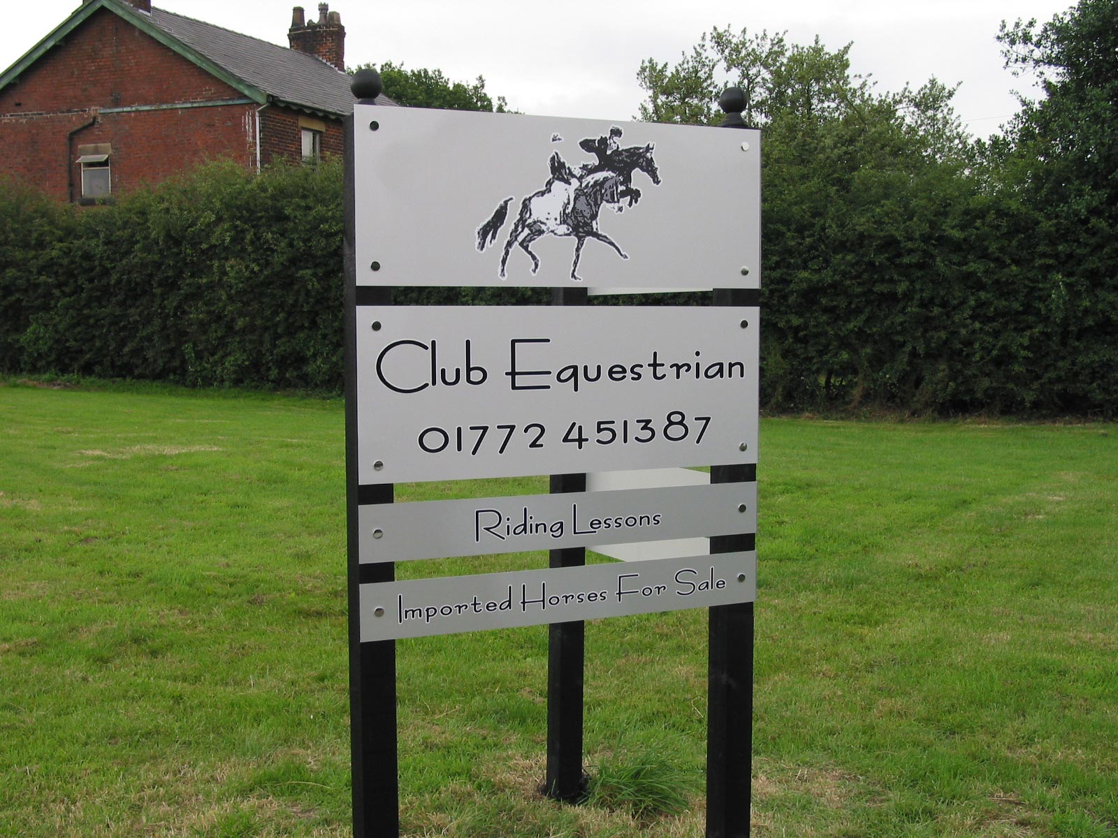
The signs for the equestrian centre looks great, did you use brushed aluminum or stainless?
ultimatehandyman
-
Hi UHM
I can guarantee I’ve been in that off licence!
I used brushed aluminium – I prefer this to the stainless effect even though the stainless starts off looking better, but after a few weeks general weathering and road ‘grime’ I think the brushed looks cleaner/brighter.
Macky
Log in to reply.


