Activity Feed › Forums › Sign Making Discussions › Gallery › vehicle graphics: Furniture Medic
-
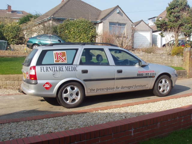
vehicle graphics: Furniture Medic
Posted by ImagineUK on March 16, 2003 at 7:20 pmTake a look at this every1. Im 19 and altho ive been doin sum signwriting for a few years i set out on my own about 6months ago so any CONSTRUCTIVE criticism would be very much appreciated.
Cheers
Andrew
Attachments:
 John Singh replied 21 years, 1 month ago 6 Members · 9 Replies
 -
9 Replies
-

hi andrew
welcome to the site mate! 😉
ill reply to this post a little later but thought ide thank you for posting and submitting your own picture also..now that ive said that, im going to delete it! 😮 😉 dont worry ill re-post it later tonight. its just that its too “big” ill crop and chop it to suit the space available. 😉
best thing to do in the meantime is introduce yourself, and tell us a bit about “you” & what got you into this game in the “say hello” forum.
oh yeh… and can i ask how you found the site mate? 😉
-

Cheers mate, took the pic off and scaled it down. Was a bit scary looking at myself that big 😮
-

Hi Again Just come across this
Not a critism more of a prefference I would have tried to pull back the back strap line so it did not run on to the door and the phone number the same
That said thiers sod all wrong with that and it shows your not scared of coming over gaps so I dont think it will be long before we see some sexy work coming out of your workshop. and well done youve alredy achived more than me as i have not worked out how to up load pictures yet.
Youll have to give me a lesson someday 😆
………….FB
-
Thanx Bob.
The only reason im any good with pictures on the internet is from looking at photos of naked laydees all the time 😆
Andrew
-
not too bad Andrew… 😎
The lower phrase sits nicely over the two doors, the logo on the side-window looks a treat. I’d have liked to have seen the phone number move back onto the door as there seems to be no reason for it to be so ‘out on its own’. Be careful stretching stuff like you have the ‘Furniture Medic’ phrase. If you want text to stand out more then it’d be better to use a heavier typestyle than stretching it. Finally, if you ran a simple pin-line through the fuel cap and door handles from front to back – it would have linked the Furniute Medic/logo group and the phone number nicely together.
These are just casual observations. It’s easy to take someone elses finished work and suggest improvements so don’t take too much notice 😛
You’ve done the hard part, which is coming up with the initial idea and making it all happen! – well done….
more please!
mikethesign
-
Yep I agree with mike on the stretching of the text on the words “furniture medic”.
This is something you should try eliminate altogether. It’s a bad habit to get into.
Keeping the font, as it would have been, would have kept the text out of the way of the petrol cap.
Dropping the height slightly would have kept it off the rear door. Try keeping in mind “big is not always better, or noticeable”
Service master & tel number would have been better situated on the centre of the drivers door and possibly an inch or so higher.
The general feel I get from the whole job is it needs something to tie it all together. Maybe the coach line like mike has suggested would do the trick. Another possibility would be to make the “prescription for damaged furniture” a solid black panel running from one wheel to the other. With the text weeded out of it showing the silver of the car through it. This coupled with moving the service master and tel number back a bit may help to tie things up…
Again, echoing what mikes said it’s always easier to pick at someone’s work, than starting from scratch. -
Unfortunately i couldnt do much with the word “furniture medic” as it is just a copy of their logo. Luckily though, i can see it as a “trial” job because the owner of the vehicle is the company my father works for (and that i work for on a “contract” basis) so some of your suggestions might still be made 😆 (Especially as one of the “1”‘s has come off the passenge side (:) .
Cheers for the comments, i can see im going to learn a lot here 🙂 I may take a few more photos today for your opinions.
😀
Andrew -

Hi Andrew, welcome to the boards. If you want to learn this is the best place to be. Listen to what people have to say about your designs and make your own mind up about what you read.
Well done with the above job, Mike and Robert have already given you their opinion so take a note of that, dont get upset if they rip your work to bits, I’m sure they wont but if people keep telling you how nice it looks you will never learn.
I hope you get as much out of this site as I do, look forward to seeing some more of your work. -

Well done Andrew and…
Welcome to the siteI think you’re courageous to be going it alone but it seems you’ve got it in ya
A lot of us here have been in the game a long time but coming on the site we’ve learn’t and are still learning a great deal
All the best for the future
John
Log in to reply.
