Activity Feed › Forums › Sign Making Discussions › Gallery › vehicle graphics: Fair Deal Tyres
-
vehicle graphics: Fair Deal Tyres
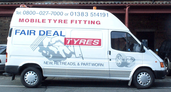
Posted by Martin Pearson on August 31, 2002 at 8:01 pmIf its not obvious the gray in the centre is a hand shake which is there trade mark/logo.
Attachments:
 Martin Pearson replied 21 years, 11 months ago 4 Members · 4 Replies
 -
4 Replies
-

hi martin
great work/design martin… i like it!
i like how you have used a tyre track for the lower panel of the van..
i also like the way you have implied the hand shake in the background. nice one mate! 😀constructive critisism:
the handshake appears to have been laid down first then the fair deal tyres on top.
the reason i say this is because the background image seems to re-appear between the letters
of the panel with the word tyres. i would imagine standing closer to the van you would see
the marks of the vinyl(hand shake) beneath the panel with tyres in it..
somthing i think we all will have done at some point. however i would suggest fitting the words
first, then apply the handshake. once this is done you can easily trim round the panel/letters and
take away any vinyl that may overlap the text. leaving a better finish & what will appear to be
only one layer.
switching the phone number with the words mobile tyre fitting would help too. the number seems to be
a bit tight for space where it is.hope i have got the application method correct mate.. i could be wrong because im not looking at it up close.
if so please excuse my comments..
😳 😳 -

Good work Martin…always interested to see your work.
For my part, I like the tyre tread pattern and the tyres on the door. The whole design is big and bold, using this large space well. It’ll certainly get the guy noticed, yet it’s not too complicated or lavish which makes it a good use of vinyl.
I too, would have liked to see the phone number given a little more space around it, either by re-sizing it or by losing the ‘tel’ and the dashes etc. The more I look a this van – the more I keep looking at that tyre tread pattern…even to the point where I’m not looking first at the name. On reflection, I’m not sure I wouldn’t have done it grey just to take the ‘edge’ of it a little…
what the heck! – it’s a good looking job that does exactly what it says on the tin!
thanks Martin
more soon
-

Comments noted guys thanks a lot, Robert I think you are right about the Mobile Tyre Fitting and phone number, they would have been better the other way round. As for the handshake showing through the text, I never thought about applying the handshake after the text. The idea was to lay down the handshake, position the text and then cut the handshake back. Problem was the van had been given a cheap respray and when we went to remove the gray vinyl the paint started comming off !!!! We ended up having to leave it which is a bit dissapointing but the customer doesn’t seem to mind.
Mike I never thought about doing the tyre tracks in gray, now I can’t make my mind up if it would have looked better that way or not.
Log in to reply.