-
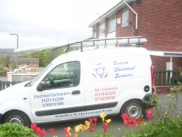
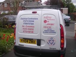
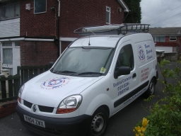
vehicle graphics: electrical services
here are a couple of jobs done recently. Images might not be too good as camera is playing up a bit..
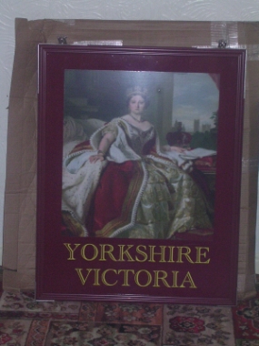
Pub Sign
Sign blank was from Jag Sign Supplies and came complete with all fixings and was flood coated onto foamex. Printed by Victory Imaging and i applied the name.
Van
Customer has two companies which he wanted combined into one logo which then gave the colour scheme for the rest of the layout. Applied using Ritrama O Grade ( im led to believe it is the same as Oracle 751, but dont quote me). All applied dry
Constructive critisism always welcome as i am wearing a tin helmet and am sat behind sandbags 😀
Cheers
Iain
Log in to reply.
