Activity Feed › Forums › Sign Making Discussions › Gallery › vehicle graphics: ekco kithcens & bathrooms
-
vehicle graphics: ekco kithcens & bathrooms
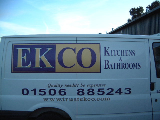
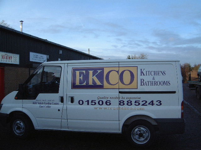
Posted by Phill Fenton on November 18, 2002 at 6:47 pmHere’s a picture of one of their vans which I lettered today. Previously all lettering was in a single colour (purple) but now they are happy to spend a bit more to get signs with a better quality look to them. With their latest van we have introduced gold as a second colour, as well as the bevelled edge effect mentioned above.
Attachments:
 Martin Pearson replied 21 years, 8 months ago 7 Members · 9 Replies
 -
9 Replies
-

It’s good to see people people pushing quality work. Great vinyl effect.
-

You’ll wear that secrets cd out Phil!!!! 😆
Nice work mate
joe -

nice one phill 😉 nice & smart
how did you do it in the end.. is it cut vinyl or did you use the pc600 on the letters?
is that a gold you have used.. looks well just cant really tell from the pictures but i reckon it should give a good rich feel to it whan the sunlight bounces of it… “thats if it is gold of course” 😀 gee,, should i have said that last passage? 😉also i notice the kerning on that number has been opened up a bit… looks spot on also.. that little bit extra space will make a hell of a differnce from a distance.. 😉
thanks for keeping us updated mate 😛
-

Rob – I never used the PC600 on this at all – it was all done using Oracal 751. I used the gold coloured vinyl, along with black/grey and white to achive the bevelled look.
You’re right about the telephone number – I increased the kerning only this morning after reading your comments about the G Sommerville van. 😀
-

Great work Phill, have you changed the colours at all because in the picture it looks like a blue and gold on the logo ?
-
It’s purple Martin (oracal 40) – although I agree it looks blue in the photograph 😀
-
Just helps to reinforce the point I was making in the other post about the taking of photographs Phill, I knew from an earlier post that it was a purple colour and couldnt see why they would have changed it so soon after you redoing some of there signs, but how ever hard I looked at the photo I couldnt get it to look purple!
Log in to reply.