Activity Feed › Forums › Sign Making Discussions › Gallery › vehicle graphics: CS Joinery
-
vehicle graphics: CS Joinery
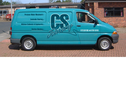
Posted by Tim Shaw on August 22, 2002 at 2:11 pmSweated blood on this one !!!!.
There is’nt a right lot you can do with two dull letters like CS.
Anyway what do you think?
Attachments:
 Tim Shaw replied 21 years, 11 months ago 10 Members · 14 Replies
 -
14 Replies
-

Power Vans can be a real pig to do sometimes because of the exceptionally deep panel pressings but Tim, this looks really smart mate, bit of a close-up on the CS and what colours did you use please mate.
-
very good job mate, cs joinery bit is excellent.
how long did it take you to apply it ??
david
-
What a truly beautiful piece of signwork.
The bold, almost defiant ‘CS’ combined with the graceful highlights within. The freehand ‘Joinery’ is delightful and the ‘whip’ in the pin line adds movement and flair.
You do create some truly classic signwork…
my best regards
mikethesign
P.S. – I’d like to ask…did you create the ‘whip’ freehand with tape or cut it as a pre-set piece?
-
We hav’nt chosen the colours yet this drawing is only for the cutomer to approve.
Hope he likes, if not I will send it to anyone who wants it!!!!
-
We hav’nt chosen the colours yet this drawing is only for the cutomer to approve.
Hope he likes, if not I will send it to anyone who wants it!!!!
-

lovely job, its nice to see some imagination, art & time put to good use
keep up the good design work tim, regards eddie -
Tim,and you told me you struggle with the design side.I particularly like the use(not use )of colour / tones. I must pop in for that cup of tea sometime
-

Another cracking design Tim, you’ve answered your own question though. You can do quite a lot with two boring letters.
I look forward to seeing the finished job, have you thought about how you will tackle the mouldings ?
As Steve says they are really deep on these vans. -

another first class job tim… brilliant mate 😀
cunstructive critisism:
im with gray on this one mate…
i dont think the colour used does the word joinery any justice,
what about making it white with light grey and pale blue highlights . sort of creating an ice look, if thats the best way to discribe it… just a thought.im a great beleaver in squinting my eyes almost closed and seeing what stands out for me… in this case i can only see the CS when i would reckon joinery would be the most important… 🙄
-
f the job get the go ahead I will take a closer look at the colours.
As for the joinery standing out more than the CS, I always try to make the text you have to look up in the phone book i.e CS , should be the stronger element.
They are deep swages on these vans, but I started with the CS text ,making sure this text would ‘roll’ into the swages from one direction without having to apply to much heat, if any at all.
Staying away from the corners of a deep swage makes life easier. I never try to put vinyls into tight, deep corners, to much like hardwork. We don’t like things popping out.
The other side of the van is identical, the only difference is the text in the left/rear panel is justified to the left and not to the right as this picture shows
-
quote :As for the joinery standing out more than the CS, I always try to make the text you have to look up in the phone book i.e CS , should be the stronger element.
sorry mate but when CS passes me in the street it means nothing to me.
if a van passes me with joiners on the side., & i need a joinery.. ill take a second look & see who they are and what the number is…as for looking them up in yellow pages.. what would CS come under?
the first thing you would do is go to joiners, then look for the company in question.not trying to be funny mate, just dont think making the initials the most dominant part of the van necessary.. .:D
-
That a fair point Rob, but the joinery lettering is close to 15″ tall, even on the picture I have posted, it is pretty clear the van belong to CS Joinery.
If the jobs get the nod then maybe I will lighten the colour of the joinery lettering, but it was layed-out to suit the size and shape of the van, missing door gaps and sliding door runner etc .
Log in to reply.