Activity Feed › Forums › Sign Making Discussions › Gallery › vehicle graphics: bvb stewen
-
vehicle graphics: bvb stewen
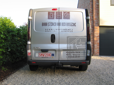
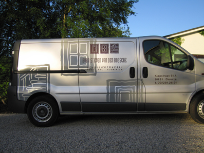
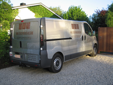
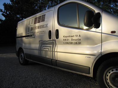
Posted by Bart Van Wassenhove on May 9, 2005 at 9:54 pmnext two pics….
Attachments:
 Bart Van Wassenhove replied 18 years, 11 months ago 7 Members · 15 Replies
 -
15 Replies
-

Nice work signboy,
very effective.You say its an Opel, but it could be a Vauxhall, Renault, or Nissan.
Looks French to me, dont know how they all got involved.Sorry for the sidetrack.
Peter -

Thx, Peter. Opel is the European name for Vauxhall… soooorry 😕
-

hi signboy, design looks very effective mate. nice one… 😉
you have split your post into two to load the 4 pictures. can i suggest, once posted firt two, just reply to that post with the next and so on. this keeps all the pictures together under one thread.
ill delete the other one before more reply to it. sorry about that…
thanks for taking the time to post your work mate, look forward to seeing more 😉
-

Nice Work Signboy
Looks cool with an interesting design layout
Thanks for sharing
John
-
No apologies necasary they still sell it in the uk under three names and in france its a renault, D its an opel, Badge marketing I think its called
Peter -
thx for the info Rob. Here they are….
Attachments:
-
no problem mate, thanks for that….
the shadow effect using the grey looks really nice, carrie & steve did similar with glass etch vinyl on a van to create similar effect. looked really smart too…
-

i like it signboy!! 😛
looks a nice & tidy design…i too like the metalic shadow effect, did you design this yourself? 😛
Nik
-
thx nicnaxpc! The logo (or u call it ‘brand’) was designed by a graphic designer. But i did the design of the van. Love it when it’s not overcrowded on the side of a van…
-

like the way you’ve treated the van as a page…..nice job….
your words look better then ours when force justified…..
and your .’s and /’s
Cheers
Andrew 😀
Attachments:

-
force justified! never noticed but agree with andrew. some text looks crap like this but this works well i think.
-
constructive crit: just my thoughts but i think the section at the top on rear doors ALL needs scaled down a bit. maybe 85%. all seems a bit tight to recesses etc and ample space between text.
nice work though mate 😉
-
thx u all for the reactions!
Rob, about the scaling down. I tried it but the text “hout – pvc -aluminium” (“hout” means wood in flemish) then becomes too small to read easily. Good critics though. I like it when i can learn from pro’s!😎
Log in to reply.
