Activity Feed › Forums › Sign Making Discussions › Gallery › vehicle graphics: bpe
-
vehicle graphics: bpe
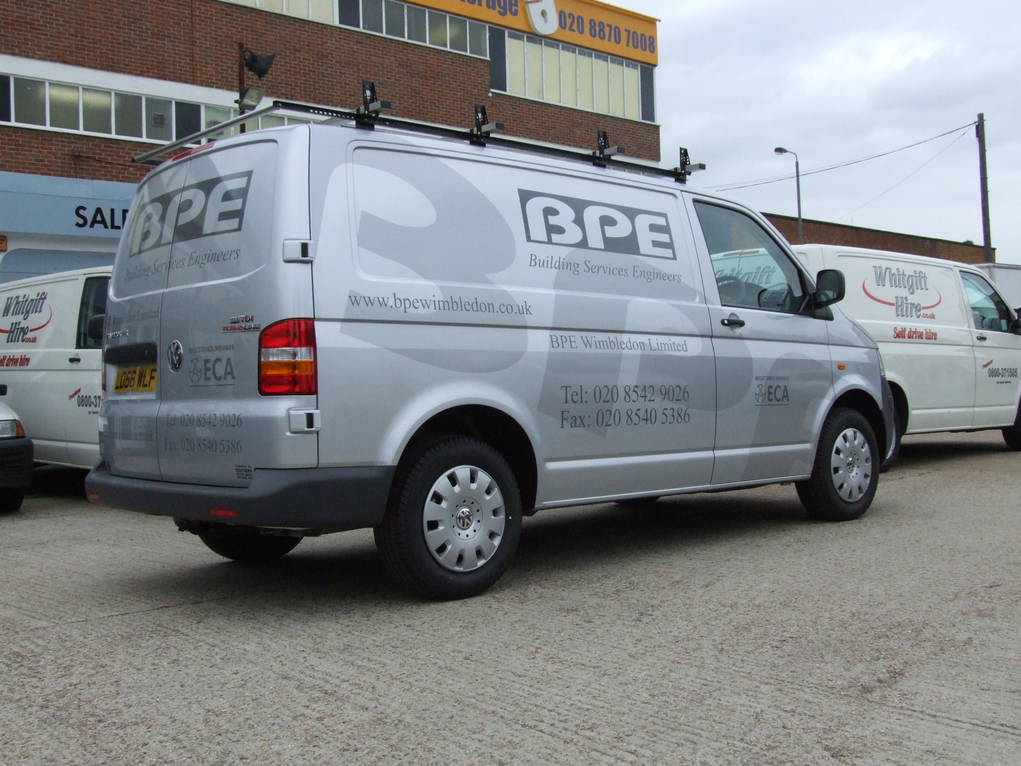
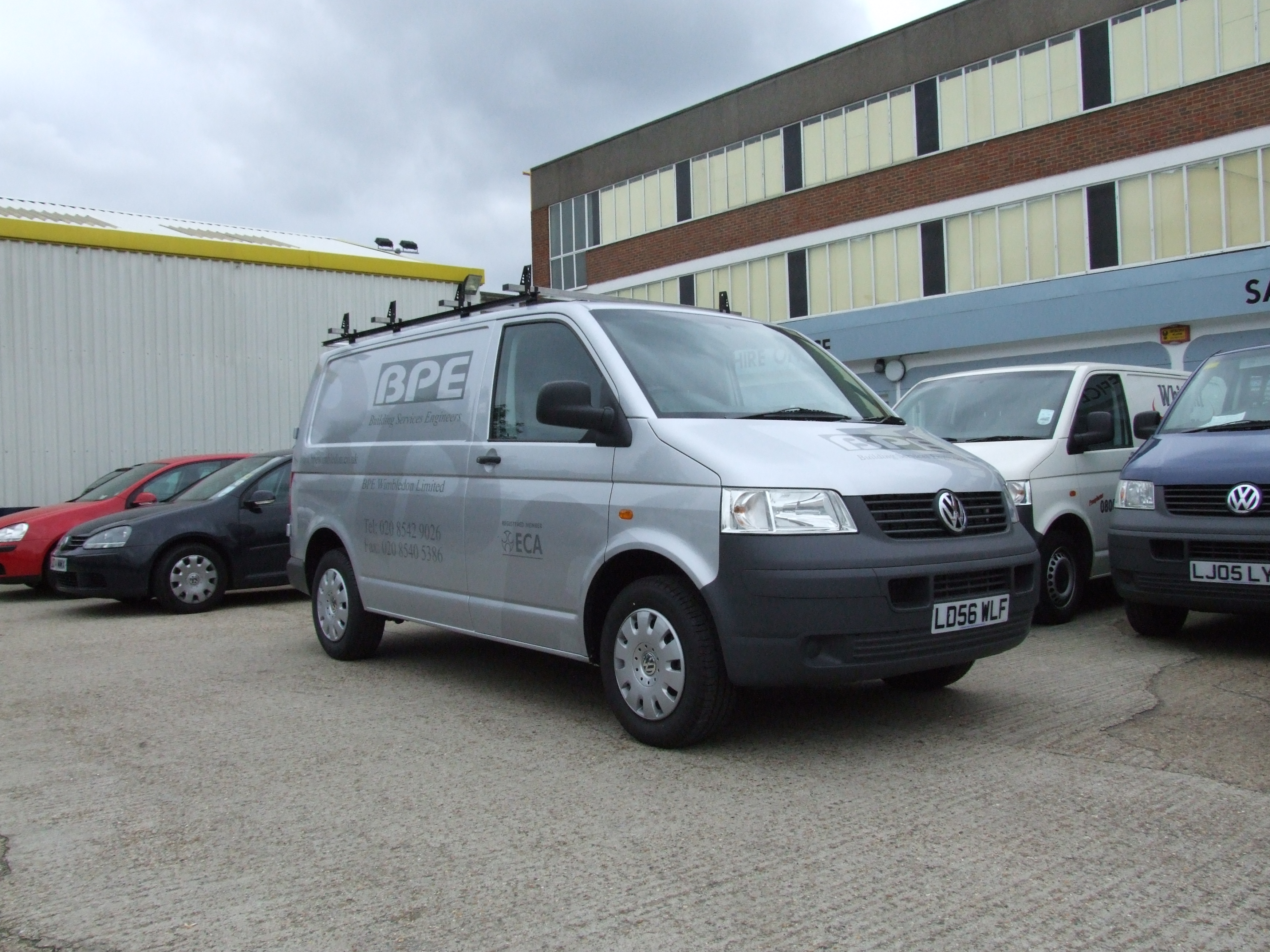
Posted by Cheryl Smith on October 3, 2006 at 10:20 amthis is one I did yesterday. Kpmf beautiful cast series, was a joy to work with, moulded into the corners wonderfully. Customer wanted something subtle, so did silver on silver. 😀
Attachments:
 Cheryl Smith replied 17 years, 7 months ago 9 Members · 11 Replies
 -
11 Replies
-

Cheryl, that looks gorgeous.
Great design, well executed.
You have every reason to be proud of that one.Got lots of piccys in the folio ?
-

Thank you very much. Have only just joined, have got loads of work under my belt, will get some more on soon. There are more on my website
Cheryl -

that looks really good Cheryl.
i like using silver vinyl on silver vans, we used to have it on our van.neill
-
thank you, It looks really lovely when you walk round it, it sort of disappears and reappears!
-

Thats very smart.. look forward to seeing other stuff..
That looks like the dog track there?? i used to live round the corner near the hospital
Simon -

Looks good Cheryl,
I find with silver, it sometimes looks like its white in certain lighting.I have use it on white vans and it gives the now you see it now you dont, effect,
Peter
-

nice job done cheryl 😀
constructive crits:
tel. no’s on back door a bit too spaced out, font choice times not one i would have chosen for a van, hard to read (but it obviously was customers choice eh) tel. no’s on side a bit stretched and shouldnt be taller than height of the engineers line 😀nik
-
no accounting for taste…..but that is what the customer wanted, and thats his font.
Cx
Log in to reply.
