Activity Feed › Forums › Sign Making Discussions › Gallery › vehicle graphics: Bang & Olufsen
-
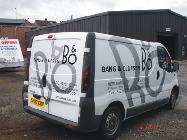
vehicle graphics: Bang & Olufsen
Posted by Marcella Ross on April 5, 2006 at 1:32 pmHere’s this mornings job. This job has been on the go since October!!!! But eventually got it lettered this morning after all sorts of messing about trying to get the van off them.
Customer seems happy enough….. thank god!Now I can send out the invoice 😀
Attachments:
 Ben Hansen replied 18 years ago 13 Members · 18 Replies
 -
18 Replies
-

Great work as always Marcella … clean, modern, catches the eye!! 😀
-

looks good Marcella…..october!!!!! did you mention the price increase in vinyl since october and then add to invoice :lol1:
-

nice job done marcella 😀
did you apply the grey all in one bit? just me beng nosey 😕
nik
-

Hi Nik, the grey section on the back doors was one piece but the sides were in two pieces, overall they were about 2.5 x 1.5m so they had to be tiled when cut.
I’d have preferred a slightly paler grey for the background logos, but customer wanted metallic silver so i used a matt finish metallic silver as it tends not to look as dark in certain lights.I did the easy bit of designing and cutting… John did this bit this morning 😀
-

oooohh.. I like that! Not as easy as it looks I bet.
What is the date stanp on the photo tho 5.12.12? My calendar must be slow. I’m still 5.04.06 😕 😛
-
quote Shane Drew:oooohh.. I like that! Not as easy as it looks I bet.
What is the date stanp on the photo tho 5.12.12? My calendar must be slow. I’m still 5.04.06 😕 😛
Shane, it’s the 5th 12.12pm …. 😀
-
quote Marcella:quote Shane Drew:oooohh.. I like that! Not as easy as it looks I bet.
What is the date stanp on the photo tho 5.12.12? My calendar must be slow. I’m still 5.04.06 😕 😛
Shane, it’s the 5th 12.12pm …. 😀
:doh: oh… er… I knew that of course.
Its 2am here, so I guess that is a good sign that I need some sleep.
See ya in the morning.
-

Nice job.

They are quite accurate with their stuff B&O
I have bin working with them quite a lot my self! -

Great work Marcella, like it alot.
Perhaps you could get some good discount on some equipment from them for doing such a good job, worth a try!! (-music)
Neil
-

Nice work Marcella – However, the main message that comes across to me is B.O not B&O – was the driver a particularly smelly individual 😕
-
:lol1: you might be right Phill! The B&O logo is exactly as it should be … not allowed to deviate from it in any way. But i know what you mean! 😀
-
I wasn’t blaming you Marcella – simply commenting on how it comes across to me at first glance. I wonder if B&O have realised their logo can be misinterpreted this way 😉
-

what you said about the silver and a lighter shade of grey was the same thoughts i had on it. that aside, i like the overall look, it has a very bouncy feel to it., and its sure to be an easy one to remember, which is normally the object vehicle graphics, other than with corporate brandings and the like.
thanks for taking the time to show us your work marcella. 😀
-

oh that is nice Marcella!
great job
we don’t seem to get that kind of ‘style’ over here and I wish we did
I really like it.
Log in to reply.
