-
Vehicle graphics: andy geary awnings
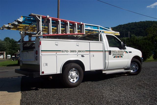
This is my cousin’s truck.. He’s the awning guy..
Looks better than the pics. Redwood Mettallic and Deep Green vinyl.
Attachments:

Log in to reply.

This is my cousin’s truck.. He’s the awning guy..
Looks better than the pics. Redwood Mettallic and Deep Green vinyl.
Attachments:
Log in to reply.
Please confirm you want to block this member.
You will no longer be able to:
Please note: This action will also remove this member from your connections and send a report to the site admin. Please allow a few minutes for this process to complete.