Activity Feed › Forums › Sign Making Discussions › Gallery › Vehicle graphics & Signs: recent work
-
Vehicle graphics & Signs: recent work
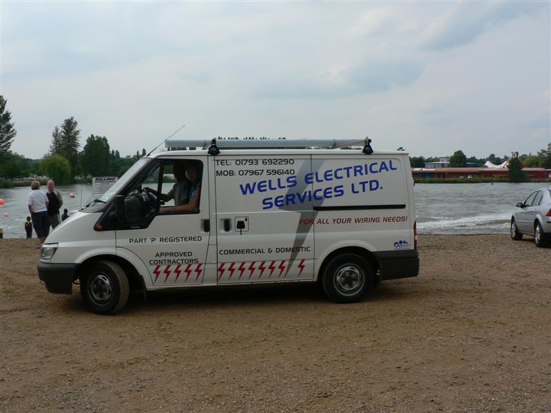
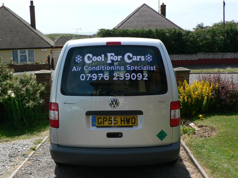
Posted by Matt Hards on July 4, 2006 at 6:53 pmsome recent works, let us know what you think.
Thanks
Matt
Attachments:


 Jill Marie Welsh replied 17 years, 10 months ago 5 Members · 5 Replies
 -
5 Replies
-

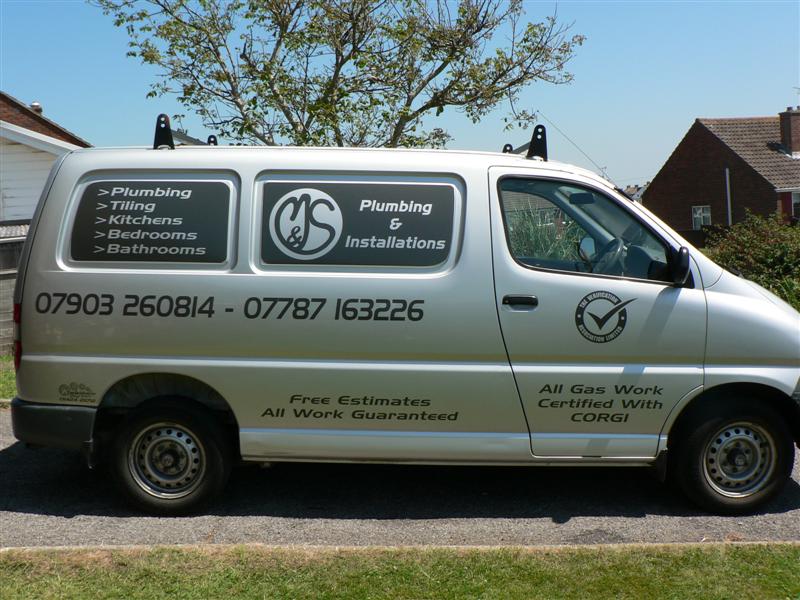
nice work matt only one crit on your M & S van I would have had the phone no’s central to the panels ( did you think about contacting Marks & Sparks I here they are re-branding 😕 ) I like the cool for cars strap line is that your idea ??
Lynn
-

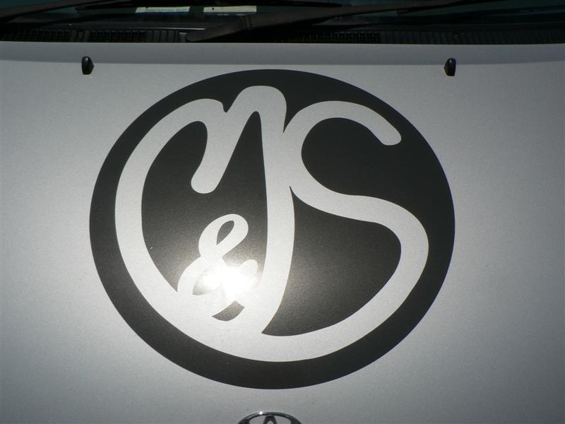
Well i did the logo, but it was the company name already, the guy gave me the drawing of the logo he wanted, (very rough pencil drawing) and I just redrew it. Thanks for your comments, crit taken into consideration for next time. 🙂
PS, the cool for cars was also the existing logo and customers choice.
-

good to see you posting Matt
looks like things are going well
on the m & s van how did you cut the panels out ?
did you do them on the van or make a template first? -

Nice work.
Funny how that 70s font AERO (on 2 different vans)
seems to be enjoying a revival in the UK!
You seem to have a nice neat touch.
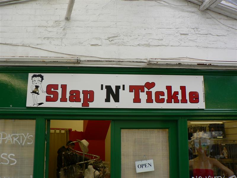
However, On the Betty Boop sign I would have liked to see tighter kerning and more negative space.
And maybe a cool 1920’s font.
Like Bell Boy from Letterhead fonts, available for free download here:
http://www.letterheadfonts.com/downloads/index.shtml
Love….Jill
Log in to reply.
