Activity Feed › Forums › Software Discussions › General Software Topics › Vehicle Graphics Alignment
-
Vehicle Graphics Alignment
Posted by Johnny Alston on February 7, 2011 at 8:21 pmWhat do you find the best way to align graphics on a vehicle?
Panel markings or spirit level or a combination of both depending on curves/ lines in the panels.
cheers
Nicola McIntosh replied 13 years, 2 months ago 15 Members · 21 Replies -
21 Replies
-

This is a question that is often asked,
but there is no hard and fast rule, it depends on the design, and the vehicle.
in general terms all text needs to be aligned horizontally throughout, normally to what is "level" but if a vehicle has a prominent horizontal bodyline, it may be better to align to this.
It is quite often the case to stand back, see if it looks right, and if it does, stick it down before you think about it!
A transit for example is easy because it has more or less square lines, but a sprinter, or vw transporter on the other hand, dont have a parallel line anywhere,
if you allign to one datum then always slant towards the front of the vehicle, level does not always look right, but slanting to to the rear will always look wrong.I can post examples if you are not sure what i am talking about
Peter
-

I would steer clear of a spirit level as you will find it very difficult to use! Rob suggests a leveling tool in his toolbox tutorial. Have tried it but sounds like a good job.
Go with Peter – Tape it up and stand back before sticking. If it looks good to the eye you will generally never have much bother.
-

Agree with Peter here. A lot of new models have nohorizontal bodyline to work to. In this instance you just have to stand back and if it looks right go for it. I tend to look from 2 angles to make sure but that is just me. It is important though that you trim parallel to the detail or it is a nightmare to do it by eye.
My favourite is a Transit every time for ease of lining up
Cheer
Gary
-

The easiest way to tell if it’s right, is the fact it’s really obvious when it’s wrong. That said, there’s a lot of vans driving about where the wrong line has been used as a start point, or letters are at different angles all over it.
Some of the newer vans seem to be designed to make our job harder, often running body lines through the writing areas, what looks right is ultimately what matters.
-

My old man had a definitive rule for this & any other sign related issues.
If it looks right. It is right.
Stick with that & you won’t go wrong.
G.
-

about 2 vehicles in ten will break the general rule and that is, for me, go with the sill along the bottom of the doors.
if this looks wrong, and it can sometimes do. try going with a horizontal running recess on the mid section of the vehicle. be careful though as most begin to run down towards the front.
whatever one you choose, if the vehicle is proving difficult to get a level you are happy with.
find the section of the vehicle you want to align too.
mark up from there to around midway on the vehicle.
now run a length of masking tape right along the vehicle and stand back.
if its running down, just alter till suits.
then use that as your bench mark and measure all your graphics positions from there.alternatively, you could try a digital angle finder. see JAG’s site for info.
angle finders are not just for a level, but can be used for various things to keep graphics and the like aligned. not just on vehicles of course..
-

A useful tip when dealing with awkward slanted vans (e.g Astra or Mercedes) is to lower the tyre pressures at the back, and pump the tyres up at the front to make the van look less slanted.
Well I’ve never had any complaints :worry:
-
Dont know what the customer would think of that one Phil but I must give it a go the next time I have something running off! 😉
-

I have to agree with the majority of you. stand back and if it suits the shape of the vehicle stick it down.
What am thinking of getting is a laser on a stand. you know the ones that give you a straight line. more for speed an alignment. has anyone tried this?
Martin
-
 quote Martin Gray:I have to agree with the majority of you. stand back and if it suits the shape of the vehicle stick it down.
What am thinking of getting is a laser on a stand. you know the ones that give you a straight line. more for speed an alignment. has anyone tried this?
Martin
Suspect it would only really work on white vans…indoors.
I’m in the ‘stand back & look’ camp.
There’s rarely a (new / small / curvy) van that allows you just to follow panels these days and for it to look OK.
Worth bearing in mind how it will looks once the back of the van is loaded up too.
Dave
-
quote DavidRogers:Worth bearing in mind how it will looks once the back of the van is loaded up too.
:lol1: :lol1: surely that is of no concern for the sign maker dave?
its a bit like saying, we should also compensate for the graphics incase the guy parks on a hill. or as phill says, has a soft tyre. :lol1: -
 quote Phill Fenton:A useful tip when dealing with awkward slanted vans (e.g Astra or Mercedes) is to lower the tyre pressures at the back, and pump the tyres up at the front to make the van look less slanted.
Well I’ve never had any complaints :worry:
Its more professional to cut the suspension springs and also increases sport performance.
-
Without this sounding too offensive, to me a good 20% of vans written the writer has used the wrong lines and subsequently achieved a bad balance.
As a signwriter, a lot of training is put into layouts, and which bodyline or angle to do lettering as a mistake in paint is far more of a problem than peeling a few letters off. It would be interesting to see what percentage of vans others believe are simply wrong.
-

When I was working with John Childs he purchased a laser level set up. The guys used it once I think. When you have some experience, you don’t really needs those tools. As has been said, looking at it from a couple of different angles usually helps. Certainly the guys have fitted enough vehicles to almost know by instinct where to place stuff. Big element of course is the design. That’s where I find the outline discs invaluable as you can get a really good insight on how the design will look when fitted. Not always true, but usually they are a big help.
Like anything, Practice makes Perfect.
Peter
-

We tend to do all our van layouts nowadays on photos of the van and only use the layout drawings for saving the file when the jobs done (to keep the file sizes down). If you check on the screen first you can get quit a good ideal of what looks level before even going out the door.
I’m usually with the base of the van brigade as when you look at the van from a distance most of the bodylines disappear.
And tell the customer you can’t guarantee the look of the work if he parks on a hill. -

Same here as said Mark 1 Eyeball and on level ground is the easiest way.
-

An imported vehicle outline imports straight. Text also types in straight. If that works on screen all you need is to take dimensions off the layout.
Personally, if its looks right, it is right. make sure the other side is pinned up first before fitting as it may look completely different depending on the design/font etc..
Matty
-
I had a new Toyota truck to write recently, (and I’d not seen one already written) I took a good long look at all the body line to be sure I’d got it right, it really does have quite a complex set of body lines. I took the time, (truthfully about half hour as I’ve been doing this a while) to figure how it should be done. The same format will work on any subsequent trucks, so it’s worth the effort.
About a week after this, I saw another one that had been written, they’d measured from the floor, ignored every line and it looked rubbish, but the customer was probably none the wiser. When this happen, and it happens a lot, it really doesn’t seem to matter anymore.
I know wraps are stunning, and some of the effects that are possible now are amazing, but layouts were significantly better 50yrs ago. Technology has moved boundries, craftmanship has plumeted.
This is in no way meant specific to any-ones work, but Google some old fashioned sign work before you tell me I’m wrong.
-
quote Bob Clarkson:I had a new Toyota truck to write recently, (and I’d not seen one already written) I took a good long look at all the body line to be sure I’d got it right, it really does have quite a complex set of body lines. I took the time, (truthfully about half hour as I’ve been doing this a while) to figure how it should be done. The same format will work on any subsequent trucks, so it’s worth the effort.
About a week after this, I saw another one that had been written, they’d measured from the floor, ignored every line and it looked rubbish, but the customer was probably none the wiser. When this happen, and it happens a lot, it really doesn’t seem to matter anymore.
I know wraps are stunning, and some of the effects that are possible now are amazing, but layouts were significantly better 50yrs ago. Technology has moved boundries, craftmanship has plumeted.
This is in no way meant specific to any-ones work, but Google some old fashioned sign work before you tell me I’m wrong.
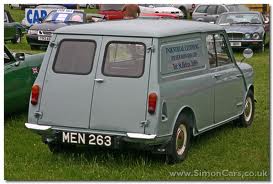
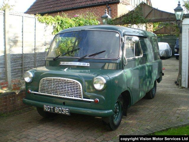
Bob mate, fifty years ago, most vans were square, or very nearly, so tradition signguys just flicked a line, we are talking alignment here, not layout, which is entirely different.
In the 60s the transit had just appeared, but even things like morris, bedford and austin vans, although they had "rounded edges" still had parallel panels
I was there and despite the phrase " if your remember the 60’s you weren’t there, I do😀
Peter
-

everyone has their own way of doing things, none are right and none are wrong, but I go by what rob suggests, always have done, but that’s with years of experience behind me, and that’s what I’m going to advise also practice makes perfect johnny keep at it you will get there and good luck 😉

Log in to reply.
