Activity Feed › Forums › Sign Making Discussions › Gallery › Vehicle graphics: aj gibson
-
Vehicle graphics: aj gibson
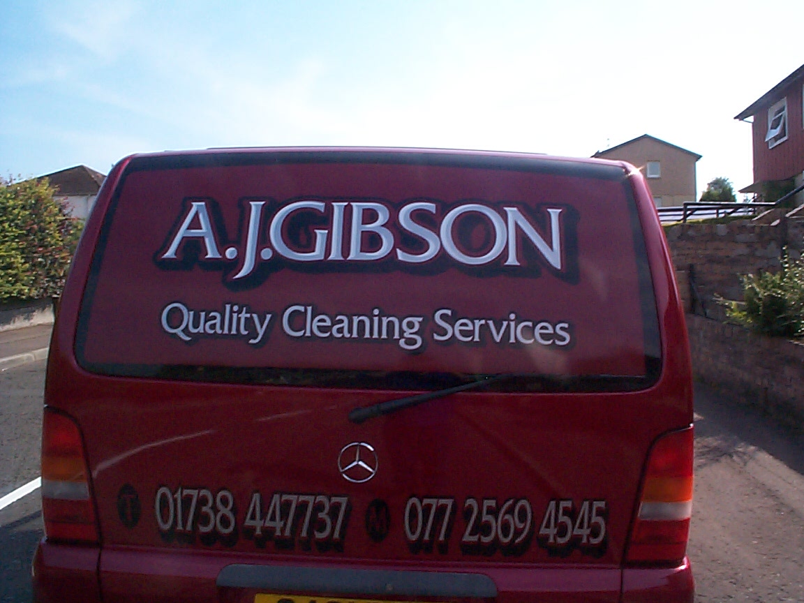
Posted by Brian Little on July 24, 2006 at 4:40 pmhi folks not posted for ages ….so heres some work
silver lettering with light grey highlight
Attachments:
 Brian Little replied 17 years, 9 months ago 9 Members · 17 Replies
 -
17 Replies
-

Nice one
thought the image was warped but was reflections messing with me head.I see you!
-

Nice.. how did u manage the shading in the text. Or did the cut.. come as part of the font.. Is so what font is that id like to have a go.
-

the style is" Frizq" one of my faves the shading is totally seperate its all vinyl .All you do …or should i say what i do is make three copys of the word your doing .Make one white and place it over another one (coloured one 0 but move it slightely to the right …then welled it so that your left with the shading .Then move it in place over the original word .Actually if you check the boards youll see that stevo has done a demo and problly explaines it a lot better 😀 😀
-

dont think i would of put the black drop shadow on, as its a dark van, not realy easy to see. would of made it cheaper for the customer to
-
hmm i disagree….i think the two go well together .As for cheapness for the customer this guy had everything but the shirt off my back ….he got a good deal ok 😀 😀
Regards Brian
-

Brian
It looks absolutely great !
Regards,
Cheryl :thumbup2: -
 quote Brian Little:hmm i disagree….i think the two go well together
Just spotted this, nice job Brian.
I agree I like the shadow, dark shadows on dark colours often work well.
When are the weather reports starting up again Brian, it’s a tad hot down here at the moment 😎 😎
-
thanks martin 😀 ….yeh everybodys allowed there point of veiw thats what makes this such a great site …..in my defence the vans a really light mettalic red quite unique really for a van and in the "real world" as apposed to the "camera world" it looked really well ……as for the weather …and i know mods it a bit in the wrong forum …and im sorry but martin did ask ….i was woken up this morning by the most fantastic electical storm i had ever seen (and that includes brisbane ….sorry shane mate 😀 😀 )…its been so hot here as i suspect the rest of "blghty"in the last month the best weather i can remmember for a long time 😀 😀
-
Again nice van shadow and dark text works well.
Any photos of the lightning?
-
no micheal….but it was something to see ….i was still half sleeping at the time 😀
-
thanks Phill ….its mabe not a true "chisel font" as we were talking about in the other forum ….but mabe …just mabe get away with it and all on 4.95
-

Lovely, Brian.
I wouldn’t change a thing.
love….Jill
Log in to reply.
