Activity Feed › Forums › Sign Making Discussions › Gallery › vehicle graphics: aircon conservatories
-
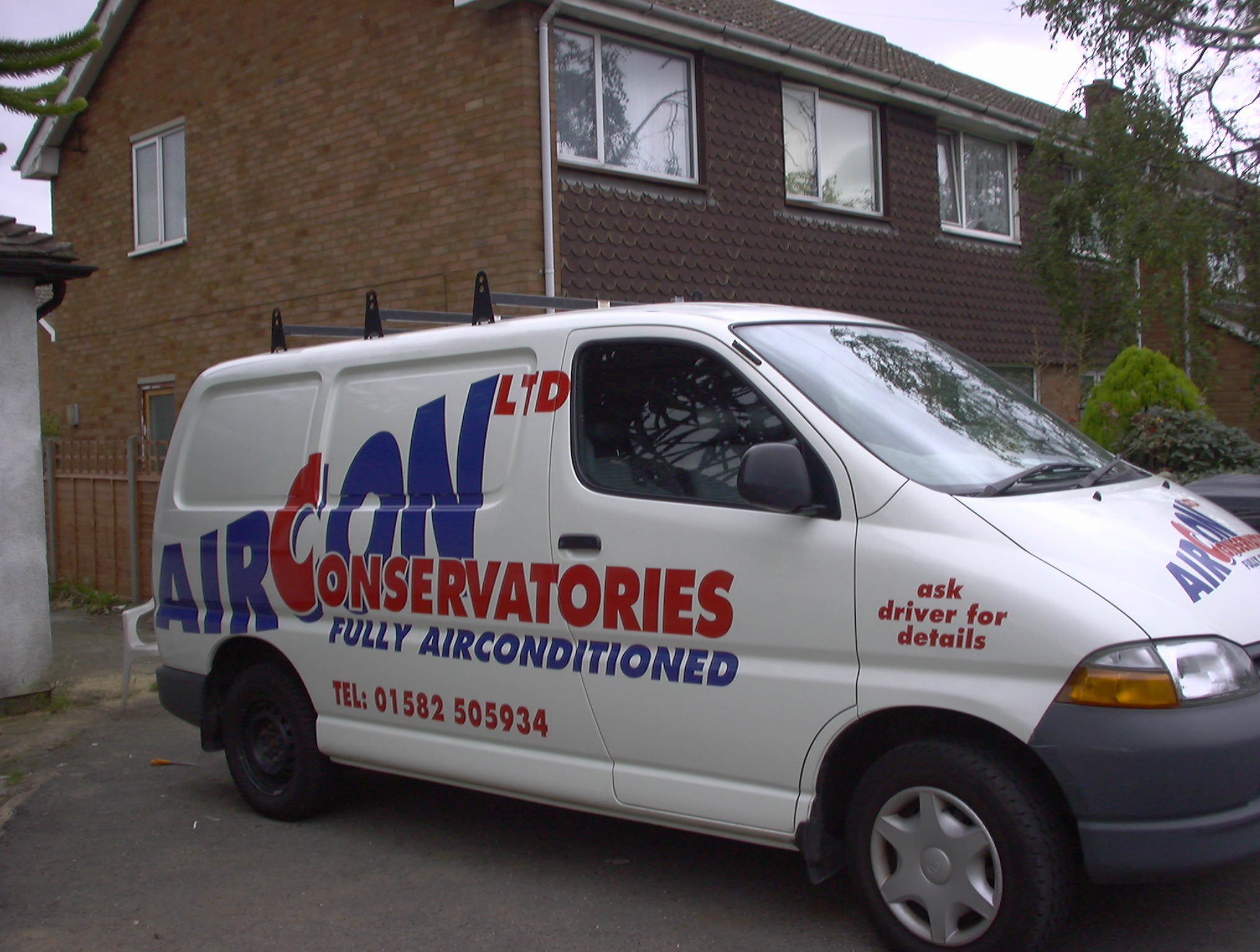
vehicle graphics: aircon conservatories
Posted by Peter Normington on November 21, 2005 at 11:48 pmAwkward sign on awkward van.
Attachments:
 Hugh Potter replied 18 years, 7 months ago 9 Members · 14 Replies
 -
14 Replies
-

now i like that!!
nice!!
thats a pic to save to my inspiration folder
😀 -

I like this too peter. Used cast material? Bit of a nightmare to lay I bet
-

Did you design the logo too Peter? I particularly like the way the ‘Aircon’ moves up the van.
-

I like that too, good simple use of colours and lots of movement. Its nice to see effective designs using just vinyl 😀
-
Just looking at it again Peter, how did you fit the logo on the other side?
-

Thanks for the comments all,
Shane
Dont have a photo of the other side, just the layout, It was done in macfleet dry of course, heated round the receses.
The design was a modified version of a letterhead that was supplied
Peter
Attachments:

-
Now that’s even nicer!
It’s a b*mmer how one side always works better than the other 👿
-

I guess I’ll have to be the bad apple because I don’t care for it.
It IS awkward looking.
The letters are overly stretched and distorted,
and while I do like the color choices, the placement on the van, especially the pictured side, looks squashed.
I know the customer provided the letterhead, so you were pretty much stuck with it.
I’d have brought the phone number closer to “airconditioned” (here two words) and moved the “Ltd” down and made it smaller.
In fact, I would have made the whole thing smaller.
Perhaps with a bit of negative space around it, it would have looked better.
Just my 2¢
Love…..Jill -
Jill,
you’re not the bad apple at all. Honesty is always the best policy.
Thanks for the crit, I did say it was awkward 😉Peter
-
hay Peter, regarding them resess, do u lay the letters over ‘as if the resess are not there’ and then heat it so resess get filled in witch i guess stretches the letter,? (if u know what i mean)…is that how its done?
cheers
-
Hi Del.
on a double corner I lay the vinyl across the gap and then gently warm it and work it in, I think Rob has done a demo on this technique.
If its a straight recess, I will usually work the vinyl in as I lay it, but you have to make sure that all the letters are done the same way otherwise you can loose a couple of inches by the time you get to the end. and the base line will be up and down.
Peter -

i think thats great looking Pete, i can see what jill means about the phone number looking a little outta the way, but then i cant really say out as i might not have put it closer either !!
good job dude !
H
Log in to reply.
