Activity Feed › Forums › Sign Making Discussions › Graphic Design Help › Van Layout Advice (MDP)
-
Van Layout Advice (MDP)
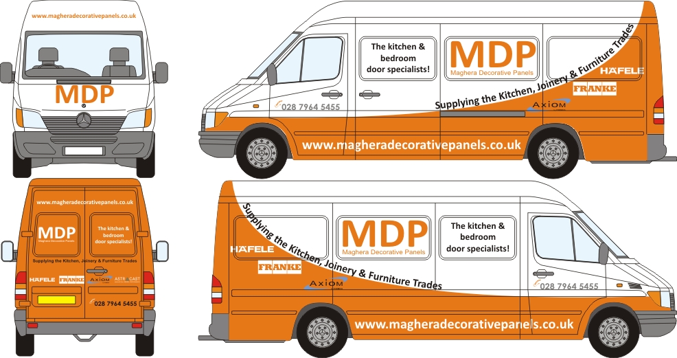
Posted by Nicholas Gormley on February 2, 2010 at 6:06 pmHi, Can anyone give me advice on this layout?? I think its missing something and cant put my finger on it. Open to all other ideas anyone can come up with to help me with this. Help would be greatly appreciated
Nicholas
Attachments:
 Matty Goodwin replied 14 years, 1 month ago 10 Members · 14 Replies
 -
14 Replies
-

I don’t know where to look first, very busy.
Nothing seems to have priority.
Text too large in places.Just my quick 2p’s worth as I have to run.
-

i personally would not use the swooshy orange bit on the layout, first time i looked at it reminded me of the TNT vans and trucks, there swoosh is the other way round mind you, but i still feel people will think you are one of the TNT vans and not give your company a second look, maybe changing the font style and colour of your business name and colour of swoosh? 😀
nik
-

There is a large home improvements company round here called ‘anglian home improvements’ they have an incredibly similar design on their new vans. That, probably wont effect you but i just wanted to mention the orange element doesn’t look that nice in the flesh, maybe it looked better on paper as well.
Does anyone on here know the vans i’m talking about, sorry couldn’t find a picture. And if you do know the vans i’m talking about, do you like them? I was just interested as they do stand out and are probably one of those love them or hate them things. Or am i just talking rubbish?
Liam
-
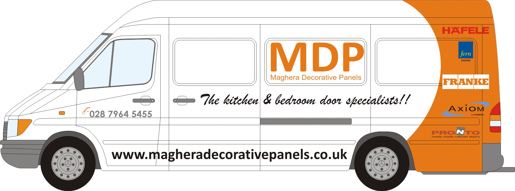
Actually, it looks very nice in this case, (one of Warren Beard’s recent) much better orange than Anglian Home Improvements!
Liam
Attachments:
-
The Anglian ones are a really pale orange. Probably their corporate colour.
-

Tim’s right. It is very busy. No focal point really.
There is far too much copy on it, some seems redundant.
One has to squint to see what they do/supply.
I would totally lose the curvy orange part.
If I am thinking door panels (which is what I think they do?) I would be more geared towards something straight and level.
I especially dislike the curving text.
Can this be a print? If so would wood grain somewhere be appropriate?
Love….Jill -

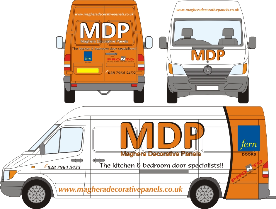
Sorry for only getting back to this now. Customer only home from holidays so wants to try and push on with this van now. He doesnt want the MDP outside of the panels because he doesnt want it going through the recesses. He wants some sort of swirl of some description. Ive seem to hit a wall on this one and cant get any further. Only colour am tied to is orange on his logo. Any help would be greatly appreciated at this time.
Nicholas
Attachments:
-
 quote Jillbeans:….Brush Script?
😮Jill’s favourite font :rofl: :rofl: :rofl:
-
quote Jillbeans:….Brush Script?
😮Oh my gowd……….You’ve set her off now! 😀 😀 😀
-
It just being used as a rough guide to what the customer wants.:P 😛 Anyone any good pointers for this layout??
-

My initial reaction is that there are too many different fonts. Maybe try different
weights in one or 2 different fonts instead.
Log in to reply.
