Activity Feed › Forums › Sign Making Discussions › Graphic Design Help › Van Layout Advice (Handyman)
-
Van Layout Advice (Handyman)
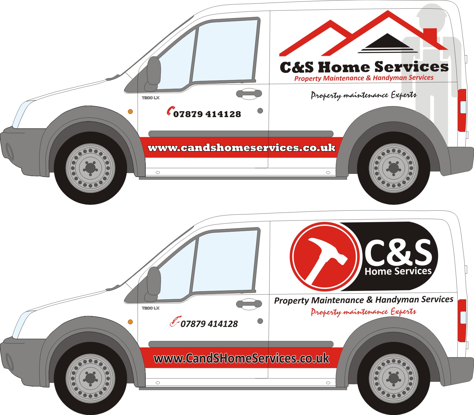
Posted by Nicholas Gormley on January 27, 2010 at 8:20 pmHi all, have to design a handyman van. All i had to go on for the design is the text that i have and rough colour’s. I have two quick ones i designed uploaded and what peoples opinions please. Any help would be brilliant.
Nicholas
Attachments:
 Liam Pattison replied 14 years, 3 months ago 8 Members · 11 Replies
 -
11 Replies
-

Hey Nicholas
I do like the lower of the two designs – but think the web address should probably be in white though just so as to stand out a little more than the black. Looking good though. 😎
JMHO – I’m no EXPERT… yet!
Ezekiel
-

Seeing the 2 designs together I think the lower one is more eye catching.
Agree with the above comment regarding the web address.
Not to sure about the cyborg in the top one
Bob
-

Like them both but probably go for the bottom one with more prominence to Home Services – C & S just keeps taking over.
Perhaps reduce the size of the side graphic as it looks squashed in top and bottom, then lengthen the black part along the panel.
Also, keep the web address all lower case and white text. People get confused and think they have to enter it as shown. -

Thanks took all that use said and made a few changes. What do use think now??
Attachments:
-

Bottom one for me too Nicholas, I’d make the phone number a bit bigger and lose the Property Maintenance Experts line. No real need for it and that script looks wrong.
-

Nicholas
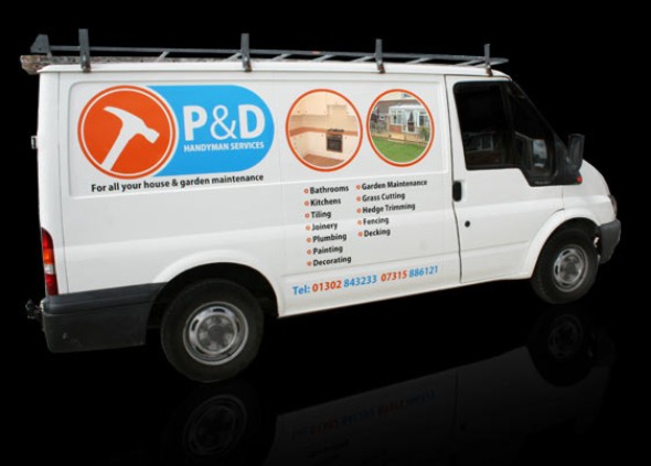
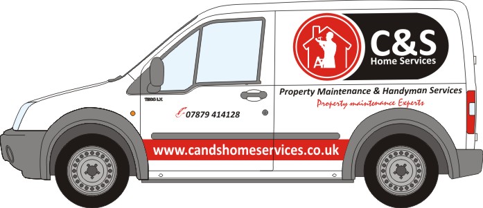
I really don’t want to come across wrong here…..we all look on the internet for inspiration and nick ideas from existing logos etc but I would have looked to at least put a different image within the circle 😉
Attachments:
-

I like the top one the bottom one looks too top heavy.
-
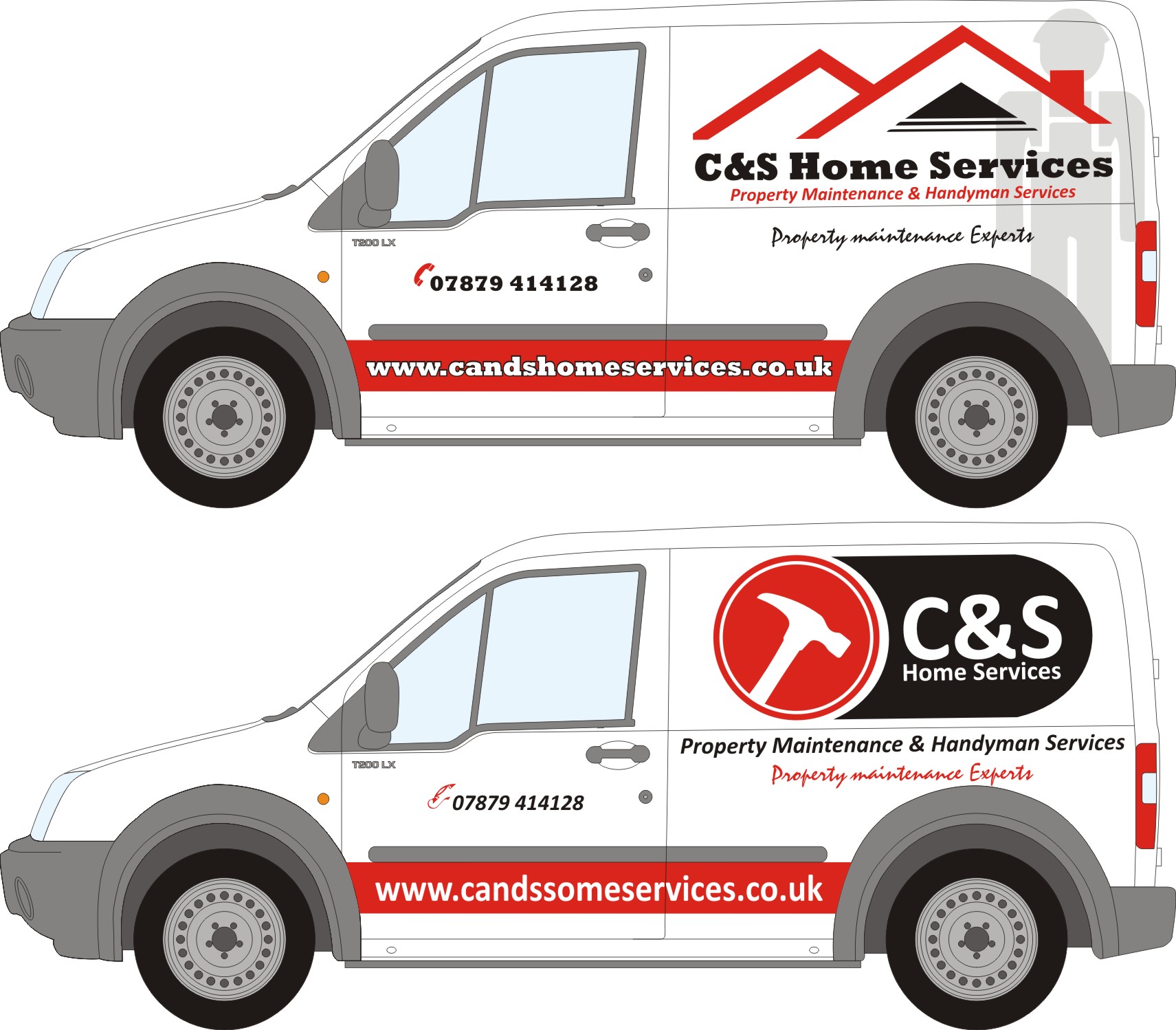
Glenn I did but the customer asked me to change the name on it so he could see what it looks like and i said to change the image but he likes it so i have another design done with it changed and am gonna try and get him 2go with it instead of copying someone else’s work.
-
Don’t forget to correct the spelling of the web address on the bottom one…
-
This is what i originally done up.
Attachments:
-
I think it would be better with just the house outline in that circle, loose the builder maybe.
Liam
Log in to reply.
