Activity Feed › Forums › Sign Making Discussions › Gallery › Van Graphics : Rampage Racing
-
Van Graphics : Rampage Racing
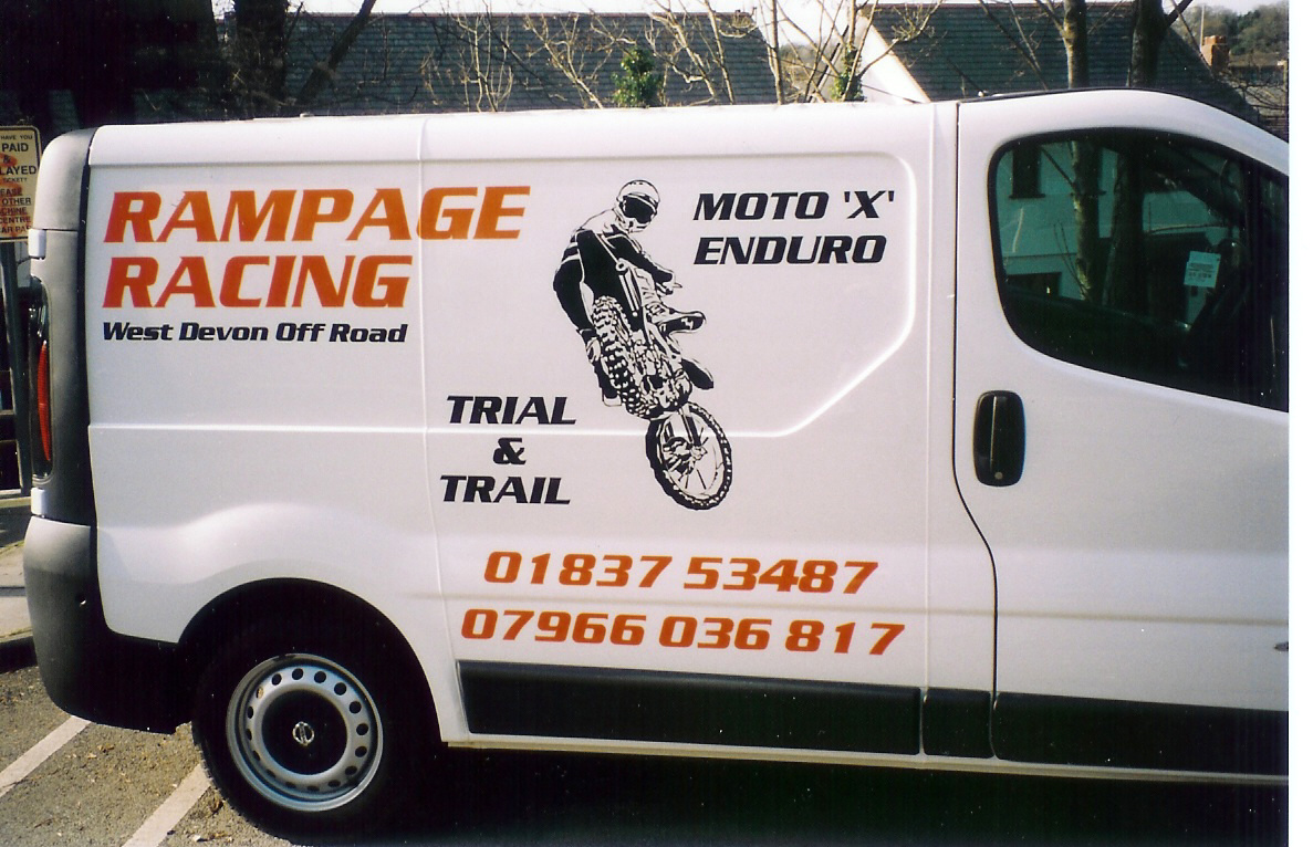
Posted by evo1v on April 9, 2004 at 9:06 pmHere’s one of my latest, pretty tame compared to some of the stuf ive seen on here, let me know your thoughts good AND bad, i like nothing better than constructive critisism.
Lawrence
Attachments:
 Steve Smith replied 20 years ago 7 Members · 7 Replies
 -
7 Replies
-

hi lawrence!!
my only comments would be, there is too much space, at the bottom left, the telephone numbers kerning is all different, on both numbers, and the line of the whole design to be all in line at the top!!
other than my cons. critisism, you have made a good job!! i was like you’reself when i first started, i loved people to comment on the jobs i had done!! only made me learn from my mistakes!! and made me determined not to repeat them!! anyway well done!! 😛
Nik
-

Nice van Lawerence 😀
I’d agree with everything Nik has said regarding con. cris. but it makes for an attractive van that advertises the owner’s business, so if the customers happy 🙂
I won’t do my trademark how long, how much statement 😉 Big G will be disappointed with me 😀
Cheers, Dewi
-

Well done Lawrence
At least you haven’t gone for the predictable layout which is just filling in the panel area.
The kerning on the phone numbers is mostly noticeable on number ones as the software sometimes has difficulties adjusting to the fact that the number one is just one stroke.
In signlab (If you have it, but if you haven’t I’m sure you can do it with other packages) you can adjust this by clicking on the text icon and it will open up two options. Click on the second one and will enable you to bring the letters or numbers closer.
John
-
HI Lawrence, i think this design is very bold and effective. I didn’t notice the kerning problem with the numbers until i read everyone elses comments and then went back! That’s one I’m going to watch out for in the future as well! Is the image the customers own or did you source it from somewhere else? nelijane
-
Thanks for all your comments, deffinatly a few things for me to think about in future jobs. I had to buy that moto cross image, cant remember the web address I got it from there was about 20 i bought in all, If anyone needs some, feel free to e-mail me I’ll send them as soon as possible. There are a few realy great images!!
Thanks again all
Lawrence
-
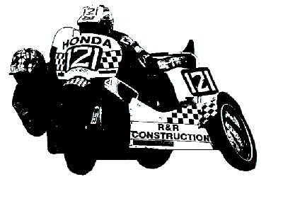
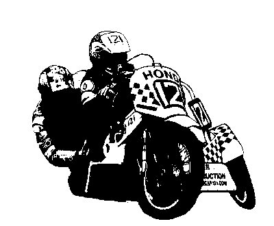
Great stuff. It’s giving me ideas on how do to my own van when I finally get round to doing it. I have prepared a couple of images of my own bike in readiness. I used the method describe by Andy Blackett ( thanks Andy 😀 ) in the tips and tricks section, to cut them out from a couple of photographs.
Attachments:
Log in to reply.
