Activity Feed › Forums › Sign Making Discussions › Gallery › Van Graphics : own van
-
Van Graphics : own van
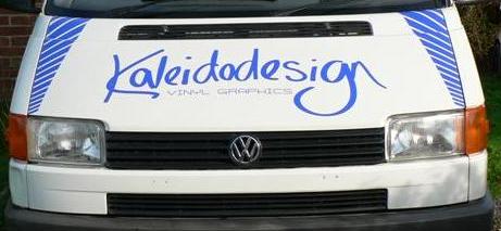
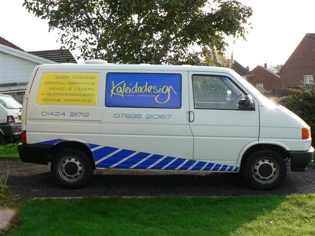
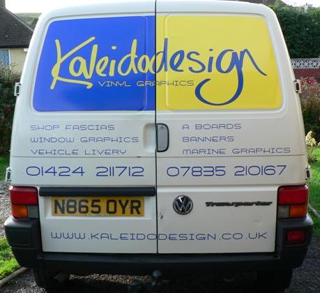
Posted by Matt Hards on October 12, 2006 at 8:24 amWell guys, heres what i opted for in the end, toned it down a fair bit to what i had planned, will also get a shot of the roof soon wo show you.
cheer
matt
Attachments:
 Karl Williams replied 17 years, 5 months ago 14 Members · 30 Replies
 -
30 Replies
-

hey matt, really nice, well thought out. nice bright colour combo. like the typeface, what is it?
Cheryl -

thanks cheryl, ,, the font is Air Conditioner, and the logo is handwritten by me.
I like bright:) -
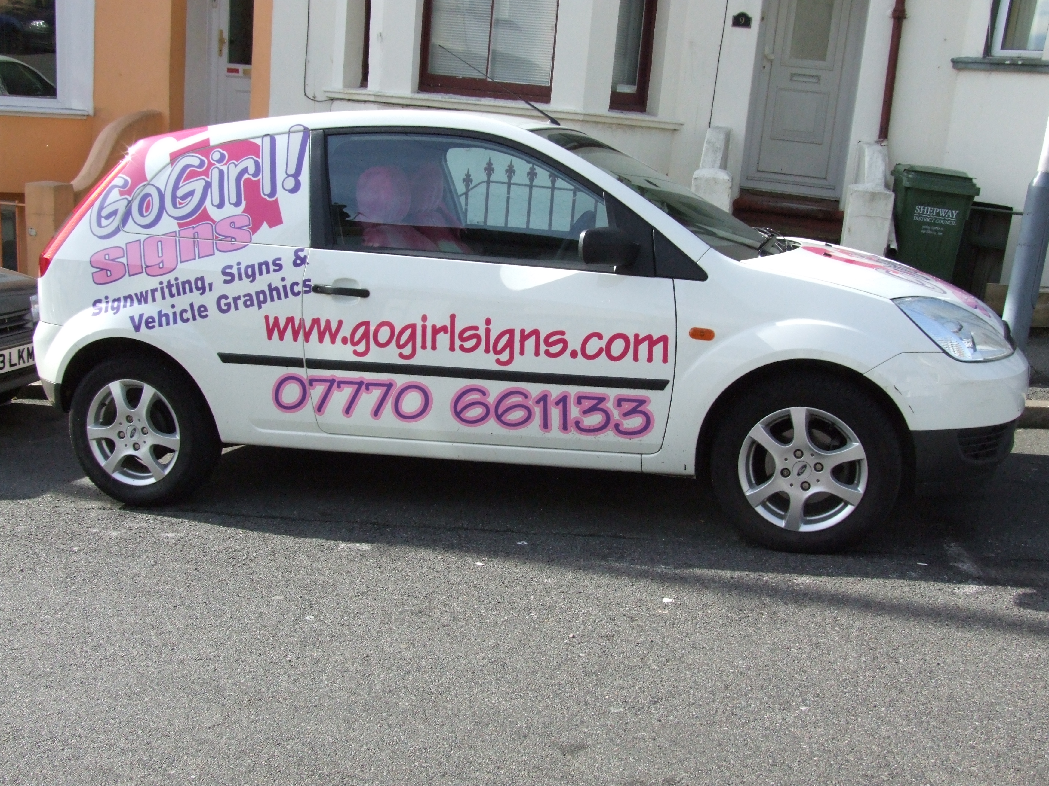
I like bright too. Heres mine, I had one morning to rustle it up and stick it on quick for a newspaper photoshoot!!
Attachments:
-
that is wicked, i love it, i wish i was a girl, nearly, lol
-

matt nice one as has been said before i can really be hard work getting your own van designed but in this case things have work well
nice work and i really like the way the rear doors lookgood stuff mate
rich 😀 😀 😀
-

Hi Matt,
Looking good. 😀 Despite comments from your previous thread, I think your handwritten font looks great. The way you’ve trimmed the coloured blocks to the shape of the panels looks really neat and tidy, just out of curiousity what method did you use?, and also what vinyl did you use.
Good stuff 😀
Ali
-

hi matt 😀
van looks good, i love the handwritten font 😀
constructive crits. i would have chosen a different front for all the smaller text as it seems to get lost on the white van hard to read, also would have made use of the handwritten font and made it bigger on the sides to give a bigger impact, the yellow panel at the end takes your eye away from the blue one 😀 but as long as your happy with it thats all that matters eh 😉nik
-
 quote Nicola Rowlands:hi matt 😀
van looks good, i love the handwritten font 😀
constructive crits. i would have chosen a different front for all the smaller text as it seems to get lost on the white van hard to read, also would have made use of the handwritten font and made it bigger on the sides to give a bigger impact, the yellow panel at the end takes your eye away from the blue one 😀 but as long as your happy with it thats all that matters eh 😉nik
the smaller looks fine to me, perhaps its your screen Nik?
nd perhaps some people have a different perception of colours, I was drawn to the blue,Anyway mat, Job well done
Peter
-
quote Peter Normington:the smaller looks fine to me, perhaps its your screen Nik?
nd perhaps some people have a different perception of colours, I was drawn to the blue,nothing wrong with my screen peter :lol1: ……squint yer eyes and look at the picture again the yellow draws you first 😕 …probably wont work now as you can visualy remember it cause youve looked at it a few times 😀
nik
-
Thanks guys, appreciate all comments, and taken into consideration.
For panels, i made templates from old vinyl backing paper. Is this a good way or bad way guys, how do you do it. This is only the second van ive cut to panels so im new to it really. You cant use template software as it doesnt give the correct shape.I have pimped the van up inside a little, as i use it for jetskiing too.
I have insulated the whole van with that polystyrene slab insulation, then ply lined, and carpeted floor and walls. in two tone, blue and anthracite. So i can sleep in it when on tour. Blue neon lights in back. Obviously kitted out with a fairly large sound system, because i cant drive without tunes. I used to have a mini, and in that i had bucket seats, sadly mini died, and bucket seats are sitting around, so im gonna bolt them in the front, and also have some multi spoke alloys lined up for it, and lowering springs to take it down 5cm.Dont want to do much on the outside other than wheels, draws the eye of thugs and thieves, plus doesnt look as professional.
But the inside will be quite nicely kitted out. -
quote Nicola Rowlands:quote Peter Normington:the smaller looks fine to me, perhaps its your screen Nik?
nd perhaps some people have a different perception of colours, I was drawn to the blue,nothing wrong with my screen peter :lol1: ……squint yer eyes and look at the picture again the yellow draws you first 😕 …probably wont work now as you can visualy remember it cause youve looked at it a few times 😀
nik
Nik public dont walk around with eyes squinted,,
it depends on your own perception/preference.
if you like custard, yellow may attract your eye.
Blue however is a rare food colour. thats why in a kitchen sticking plasters are blue, sory ranting, and hijacking yet another post, read and delete,Peter
-
quote Peter Normington:Nik public dont walk around with eyes squinted,,
i know they dont (most of the public wouldnt know a good sign right colour or not, even if they opened their eyes) ….but i do it all the time 😀 😀
nik
-

Not bad Matt, better than your original proposal. You were determind to get those chevrons in.
I would agree with Nick, and would have chosen a stronger font for for the bullets, which should also have been much tighter about 15% smaller, way to much space between them.
Not my cup of tea, but as you say if it’s catching peoples eye than it’s doing its job!
Well done!
mARTIN
-
I love your handwritten font, very artistic, and the font too as I have said before, maybe the lettering on the yellow could have been ‘fattened up’ a little bit to make it a bit more beefy so easier to spot directly thats all but I still feel uncomfortable offering any sort of uninvited critisisum to you, as you look like a natural to me. A right Passion Wagon by the sounds of it, bet youve even got comfy cush’s and a fridge in there!!
Cheryl
-
quote Cheryl Smith:I still feel uncomfortable offering any sort of uninvited critisisum
Always constructive never malicious Cheryl.
Thats what good about this site, constuctive crit is always good and shouldn’t be taken as uninvited critisimum.
Mat’s been on the boards for a while and knows the score, hence showing us his original designs, I can’t for a moment think he would take offence as to anything that has been said.
Your work is superb, so I feel people would welcome your comments on what they show,be it good or not so good.
Have a good weekend
Martin 😀
-
As Martin said, I have been on here a while, and i get good and bad comments, like most people….
I am a newbie and i like to hear what people have to say , good and bad. Im already thinking of changing that text now in that panel, because of peoples comments, I can see what they mean.Cheryl, Yes there are cushions involved lol and a fridge is on the to do list, purely for staying away type purposes. :):)
-
Yeh, this site is great, even for oldies like me!! I have been doin this for about 18 years or so…not counted up actual amount, and been doing it for the majority on my own, so to talk and share with likeminded people is all new to me, and a welcome relief!!
Plenty of room in that van for a nice big subwoofer and a hammock!! lol
-
too late for the subwoofer, thats already in there, lol, hammock, now theres an idea. I mite post sum photos of the inside so far. lol
-

Hi Matt
No criticism from me I like the fonts and the colours just wish I was years younger to do the whole surfing shag wagon type thing 😕
Cheryl – like your design very bright -seen you on the motorway before in a blue focus that was eye catching too
John
-

looks good matt, i saw it in the flesh down at the suzuki garage by sovereign harbour last week(ish), i’d have stopped and said hi if i’d not been running late,
it’s a very eye catching design, i spotted it from a mile off !
-
thanks hugh, yes i was doing a little job for a mate there.
Nice to know people are seeing it already, had a few comments now -
well i have finally got round to trying something else font wise on my van. I kept looking and looking, and i agreed with previous comments on the font. And decided to go for something else. I have done the back, and "jazzed" it up a little. As I do like a bit of colour, haha. I am going to leave the sides as they were just replacing the font for this new one.
Let me know what you think
Attachments:

-

yes Matt that is 😎 certainly more stand out than the first one nice
Lynn
-

Works much better and stands out much much more.
ps. Only one minor thing – I would’ve put the left hand edge of ‘Sign Solutions’ in a wee bit furthar as it looks a bit off balance / hanging ‘out there’ eg. one characters width less / tighten up the kerning.
Dave -
The back is alot more eyecatchin matt, Ive always liked that blue.
well done -

before you read this, remember it’s possitive criticisme,
i’d leave out the "and much more"
it doesn’t say what you do, just that you do more than what you saythe colours are to bright, the colours scream to much, don’t use contrasting colours but complementing colours: as an example: change the blue in orange and make both the yellow and orange not so bright.
you can also change the yellow in another tint blueremember that when it catches the eye it’s job is only half done it should say that you’re the pro they need
i hope i’ve made my comments as contstructive as possible
-

Hi
really like the GoGirl car looks eye catching.Can you tell me the big G that just goes over the roof do you apply that in a special way ? How to stop it creasing?
Lee
-
HI MATT,
SECOND DESIGN IS SPOT ON! COLOURS GO WELL. I ALWAYS GET SOMEONE WHO WILL CRITICISE A DESIGN. TRY IT AND TEST IT. THE RESPONSE FROM NEW CLIENTS IS SURE TO BE A GOOD ONE!CHEERS,
KARLmod-edit
Log in to reply.
