Activity Feed › Forums › Sign Making Discussions › Gallery › Van Graphics : Klear View
-
Van Graphics : Klear View
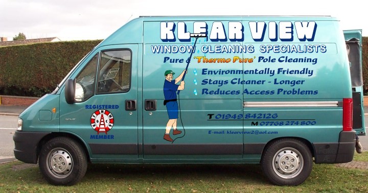
Posted by Alan on November 14, 2003 at 11:40 pmThis is “based” on the customer’s own design with the graphic digitised from a rather poor photograph, what do you think!!
Alan
Attachments:
 John Singh replied 20 years, 5 months ago 3 Members · 3 Replies
 -
3 Replies
-

Hi Alan!
Well, here’s my opinion….remember, you asked!
Not too shabby, even for “nephew art” (that’s what we call it when a customer provides the artwork)
1-I would reduce the size of the emblem on the door to keep it on the upper portion of the panel & change the copy to black.
2-“Klear View” needs to be just a bit smaller….more negative space around it. I think the shadow should be changed to black.
3-Try making a plain black rectangular panel under “Klear View” and then add the “window cleaning specialists” in white. (Maybe a Gill Sans Bold font?)This will balance out the black molding on the bottom of the van.
4-Instead of blue for the main copy color…why not use black? And remember italicised fonts are harder to read. I like the yellow-orangy colors on thermo-pure…it pops with the teal van.
5-I would put the phone #s on one line, breaking up the #s like you did with the black T and M…but I would use purple instead of blue. I would also use the same font as for the window cleaning specialists. The website could be centered beneath this.
6-The guy is fine…are you allowed to give him a red hat so he coordinates with the door emblem? I’d tell you to put him in purple clothes too, but then people would think he was like Tinky-Winkie. I would give him black shoes as well. I like the water drops.
Sorry for rattling on…I hope I don’t sound like a know-it-all. I don’t mean to…just wanted to help.
Love- JILL -

Must be a popular name “clear view”
Here’s one I’m doing
Attachments:

-

Looks fine Alan
As Jill says maybe the logo should have been a lot smaller for 2 reasons which you have no control over;
Its an absolutely awful logo (The ‘graphic artist’ should be shot)
And the colours are probably the worst to compliment the unusual vehicle finishJohn
Log in to reply.
