Activity Feed › Forums › Sign Making Discussions › Gallery › Van Graphics : Hughes Decorators
-
Van Graphics : Hughes Decorators
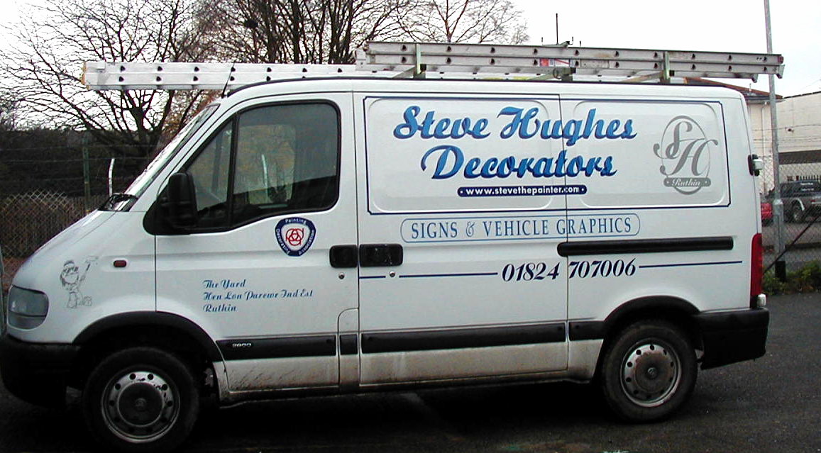
Posted by Jill on November 13, 2003 at 12:26 pmhere is the van that caused so much trouble. Many thanks to mike the sign who helped a lot with this design.
Regards
Steve
Attachments:
 Jill Marie Welsh replied 20 years, 5 months ago 11 Members · 12 Replies
 -
12 Replies
-

Sorry Jill/Steve,
I really was wishing you the best of luck with this. Unfortunately your end result is unbalanced
and lacking clarity.If you compare it against mikes proposal I’m sure you’ll see what I mean about the balance.
I fear many people are going to see this and wonder exactly what it is you do. Something which
would have been avoid by the inclusion ‘now also’ above the ‘sign and vehicle graphics’ reference.Sorry to be so negative, but thats how it looks.
-

Hi guys I can see what you where trying to do, first thing please lose that line around the main name, just get rid of it, next centre the “Signs & Graphics” with the panel not your name, it really does look bad like that, the stripe with the phone number needs to continue the length of the vehicle, like that it just looks as if it has been taken off as if the passenger door has had a re-spray, or possibly swap the position of the phone number with the signs bit, keep the shape for the signs bit but make it solid, reverse the lettering out and make it a san serif face (block), centre it on the vehicle and extend the pin line front and back, please please I’m not having a pop at you, its just that these things smacked me in the face the minute the picture loaded. It is the bloody hardest thing doing your own vehicle, trust me I’ve been re-designing mine since bloody april.
Don’t get disheartened, designing is a bloody big learning curve, like I have probably said before get yourself a copy of Mastering Layout by Mike Stevens, it really is good and get a subscription to Signcraft, when I first got a copy of it I could have cried because everything I had designed looked utter sh*te by comparison.Here you go this is the first van I ever did back in 1996 and it looks ‘kin awful. 🙂
Attachments:
-
Well done Steve
Good constructive criticism with helpful suggestions for improvement. 😉
Jill & Steve
I have a feeling that trying not to copy Mike’s example too closely, because of certain criticisms, may have hampered your layout. 😕
And that Mike Stevens book ‘Mastering Layout’ that Steve mentions is an absolute must-have, and if I ever master it I’ll let you know.
Good fun innit 😆 😆
Alan
-

Hey Stevie boy !!!!
Well done m8 !
i think that’s just what’s needed sometimes, “old hands” showing that they didn’t always do it right !
Will see if I can dig out the first van I ever did in September 2000 😀 😀 Probably no worse than i can do now !
As for Steve & Jill’s van ………… I agree with what Steve has said, but it was a bloody good attempt & as good as mike’s design was, it wansn’t Steves & he no doubt wanted his work on it — who can blame him 😕
Better stop rambling, I sound like a certain chappie up Norf 😆
Sparky
-

Steve,
Having seen this van with my naked eye I can tell you that I knew exactly what you did as soon as I saw it.
I am always on the look out for competition in my area and just driving past your Van in Corwen It caught my eye and told me that you did painting and vehicle graphics just with a glimpse.
I believe that A sign writers vehicle should look a bit special otherwise who is going to let you loose on their own spanky new van.
You probably dont lose too much work with a van looking like yours.
I think that if a van is too fancy it can be unreadable in the short time as the vehicle passes by.
Trying to find the line between easily readable and looking fancy and professional is very difficult, especially for a first year novice such as myself but I will hopfully get there before too long.
-

I agree with Paddy. If I’d seen this van in my neighbourhood I’d be thinking Oh dear…. I’ve got some serious competition. Very professional and a cut above the typical traders van you see going around.
Well done – that Van is a great advert for your business. 😀
-

Hi Steve & Lynn
I think the van is very nice. Much better improvement on the first one you posted.
Now with that in mind. Doesn’t it just go to show you our friend that posted saying if you can’t design your going no-place.. He’s obviously wrong.. I believe if you want to be better, want to learn you will…Sparky.. I have seen some of your first stuff done.. I can honestly say I have seen so much improvement ide be kissing your cheeky backside if I mentioned it. 😆 😆 😆
quote :Better stop rambling, I sound like a certain chappie up NorfRamble.. Who? Me? Never! 😉
The comments so far have been good ones in respect of giving help..
Steve! First van you did eh.. that phone numbers too big mate and the kerning could do with being opened! 😆 😆 😆 😉
Constructive criticism:
Like Steve said ide drop the border & the lines either side of the number.
I would increase the kerning on the number to about 140% this will help span the info above and give a feel it belongs to both services offered.
Steve Hughes decorticators should have run in line with the logo.
Don’t let small things like a web address through the balance off.. If the logo and the Steve Hughes bit was inline then you could have spanned the length beneath it with the signs and graphics info.. Again. It would be an idea to say, “we also do” above the signs part..I would drop the clipart on the front wing..
Legals… well I wouldn’t make them a script.. Maybe futura or Helvetica etc..
That’s just a preference thing though..The quality assured badge seems out of place.. I don’t think its straight. Not having a go at it honest. Just, when people look at graphics companies van they expect perfection.. And no our vans are not perfect before you ask! 😉
-

Hi All,
Thank you all for you input with the above we will be changing a few things with the layout as suggested once we have put it right I will post it back up again.Once again thank you for you comments.Regards
STEVE 😀 -
I’ve had to come back to this one to have another look before commenting and as I’m doing something similar for a customer at the moment.
I agree the border around the name doesn’t look right and the line alongside the phone number doesn’t do a lot either but overall it seems fine to me.
Having seen some great work on the boards which I aspire to and have a long way to go before I get anywhere near competing with I can’t help feeling that a bit of quirky simplicity gets overlooked sometimes!
The most recent example of what I mean comes from my days in radio advertising. We produced an advert for a local Upholsterer with a really traditional, almost victorian feel to it, sewing machine running, the sound of tacks being painstakingly driven in and some excellent copy. The customer rejected it and presented us with a script saying. We make 3 piece suites are open from 8am and have a Sale on too. It was rubbish, no music, nothing………but it worked! So well he had to suspend the campaign for a couple of weeks to catch up!
That’s my early waffle done for the day! (:)
-

Hi Jill-N-Steve…
#1…I do like the grey logo…I really do.
I hate vans that have those built-in panels…just did a big-a** one yesterday. But something that is nice about them is they automatically give you 2 good panels.
I would have done this: Painted in the left one totally with Reflex Blue 1-Shot. Painted in the Right one totally with Medium Grey 1-Shot. (use vinyl or paint) Maybe…maybe a reflex blue outline on the panel.
Left: They grey logo centered with your company name beneath it in white.
Right: A red-bulleted list of services or phone # in reflex blue…web addy in red panel with white copy. (use vinyl or paint)
Nothing else! Nothing on doors…panel below the 2 panels…etc. The basic construction of the van is busy enough. Remember the KISS rule…Keep It Simple, Stupid!
Not trying to sound like a smarty…The Mike Stevens book is a must-have, as well as Atkinson.
Good Luck, guys.
Love- JILL (the Queen of Constructive Criticism)

Log in to reply.
