Activity Feed Forums Sign Making Discussions Gallery Van Graphics: Centre Flowers

  • Van Graphics: Centre Flowers

    Posted by Alan on December 5, 2003 at 6:11 pm

    I quoted for the previous van to this one in April 99 but unfortunately lost it to someone else. That time round there was little design work to do. It was just a matter of using the layout of fonts and graphic from existing stationery. šŸ˜•
    This time I have a freer hand on design and having seen printouts of ā€œAnotherā€ sign makerā€™s efforts I can assure you that competitions looking light. šŸ˜‰

    ā€œAnotherā€ has suggested two layouts sowing large digital prints with some ugly lettering and worst still a version of the ugly lettering on itā€™s own. šŸ˜”
    Iā€™m sure the customer was not impressed with the layouts, and I dare say the price, so heā€™s looking to go back to a ā€˜simpleā€™ vinyl graphic (as on his original van) and hopefully heā€™ll be hooked if I come up with an attractive layout thatā€™s straightforward enough to keep the cost in check.

    Comments and or suggestions will be totally ignored, sorry I mean taken onboard. šŸ˜†

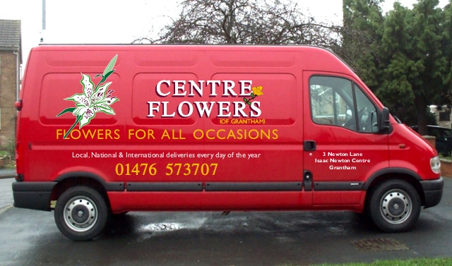
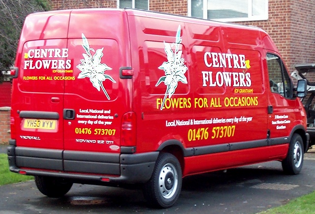
    The customer suggested white lilies but showed me a picture of a full bouquet that would be difficult to make into a half-decent cuttable image so Iā€™ve drawn up this very graphical single bloom hoping it will hit the right note.

    I donā€™t want to see this vehicle driving round for the next 4 years with the competitionā€™s graphics on it. šŸ‘æ

    Alan


    Attachments:

    Nigel Fraser replied 20 years, 4 months ago 11 Members · 15 Replies
  • 15 Replies
  • John Singh

    Member
    December 5, 2003 at 6:46 pm

    The single flower does it for me, Alan

    Great design

    Can’t see why you don’t get the job unless he goes with the cheapskate

    John

  • Kevin Flowers

    Member
    December 5, 2003 at 7:10 pm

    HI
    very nice design Alan how about trying the lilly slanted to the rear, customer should be over the moon with the design

    Kevin

  • Terry Bull

    Member
    December 5, 2003 at 9:31 pm

    perfect Alan
    just right!

  • Alan

    Member
    December 8, 2003 at 6:26 pm

    Thanks for the thumbs up Guys.

    I printed out the design today and showed it to the customer, I think I can safely say he was as chuffed as muck.

    If I remember to take some pix šŸ™„ of the finished van Iā€™ll post them here. Not sure when that will be yet.

    Alan

  • Alan

    Member
    December 15, 2003 at 7:40 pm

    The finished van.

    Sorry the photograph isnā€™t better. šŸ™

    Alan


    Attachments:

  • Paul Goodwin

    Member
    December 15, 2003 at 8:58 pm

    Looks realy good Alan, very eye catching (butter)

  • John Singh

    Member
    December 15, 2003 at 9:18 pm

    Great to see the finished number and it looks great

    John

  • Lee Attewell

    Member
    December 15, 2003 at 9:53 pm

    Lurverly one Alan. Don’t you just love it when a plan comes together?

  • Nicola McIntosh

    Member
    December 15, 2003 at 10:19 pm

    really nice alan!! šŸ˜† šŸ˜†
    terrific to see finished! colours are very nice!

    Nicola

  • Nigel Fraser

    Member
    December 15, 2003 at 10:41 pm

    Yes I agree too ! Nice job and I can’t see any bubbles from here either šŸ˜®

    No seriously, its sometimes better to go for the “less is more” approach rather than wacking on huge digital images that cost the cutomer a fortune. The overall design looks great, really eye catching and still professional too.

    If you don’t mind me asking (and tell me to mind my own business if you do) how much would you charge the punter for that sort of completed job ?
    I think it’s tricky to keep your eye on the ball price wise without talking to others in the business. It’s all too easy to have a fixed idea of how much an average transit “should” cost and then not increase your prices year on year. I know I have suffered this problem myself in the past – but now I generally find customers think it will cost more than it does. With the exception of more complex building/shop signs like built-up metal text/halo illum. etc which usually have the opposite effect !

    Anyway I must stop wittering on and post this….

    Nigel

  • Mike Brown

    Member
    December 15, 2003 at 10:50 pm

    …think I must have missed this one origianlly Alan šŸ˜³

    Just read it through and was real pleased to see that it looked as great in real life as it did on the mock-up…quality work indeed.

    thanks for sharing your work

    more soon

    mikethesign

  • Phill Fenton

    Member
    December 15, 2003 at 11:31 pm

    Nice one Alan – A great advert for their business, and a good advert for your design skills šŸ˜€

  • Alan

    Member
    December 16, 2003 at 11:29 am

    Thanks people, you seem almost as happy with it as the client.

    Nigel, 320.
    Now I hope that some are thinking ā€˜thatā€™s not enoughā€™ and others ā€˜thatā€™s too muchā€™ because this will mean that Iā€™m somewhere in the middle, and Iā€™ll settle for that.
    If on the other hand every one says itā€™s too cheap Iā€™ll hide under the desk and have a cry. šŸ˜„

    Alan

  • Andy Gorman

    Member
    December 16, 2003 at 11:39 am

    Blimey, that’s cheap. Only teasin’. šŸ˜‰

    I appreciate it when some people are happy to divulge what they charge for work. It helps to keep abreast of the ‘going rate’ as it were.

    Very nice job, by the way. But you already know that.

  • Nigel Fraser

    Member
    December 16, 2003 at 8:43 pm

    Thanks for the info Alan, that sounds just about right money to me anyway.
    When I get my uploading sorted out I will post some of my images for people to have a go (look) at !

    Nigel

Log in to reply.