Activity Feed › Forums › Sign Making Discussions › Gallery › Van graphics: blue coyote
-
Van graphics: blue coyote
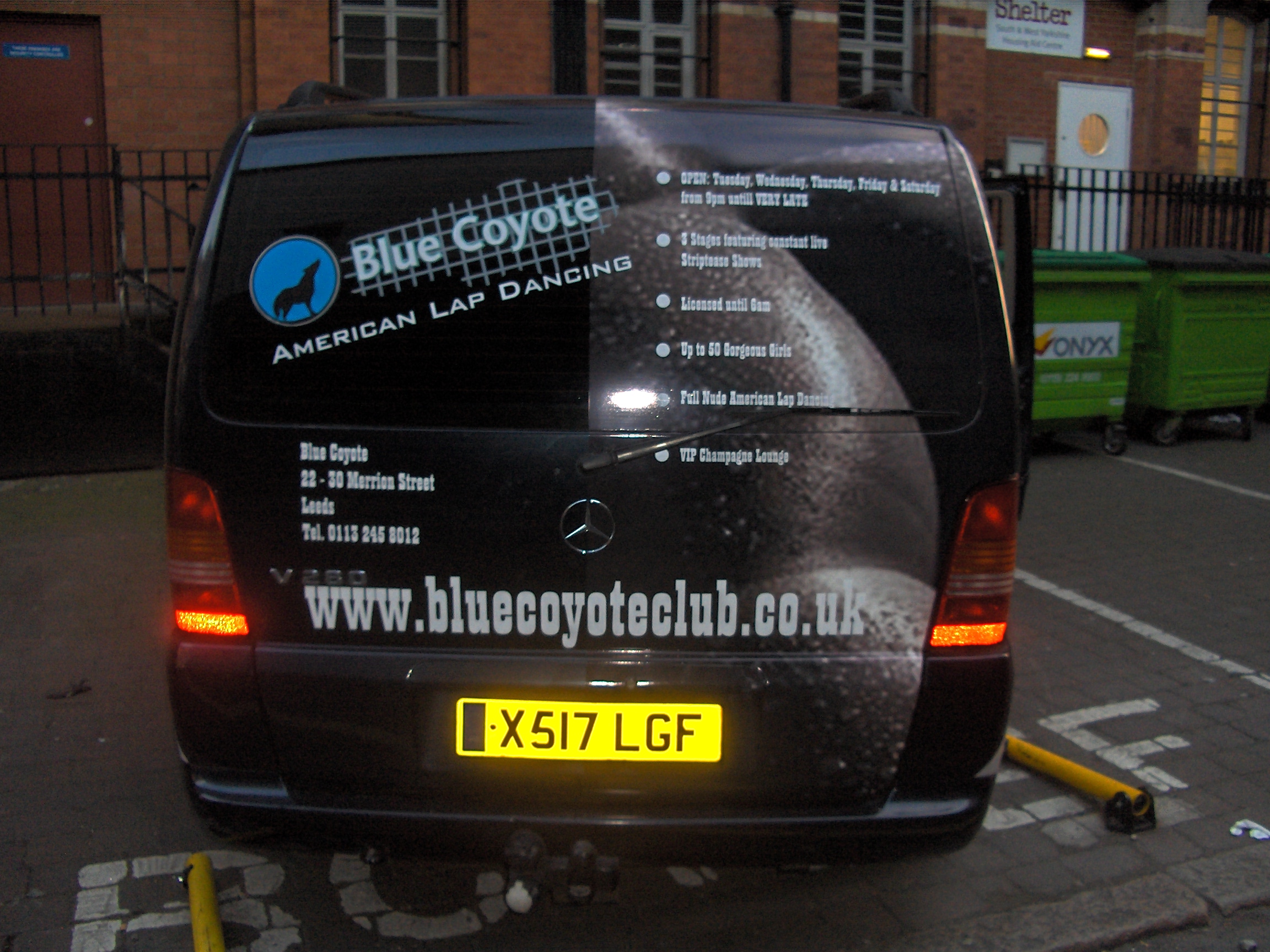
Posted by Phil Halling on June 24, 2006 at 5:03 pmOne we were called in to do last week
Attachments:

 Alistair Richards replied 17 years, 10 months ago 8 Members · 8 Replies
 -
8 Replies
-

Nice job Phil,
i bet it took you twice as long to apply the lower half 😀Kev
-

brilliant job phil 😀
cons. crits noticed the web address was stretched upwards on the back and bullet points a bit to spaced out….takes the look away from the layout, but thats my opinion remember 😉
nik
-
 quote :Nice job Phil,
i bet it took you twice as long to apply the lower halfapplied with the upmost care i bet.
nice one
chris
-

phil that looks excellent 😀 😀 😀 …..eh did you get any freebies from the customer 😉 😉
-
 quote Phil Halling:One we were called in to do last week
so did you apply the graphics also phil? 😉
very nice work mate. looks really good.
one part i am not keen on is the BIG web address on the rear. guess it might be the font used, but it looks a bit stretched and overpowering mate. other than that, all good 😉
-

was it three dimensional (bubbles in the right place)
looks brill
stephen
-

That’s really great like it a lot.
Did you have her naked on the other side??? :lol1: :lol1: :lol1:
Ali
Log in to reply.
