Activity Feed › Forums › Sign Making Discussions › Graphic Design Help › van design help
-
van design help
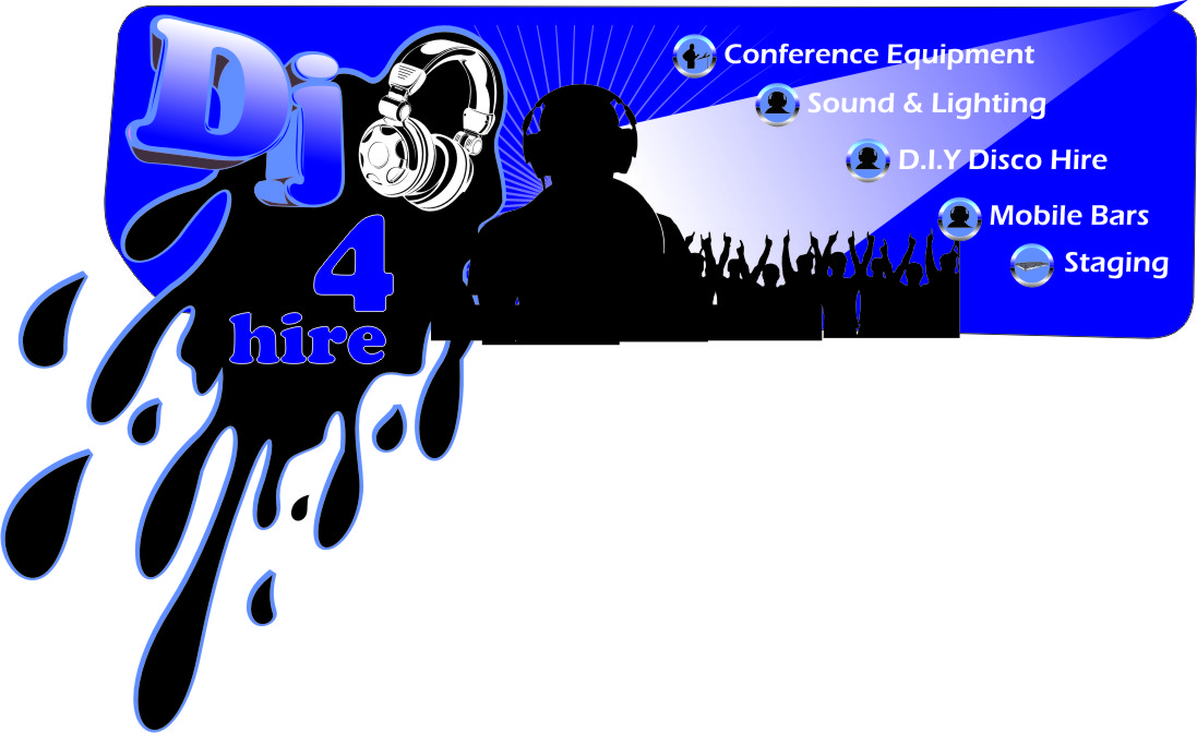
Posted by Chris Windebank on August 1, 2011 at 9:40 amDon’t usually ask for help but stuck with this.
Client wants images rather than text now.
Dj, staging and conferences are the main theme.
Ignore the back, different advertisingLots of vectors he chose from Shutterstock, too many!
Was thinking about the use of icons to keep it neatAny ideas would be most welcome
Attachments:
 Chris Windebank replied 12 years, 9 months ago 5 Members · 12 Replies
 -
12 Replies
-

For some reason the full size image comes up negative, so can’t really see what I am looking at.
-

Thanks for looking David, appears OK when I open it. Can email if you like but a large file too big for here
-

It really lacks cohesiveness. The images are all over the place.
Perhaps if you put some sort of frame around each picture, then did the old overlap thing like splayed playing cards?
The graphics on the one side are difficult to read when distorted as they are, maybe making those a bit smaller would help.
And the one where the guy is pointing at the (whiteboard?) he could be pointing at the company name. Because even though the images are flashy, etc, it’s still really hard to pinpoint in 5 seconds just what it is that they do.
And maybe you should say that to the customer.
Too many images make for a really jumbled clusterf*ck of a layout.
You know it, I know it, and he needs to know it too.
😉
Love….Jill -
Yeah if you can e-mail it over I’ll take a look.
Seems very quiet over here today… and last week so I’ve reviewed my prices, made some price lists, ordered some leaflets…. kind of at loose end for the time been.
-

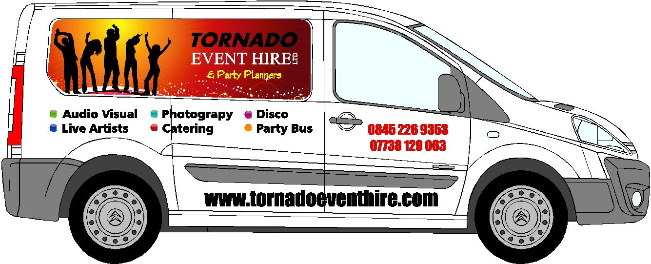
event hire businesses are always hard Chris. They do so many things and they want them all featured from experience. I’d concentrate on a single image on either side. Each side can be different, but we all know if it is too busy, no one will look at it anyway.
Not much help I know, sorry
-
It is a help Shane, been trying to say this to him thats why I thought icons might be the way to go
-
Ah ha. Got it to view the file on my PC. Mac mustn’t be liking the file.
Agree with the images been too much, and it doesn’t really say what they do.
I like the black and white version, but maybe too much text. It’s clear to see they do Dj’ing but not really advertise their other services clearly.
Maybe a generic title "Joe Bloggs Event Hire" or something similar, public will get the idea what they do, then expand on this elsewhere?
-
thanks all, nice layout John. All comments taken on board, will post design after he has gone later today
Thanks again
-
well I took Shanes advice. Client went for one theme and had text added.
Obviously not quite finished but design is almost there
Attachments:
-
I’d use a font like Impact and stack the services (white with a thin black outline) right justified.
I think they are real hard to read, and the staggering makes it even trickier.
I don’t think you need those icons, if anything just a black dot. Keep it simple darlin.
Log in to reply.
