Activity Feed › Forums › Sign Making Discussions › Graphic Design Help › Van design completed
-
Van design completed
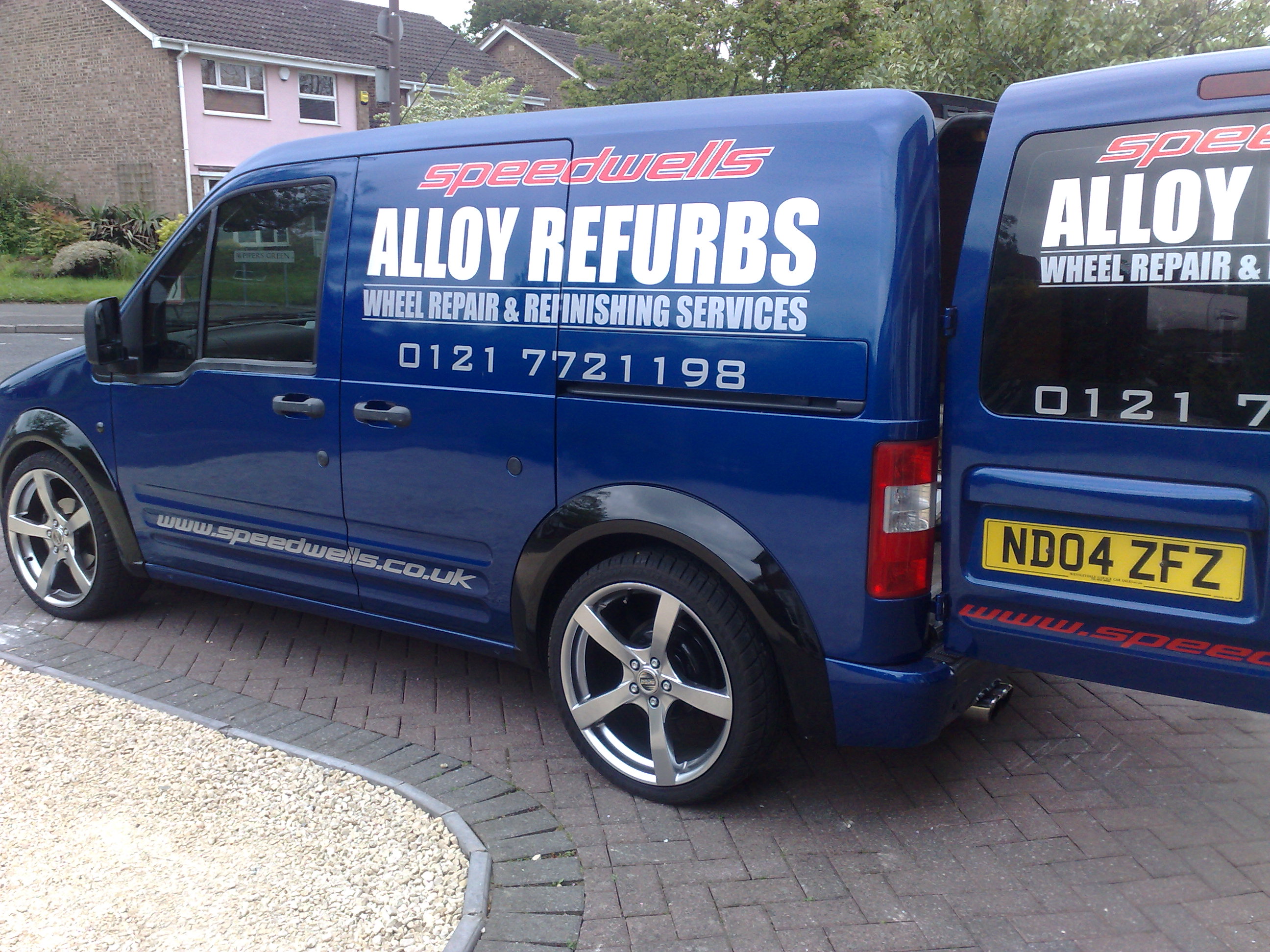
Posted by Ibrar Jabbar on May 25, 2009 at 9:12 pmFollowing on from my previous thread which got locked , I have now completed my van sign project, big thanks to all those who offered good advice 😀
Here’s a picture for all doubter’s.
Attachments:
 John Childs replied 14 years, 11 months ago 16 Members · 29 Replies
 -
29 Replies
-

Ibrar
starting your thread in that tone won’t win you any better responses this time around either, every person is entitled to their own opinion and some chose to give that last time. Let it go & get on with enjoying the site.Slight critic on the van, phone numbers on edge of rear window & close to door runner on side of the van. Secondly the WWW is out on its own & not part of the design, lower down & in the recess it will get dirty quickly meaning people may disregard it. Either use vehicle outline or pic of van to help find best layout. Even tape in place & stand back & double check the look before applying.
Anyway well done
Kev
-

Didn’t mean to sound harsh or offending, I know it’s not perfect but for a first timer I’m happy with it, thanks for your comments 😀
-

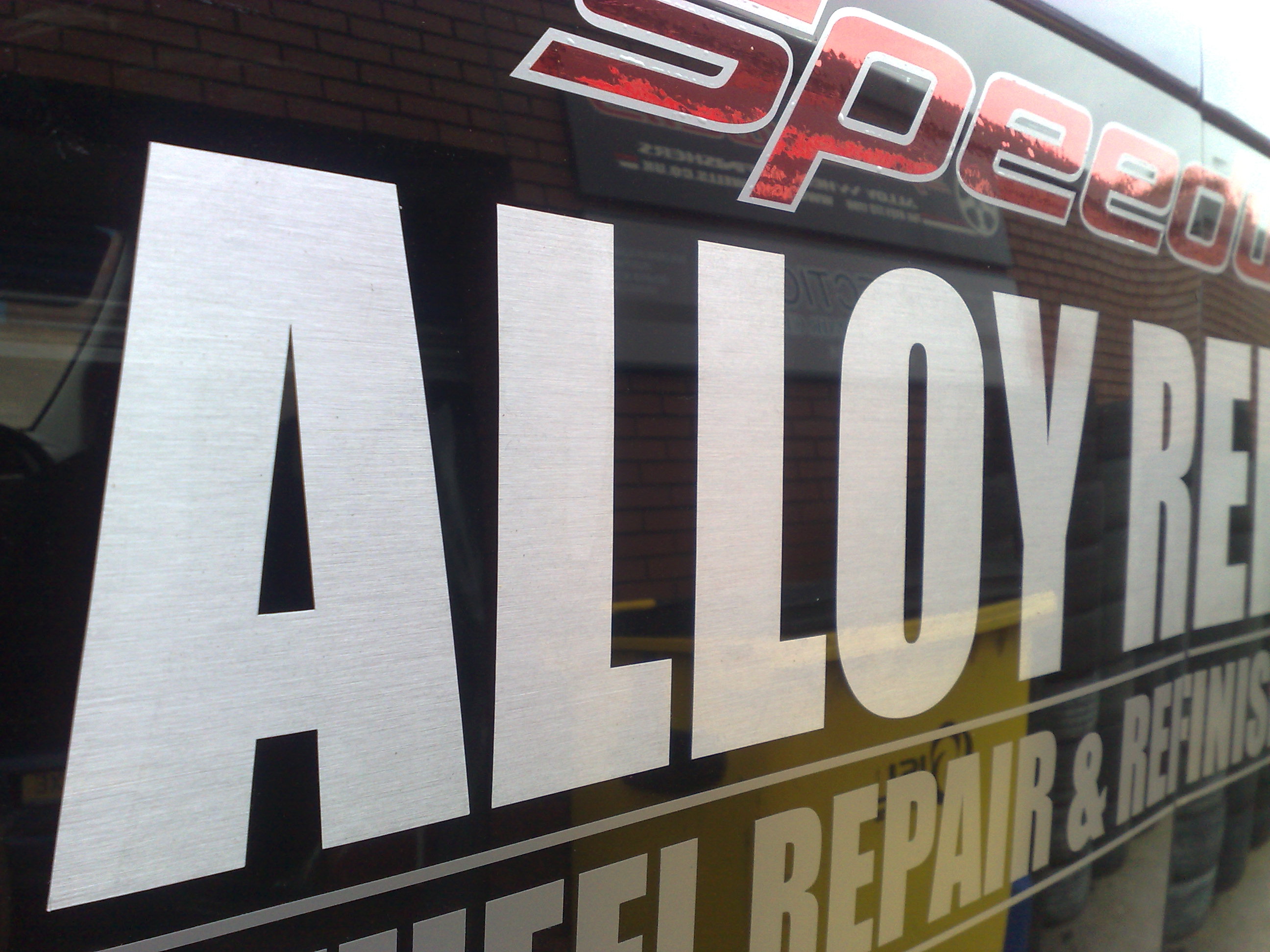
hi ibrar well done on your first attempt, but im going to be very honest here, take it all off and start again, the reasons why im saying that are, it has all been lined up without any care to it being finished straight, the speedy..text has loads of bubbles, pointing to it being layered up in workshop at not on van, and I also agree with what kevin has pointed out. I know this might have sounded a bit harse, but im only being constructive, and that it is the only way to learn and get it right 😀
nik
-

Looks good 😀 well done for your 1st van – bound to get you some work in.
John
-

I like it as well, a couple of errors but a good first attempt, well done.
Jason
-
Nic
you looked at closer than i did, but can see it nowKev
-

Yup -I reckon that does the business – no need to rip it off and start again, no project is ever perfect no matter how hard we try . Well done with your first van 😀
-

And I would have adjusted the kerning on the phone numbers.
A fault with dtp fonts is that they have too much space on either side of the "1". Closing them up makes all the difference to appearance.
-
Very good for 1st try, when I look at my first van I wish I could redo it
-

Well I think it looks great with extra credit for having a go at something different.
Beats some of the other (not just first time) jobs posted hands down. -

hey nice wheels! did you use a brush effect steel and a holographic red/…hard to see from the pics. I like it….as has been said…I have seen alot worse first attempts.
I didnt see your last post or reactions…and please correct me if I am wrong….but from what I gather,you didnt like the neg crits…I didnt intitally to mine…working alone and only with customer feedback…which was always good….I took it a bit personally to start with………but looked at my own reaction and realised that I HAD actually asked for peoples opinions and everyone IS different. I talked to Nic about this at the show when I first met her admitted my feelings and I cant help but chuckle to myself now at my pride!!
The thing is if YOU believe it to be good BELIEVE it. All these things are here to help as grow as people and in our trade>Good luck, keep up the good work.
-

I think for a first attempt this looks ok and yes the phone number needs to be lifted away from the door slider and the number on the back also needs lifting up away from the rear window. However I do like the use of colours, the main thing to remember is to give all your wording space to breathe and everything MUST be lined up straight. Work on your application techniques and look around to see other work and what looks good and what doesn’t
-
I think you’ve done well for the design for a first try, I agree with others that it doesnt look that well applied, and the bubbles in the red would send me mad every time I looked at them, but that is something you gain with experience, and as the van is for selling wheels, not signs then it will be OK.
One thing I hope you did check is the lifespan of the vinyls used – a lot of the fancier finishes only have fairly short lifespans, so if you were going to use them on a customers vehicle you wouldnt want them coming back after a few months to have them replaced !
-
quote Nicola McIntosh:hi ibrar well done on your first attempt, but im going to be very honest here, take it all off and start again, the reasons why im saying that are, it has all been lined up without any care to it being finished straight, the speedy..text has loads of bubbles, pointing to it being layered up in workshop at not on van, and I also agree with what kevin has pointed out. I know this might have sounded a bit harse, but im only being constructive, and that it is the only way to learn and get it right 😀
nik
I will leave it on for now as it doesn’t look bad in person and I’m happy with it 😀
-
quote John Gregson:Looks good 😀 well done for your 1st van – bound to get you some work in.
John
Thanks John, It already has, had a boy racer stop in the petrol station this morning :lol1:
-
quote Jason Davies:I like it as well, a couple of errors but a good first attempt, well done.
Jason
Thanks Jason,
I will learn from my mistakes and improve 😎
-
quote Phill:Yup -I reckon that does the business – no need to rip it off and start again, no project is ever perfect no matter how hard we try . Well done with your first van 😀
Thanks Phill :thumbup2:
-
quote John Childs:And I would have adjusted the kerning on the phone numbers.
A fault with dtp fonts is that they have too much space on either side of the “1”. Closing them up makes all the difference to appearance.
I know what you mean about the kerning, but I kind of like it spaced out 😎
-
quote Barrie Dixon:Very good for 1st try, when I look at my first van I wish I could redo it
Thanks Barrie, who knows 6 months down the line I might redo mine again :lol1:
-
quote Peter Dee:Well I think it looks great with extra credit for having a go at something different.
Beats some of the other (not just first time) jobs posted hands down.Thanks Peter :thumbup2:
-
quote Cheryl Smith:hey nice wheels! did you use a brush effect steel and a holographic red/…hard to see from the pics. I like it….as has been said…I have seen alot worse first attempts.
I didnt see your last post or reactions…and please correct me if I am wrong….but from what I gather,you didnt like the neg crits…I didnt intitally to mine…working alone and only with customer feedback…which was always good….I took it a bit personally to start with………but looked at my own reaction and realised that I HAD actually asked for peoples opinions and everyone IS different. I talked to Nic about this at the show when I first met her admitted my feelings and I cant help but chuckle to myself now at my pride!!
The thing is if YOU believe it to be good BELIEVE it. All these things are here to help as grow as people and in our trade>Good luck, keep up the good work.
Thanks Cheryl
I used red chrome, brushed aluminium and standard silver vinyl. -
quote Jayne Marsh:I think for a first attempt this looks ok and yes the phone number needs to be lifted away from the door slider and the number on the back also needs lifting up away from the rear window. However I do like the use of colours, the main thing to remember is to give all your wording space to breathe and everything MUST be lined up straight. Work on your application techniques and look around to see other work and what looks good and what doesn’t
Thanks Jayne
I know what you mean I definitely need to improve on my application technique, need more practice 😀
-

I can only agree with Nic,
Its badly applied, nothing is straight, and full of bubbles.
So I refer to my first comments, maybe better to get a sign maker to do it for you, you would have saved some money, and got a better job to promote your company, instead of giving the wrong image.But well done for trying
Peter
-
quote Mike Fear:I think you’ve done well for the design for a first try, I agree with others that it doesnt look that well applied, and the bubbles in the red would send me mad every time I looked at them, but that is something you gain with experience, and as the van is for selling wheels, not signs then it will be OK.
One thing I hope you did check is the lifespan of the vinyls used – a lot of the fancier finishes only have fairly short lifespans, so if you were going to use them on a customers vehicle you wouldnt want them coming back after a few months to have them replaced !
The bubbles don’t show up much in person, however I am still slowly pin pricking and easing them out.
-
quote Peter Normington:I can only agree with Nic,
Its badly applied, nothing is straight, and full of bubbles.
So I refer to my first comments, maybe better to get a sign maker to do it for you, you would have saved some money, and got a better job to promote your company, instead of giving the wrong image.But well done for trying
Peter
LOL
-

…people will probably just assume a dodgy sign company did it.
😉
Love….Jill -

One of the most important things in signs is kerning I know you said you like it spaced out wide but thats ok as long as its even. Kerning is the space difference between letters and it needs to look even, the problem with some computer fonts is that the kerning is terrible, this is where the professionalism of a sign maker comes into it. You have to adjust it to make it look right. I’ve seen some signs and vans done by professional sign makers with years of experience who still do not understand kerning (some on this forum). Stand back and look at the van and you will see what I mean and what others mean by the lettering all at the bottom. Even today with everything done on computers its not as simple as pressing a few buttons, you still need an artistic eye.
-
 quote Martin Oxenham:One of the most important things in signs is kerning I know you said you like it spaced out wide but thats ok as long as its even. Kerning is the space difference between letters and it needs to look even, the problem with some computer fonts is that the kerning is terrible, this is where the professionalism of a sign maker comes into it. You have to adjust it to make it look right. I’ve seen some signs and vans done by professional sign makers with years of experience who still do not understand kerning (some on this forum). Stand back and look at the van and you will see what I mean and what others mean by the lettering all at the bottom. Even today with everything done on computers its not as simple as pressing a few buttons, you still need an artistic eye.
Spot on Martin!!!
I’m sick to death of people jumping in on this trade with absolutely NO idea at all of layout design and especially kerning.
I’ve seen one near me lately that just beggers belief.Ibrar, this is not pointed at you directly…
With reference to your van there is some good criticism here.
In all honestly I would sway with Peter and Nik, there’s a lot of sense in what Peter is saying without dismissing his post with a LOL.
A DESCENT sign company would have been a better option to portray your business.In theory the layout and design is good ( I have seen a lot worse by more established people) but the kerning and other spacing let it down badly BUT. the wording not being laid up straight is a definite take off and redo.
-
quote Ibrar Jabbar:I know what you mean about the kerning, but I kind of like it spaced out 😎
Oh yeah, Ibrar, nothing at all wrong with spaced out, I like it myself.
But the spacing between the numbers should be consistent and you’ve left the spaces either side of the "1" larger than between any other characters.
Do you see what I mean?
Log in to reply.
