Activity Feed › Forums › Sign Making Discussions › Graphic Design Help › van back doors help…
-
van back doors help…
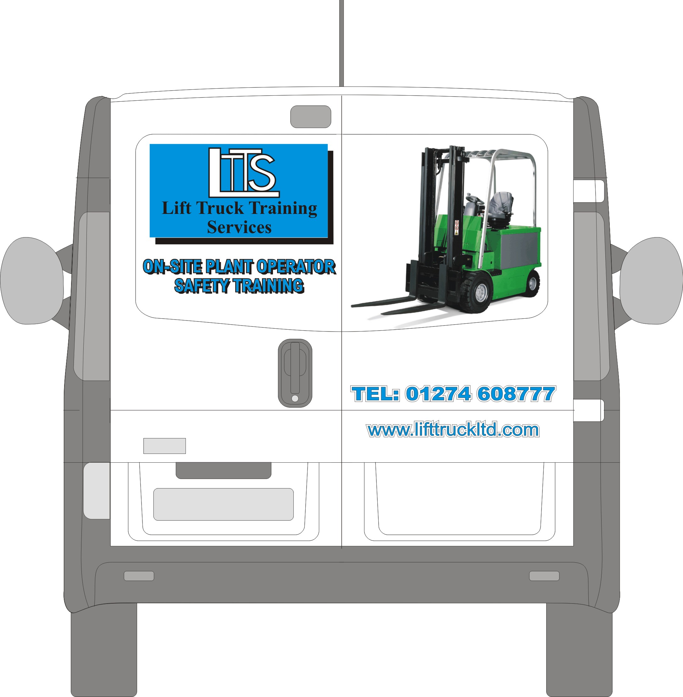
Posted by Stephen Ingham on June 15, 2010 at 8:48 pmHi all, can anyone help with a few pointers or ideas for the back doors of a vivaro van, i seem to be having a mental block.
The brief is simple but eye catching….not much then…lol
cheers
stephen
Attachments:
 Jill Marie Welsh replied 13 years, 10 months ago 7 Members · 19 Replies
 -
19 Replies
-

Right!
Id flood coat the rear top panel in blue. Make it look like its meant to be there and add their logo. Phone number and web address underneath on the flat panel underneath.
(loose the drop shadow on the text, it doesn’t work!)
Print the fork lift image on clear to fit ‘around the’ text and logo.
Just my input. If it wasn’t so late I’d do it in illustrater to show what I mean! Maybe tomorrow if time allows…
Matt
-

Hi Matt, thanks for the input.
Much appreciated
cheers
stephen -

Did this one a few years back…almost the same business initials!
White halo is reflective. Actually looked more ‘silver’ until the light caught it.
Really basic and to the customers spec. to fit in with his existing identity.
Text fitted round the forklift like Matty’s suggestion.
Attachments:

-

One quick tip is that the drop shadow should never have more impact than its text.
Love….Jill -
😕
I thought we always agreed on stuff Matty.
PS
Stephen maybe lose the "Tel:" if possible.
😀 -
Maybe a tag line in brush script…
Only joking… (Jill xx)
-
 quote Matty Goodwin:Maybe a tag line in brush script…
Only joking… (Jill xx)
he he
-
thanks for the replies.
Matty, i guess strap lines arent a favourite of jills? There was a mention of the companies strap line too of "giving your business a positive lift"….maybe not then?
cheers
stephen -
Its not so much the strap line, more what font its in!
Saying that, I think the ‘giving your business a positive lift’ works for this company.
Interested to see what you come up with, design wise.
Good luck
Matt
-
 quote Stephen Ingham:Matty, i guess strap lines arent a favourite of jills?
stephenNo Stephen, it’s Brush Script that isn’t Jills favorite. 👿
Beat me to it Matty 🙄
-
Right…i get it now…no brush script…
So if it was in ariel italic or something like that then that maybe okay?
cheers
stephen -
As I said, I think they sometimes works and this one does. (just my opinion!)
Matt
-
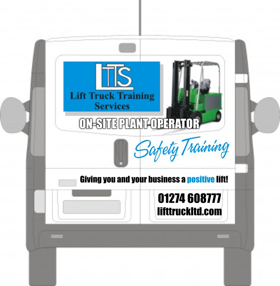
I hate Arial too.
But I like a good strap line, I call it a tagline.This is how I would do it, and I would try to get a yellow forklift rather than the green one. You are stuck with the logo but you could lighten the black drop shadow.
Attachments:
-
AAAGHHH! Hate it!
Defo flood the recess panel blue and go from there!
Matt
-

I think that gross logo will kill anything it goes near.
I would suggest moving it somewhere well away from the main design rather than trying to integrate it.Don’t like the condensed font – unreadable even from a short distance imho.
-
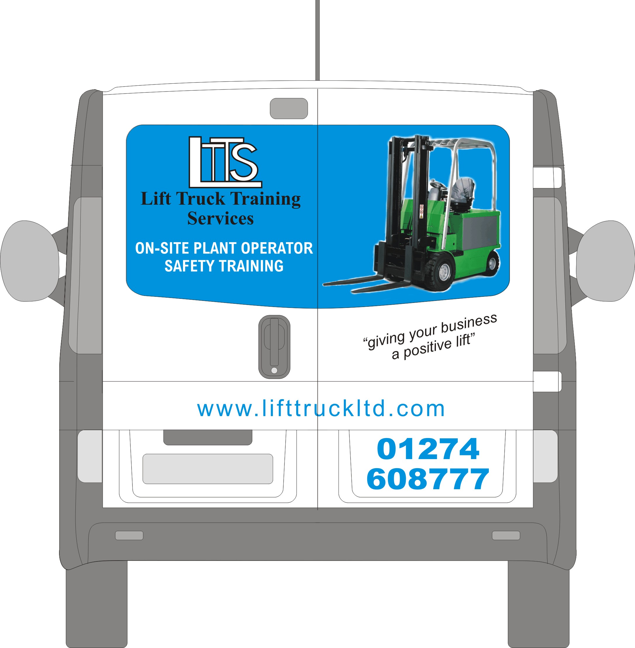
Hows this…i have tried to hide or disguise the logo, jill i cant find a suitable yellow fork truck, unless anyone can change the colour for me…lol
cheers
stephen
Attachments:
-
I’d loose the forklift image for now…
make the logo bigger, put the logo text in one line and the line underneath in one line, and fill the blue panel. Make the web address bigger, and the slogan.
Then work out how to use the image.
It seems to take priority over the actual job they do.
Matt
Log in to reply.
