Activity Feed › Forums › Sign Making Discussions › Off Topic Chat › Ugh! I hate that font.
-
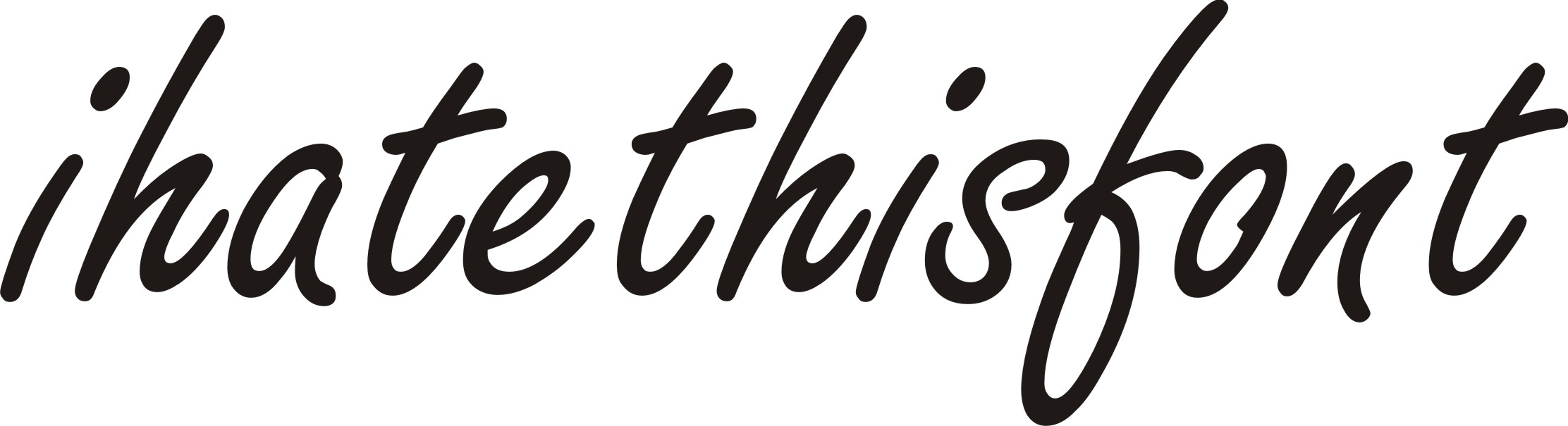
Ugh! I hate that font.
Posted by Tim Hobbs on May 28, 2010 at 8:44 amJust for a larf I wondered what you guys hate from the font world.
Me, I can’t stand Curlz or Papyrus. (The Beauty Salon Fonts)
Also working in Bath I get a bit fed up of TNR.
Oh, and designers who think that signage is about spindly little text that you can’t read from more than a foot away, but maybe that’s another topic.LOL 🙂
Jamie Wood replied 13 years, 11 months ago 21 Members · 29 Replies -
29 Replies
-

i hate the font Revue for some reason-
if someone can show me where they used it in a good way that could change my mind and cure me i would be grateful
liam
Attachments:

-

I hate Abaddon even more than I hate Brush Script.
I also hate Arial, Balloon Bold, Meta, Comic Sans, Papyrus, Curlz, Banco, Serpentine, and that one blackletter font I can never remember the name of.
Not that I’m opinionated or anything.
Love…Jill -

I don’t mind fonts – they rend to keep themselves to themselves and have never done me any harm.
Live and let live I say (puppy-eyes)
-
 quote Jamie Wood:… and particularly Hobo. Ugh.
Oh, I don’t know, he was one of Cooper Black’s friends after all.
-

When it comes to weeding it has to be Algerian…. pain in the rear
Small txt on the sleeve with that font is murder 🙁
-

I hate all the fonts on a "1500 Font CD Collection!" that you might find on some dodgy ebay site
-

2 fonts walk into a bar and ask a pint of Ale
the barman says
"sorry we don’t serve your type in here"
oh and it’s boat owners who want their boat name all in Brushscript capitals
-
 quote Jillbeans:I hate Abaddon even more than I hate Brush Script.
I also hate Arial, Balloon Bold, Meta, Comic Sans, Papyrus, Curlz, Banco, Serpentine, and that one blackletter font I can never remember the name of.
Not that I’m opinionated or anything.
Love…JillBoy!
Jill! you certainly have some issues,
Although! I must say I do have a slight hatred for (:) Balloon Bold (hot) -

Murray Hill, 20 or so years ago the pub chains used it too death.
Brody or Brophy?? similar to Brush Script……
and Bank Gothic.
-
I also hate what people do to fonts.
Stretch, squish, arch, squeeze, countless special effects.
Microsoft Word is responsible, I tell you. -

I love to hate Old English. But I really love it when I see names tattooed all in caps on people. :rofl: :you:
-

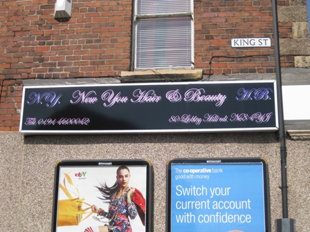
Oh, not forgetting ‘SLIPPERY’ / ‘SLIPSTREAM’ the ‘go-faster’ font that nearly every ‘EXPRESS’ business uses.
All CAPS Old English.
Generic Mediterranean restaurant
Bizarre fonts to denote the EXTREME CRAZINESS of the sign.
Script fonts – with open kerning…(lazy . stupid ‘signmaker’…no…let’s rephrase…plotter operator…)
The ‘pipe’ style fonts that certain plumbers / gas fitters seem fascinated by…
Attachments:

-
 quote Jillbeans:I also hate what people do to fonts.
Stretch, squish, arch, squeeze, countless special effects.
Microsoft Word is responsible, I tell you.I totally agree Jill, Microsoft word made everyone into a designer…..not!
I am a great believer every font has its place, but some are just to pants to use, as said Comic sans takes some beating as the one below does
Attachments:
-
hmm how about the forum fonts that have changed a few times over the last 24hours lol
-
Three fonts that I initially loved but am now sick of are Letterhead fonts.
Sarah Script, Esoteric 3, and Boston Truckstyle.
I just see them too much, no offense to their designers.
Like I said, I used to love them. -

I can’t add anymore to these. I was thinking freestyle but I see martin as included that.
My biggest pet hate tho is all uppercase script words. I refused to do one the other day, lost the business but I didn’t want to be associated with it.
I told the guy, I’ll design the sign, you go back to doing what you do… He thought he could do both 🙄
-

I hate all the spandex, "GERBER Edge" styles… OK not necessarily the font itself. but when i see the old desert/sky effect etc on fonts and so on… im like oh please… to add insult is seeing it in half font tiled only 24 inches high!
saw a bus done in it today which brought it too mind…
OK, got that off my chest, back to Fonts in general. 😀 😉
-

I have very strong feelings about Crille and none of them are good!
-
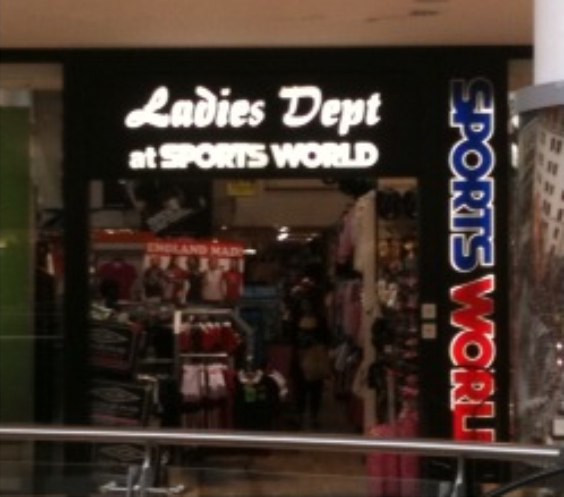
Strolling round Lakeside and saw this 😮 unbelievable choice of font, think it’s called Champion in SL
It looks 10 times worse in real life than in the photo
Who ever suggested and signed this off should be ‘hung drawn and quartered then shot, then banned from using a computer.
Poor pic quality 🙁
Attachments:
-

We were discussing this the other day on another forum, I don’t see everyone’s problem with brush script, Sure its ugly and you cant modify it BUT isn’t it refreshing when a customer comes in and knows exactly the font that they are after?? It saves you time instead of fannying around picking a font and as soon as they say Brush Script you can show them a quick alternative that is better and bada bing bada boom you are a genius! I like it, apart from when i forget to weld -And if you say that has never happened to you, you are lying! :lol1: 😮
-

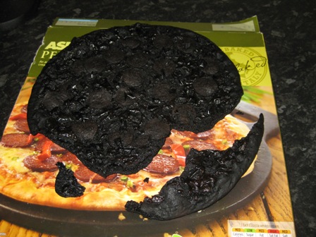
been driving past this for a while and it hurts my eyes
haven’t seen anything this bad for a while apart from the pizza Gareth hankinsons mrs cooked for himDerek
Attachments:
-
 quote Mike Grant:I love to hate Old English. But I really love it when I see names tattooed all in caps on people. :rofl: :you:
LOL, yeah, I agree with that. Why do people think it’s OK to use a script all in caps?
Algerian, Hobo, Dynamic (really quite offensive and can’t imagine when it could ever be used appropriately!) Champion is, as mentioned, an ugly script. Oh there are loads that irritate me. I especially hate to see text stretched, especially when it’s stretched in height to within and inch of it’s life to fill the high top above the back doors of a van! 😕
-
 quote Marcella Ross:Dynamic (really quite offensive and can’t imagine when it could ever be used appropriately!)
I’d forgotten about this one. A company round the corner uses it, and it really does
look rotten.
Log in to reply.
