Activity Feed › Forums › Sign Making Discussions › Vehicle Wrapping › Truck wrap: AIM volvo 220
-
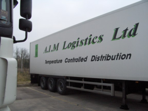
Truck wrap: AIM volvo 220
Posted by Phil Halling on February 25, 2006 at 6:02 pmHere’s one we have just done, comments appreciated.
It was our own design – a complete in house job.
Simon Kay replied 18 years, 2 months ago 8 Members · 9 Replies -
9 Replies
-
Great work and looks first class, the back doors and tailgate are really cool and must have take some skill, an artist at work i’m sure.
Russ
-
Phill,
you obviously aim to please you customers.
I think you have done that here.Nice job,
Peter
-
Well done Phill. Good job all round. design thru to application. as Russ says, a talented group at work there
-
I always find it hard when I have created a background to allow the top layer to be dominant if you know what I mean.
I think you have managed it here although I think I would have made the phone numbers a little bigger, even though they are readable now.
Does that make sense ?
Sometimes I design something that looks great, on screen, but when I come to do it ( or have it done) in real life it doesn’t quite have that same impact. I’m wondering if that’s how you are feeling now, asking for feedback.
I llike the choice of colours. I like the design, but I feel there may be something missing , if , you were looking for the ideal job.
Apart from that you have done a wonderfull job, one that I could only dream about doing. Well done.
😀 Simon.
-
While I like the colors and the background design, the text seems fragmented somehow.
I think that the AIM in the green panel would have looked far better if it were white instead of black.
The italic lettering on the name is nowhere near as strong as the sans-serif on the towns, AIM, and phone numbers.
Just my 2¢, I do like the background very well.
But you have to ask yourself which is more important, the text or the background?
I think this question should be addressed fully in this new age of wraps and printing.
Love….jill -
Whilst I here what what you say Simon, about the phone numbers, I disagree because as you say you can read them now – but any bigger and they would dominate the whole rear, maybe just maybe they could have been white, I dont really know.
Jill, I quite agree with most of what you say but as always we have to work within the clients brief, and if you look at the next two photos of his existing vehicles, you will see why we did it as we did – mainly to keep somewhere in the same ballpark as his other trucks which will not be changed over for a few months yet. I feel we have acheived a newer fresher and more interesting image for his company but have kept enough of the old elements that joe public will recognise that it is the same company.Phil
-
I like the way you used the compass phill. After seeing the chelsea bus and the way you wrapped that golf gti in nottingham, on a freezing january day, i would’nt dare to run you down mate.(i was that really annoying taffy who would’nt stop asking questions) Good to see you posting your work again mate. All the best. Here we go again!!! How much?
Matt
-
Phil,
Don’t get me wrong. I think you’ve done a great job. I was trying to be objective and ask myself ‘what if’ in my new improved active roll in UKSB.
It’s a far bigger and better job than anything I could take on. You are in fact a ‘master’ and I am ‘not worthy’.
However I thought I’d chuck my two bob’s worth in. 😀
I can’t wait for the hooha that will erupt whenever I get around to actually posting some of my work. 😀
Good on ya.
Cheers
Simon.
Log in to reply.


