Activity Feed › Forums › Sign Making Discussions › Gallery › Truck Graphics: Turfland
-
Truck Graphics: Turfland
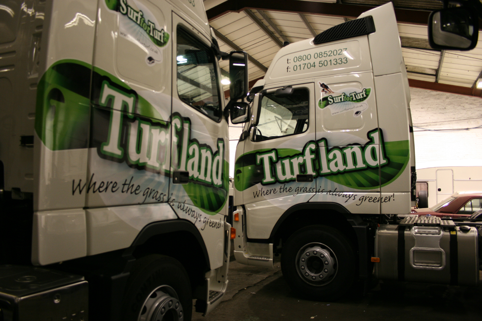
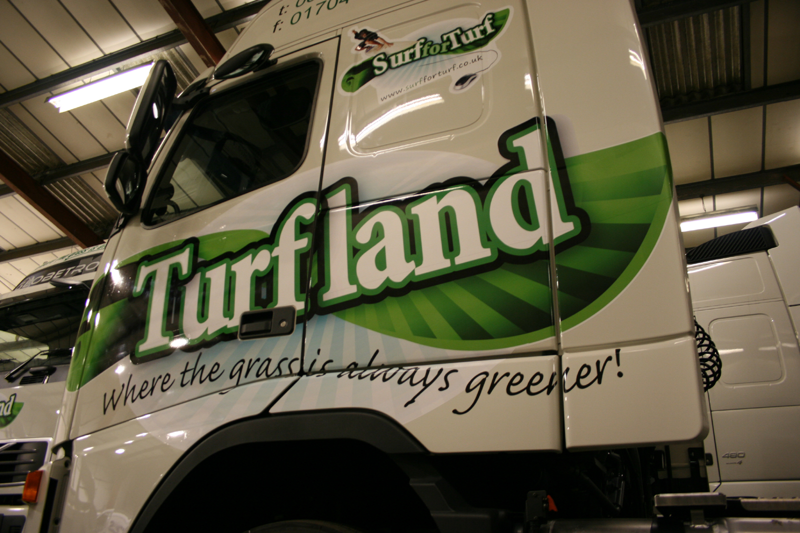
Posted by David McDonald on March 6, 2008 at 8:05 amHi All
2 from last nights job – inside but still minus temp.
We did these in Metamark MD7 just to see how it performed in place of the Oracal stuff we normally use. Can’t say I noticed much difference between them but found it to be a very ‘friendly’ film to work with. Will have to do some more with it to make my mind up.
Cheer
Macky
Attachments:
 Chris Wool replied 16 years ago 10 Members · 10 Replies
 -
10 Replies
-

Excellent!
Not something you’d see every day, and it looks great.
Normally I’d holler at you for arching script but in this case, it works!
Love….Jill -

First time I’ve been on for a while… Just looked at these, brilliant job, look great.
Then I thought to myself i know this firm, Just outside Southport, NW England right?….the world is getting smaller, I live and work there myself..spooky, its the 1st job I looked at on this site!
-

Hey David,
That’s a really nice design. Stands out really well.
Good work.
-

nice work macky… looks good mate.
im not keen on the small repeat of the logo on the sleeper cab section or the use of the fax number. (never see the point in customers using it)
i do like the logo as it is distinctive and does the job well but the repeat logo sorta highlights the extreme white of the vinyl used for printing. i know why you have used white but you should try a sample print onto a clear digital and apply to the truck. everything will blend much nicer using the trucks white colour as your white layer.thanks for taking the time to post your work mate. much appreciated. 😀
-

rob said it for me really, i think even on clear it wouldn’t look so good in a years time.
for this application i think i would have lost the blue fade and cut to the main edge, which i think would have done the excellent logo text justice.
nice but could have been stunning.out of interest did you design the logo
chris
Log in to reply.
