Activity Feed › Forums › Sign Making Discussions › Gallery › Truck graphics – J.R.Payne
-
Truck graphics – J.R.Payne
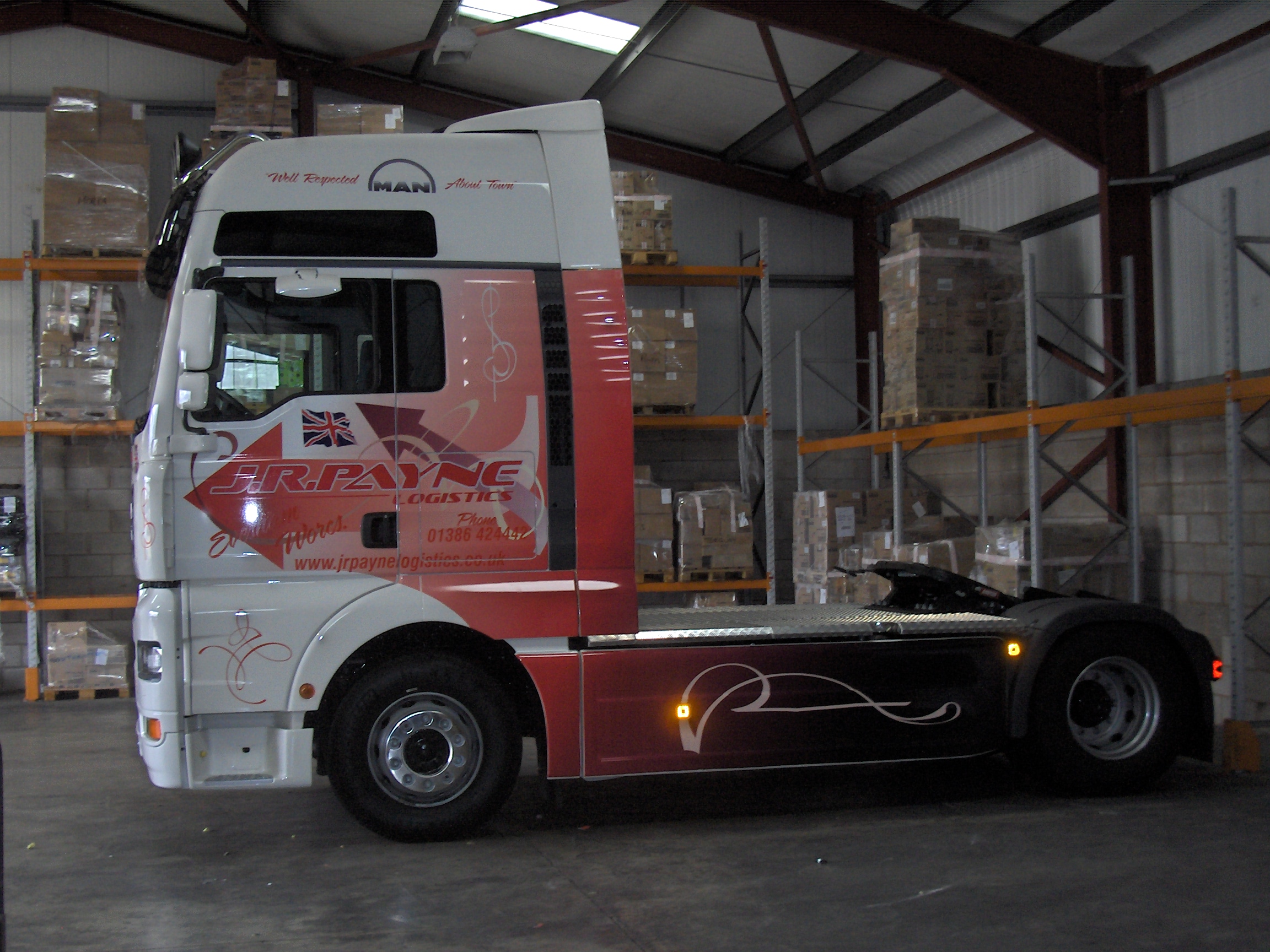
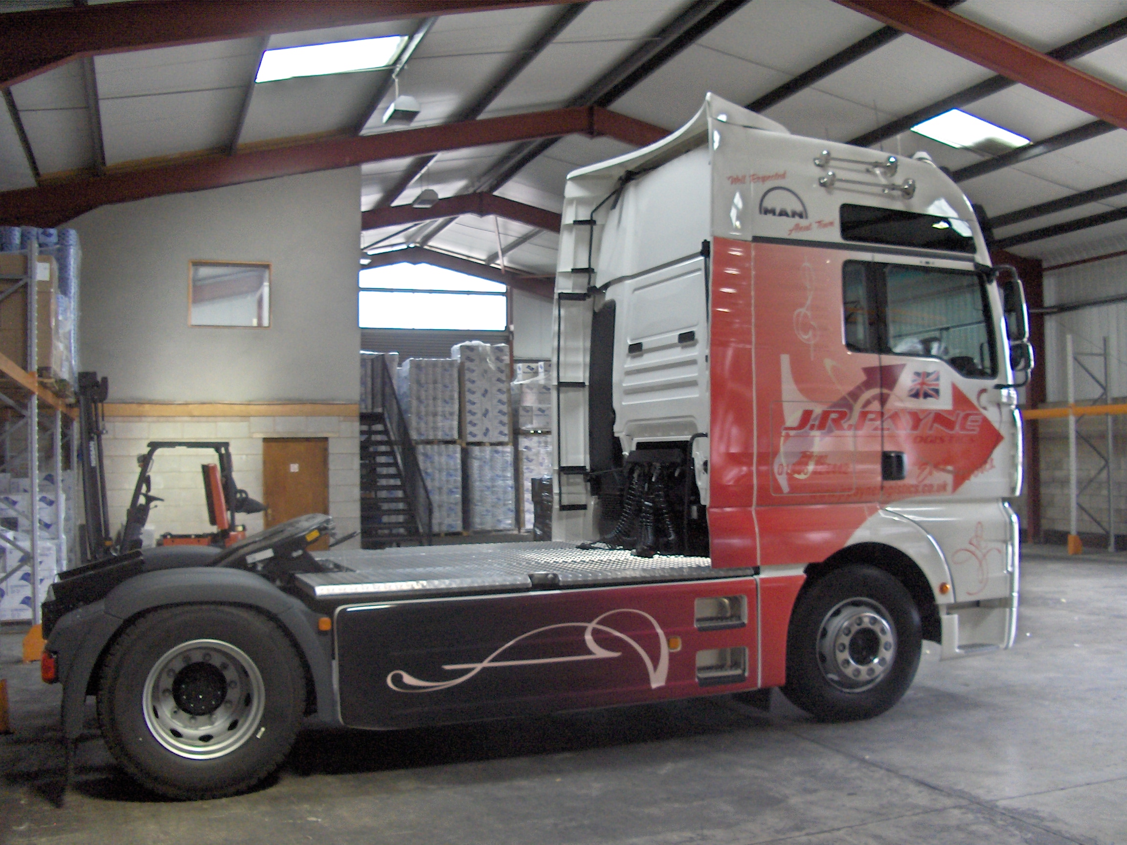
Posted by Phil Halling on August 7, 2006 at 6:31 amHere one for Worcestershire Haulier John Payne.
All designed & printed in house on avery material.
Attachments:

 Brian Little replied 17 years, 9 months ago 8 Members · 9 Replies
 -
9 Replies
-

very nice work phil… has a sort of modern look, but traditional feel to it too. well done mate….
only bit of crit… not sure if its the picture but some of the red on red like tel number seems to be a bit lost.
thanks for taking the time to post your work mate… 😀
-

Rob, all the red text on the sides looks lost in places but the brief was he wanted to look modern over and above advertising.
-

I agree that is is hard to read some of the copy…
but I have always thought of a tractor trailer truck as mainly needing to identify the hauling company.
Usually nobody will be driving alongside of it with a scribble pad trying to jot down the phone number.
(unless the driver is dangerous!)
It is certainly striking and different.
I especially like the hoop-de-do on the back.
The traditional-looking name up front still identifies the company quite well.
I think the truck will really stand out, maybe even start a fad.
love….jill -

Nice one.
Though the red text does disappear in to the background too much. -

Hi Phil, Nice work 🙂 Im meant to be doing a few of these soon, well some are Ivecos and some are Scania’s, but they all look the same, can i ask what vinyl you used? ive done a few things but nothing like a cabin… bit worried
🙄
-

Looks different Phil, is the print contour cut arround the arrow head? or is the area in front white or clear vinyl?
Peter
-
Hi Peter,
The area in front of the arrow head is indeed white vinyl. -

Phil ..love the design ….just not sure of the colours its lost for me
Log in to reply.
