Activity Feed › Forums › Sign Making Discussions › Graphic Design Help › Thoughts on new Logo !!!!!
-
Thoughts on new Logo !!!!!
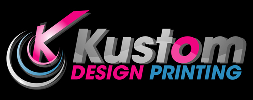
Posted by Shaun Cleary on October 19, 2009 at 7:15 pmHere is the file
Attachments:
 Warren Beard replied 14 years, 6 months ago 5 Members · 10 Replies
 -
10 Replies
-

That’s the best logo I’ve seen on here for a long time mate. 😉
-

Oh please not on here too, we have already critiqued this on another forum.
And you know how I feel about the "O".
Did you buy this from one of those logo sites because I seem to remember you posting about those logos too.
Not trying to be a b!tch.
It’s funny that people here like it while others there did not.
Including me.
Like I said, I think if the name was all in white instead of that weird uneven grey, it would look better.
😉
Love…Jill -
Hi thanks Jill, I just want to get as many opinions as I can on what they like and dislike about the logo.
I am in two minds myself, I did buy the logo from Logo Quality nice company to deal with.
Any likes or dislikes will be appreciated people as this is what I want to hear.
-
At least you’re honest. I liked the first one. Look nicer in brush script though….what do you think Jill? :lol1: :lol1:
-
Looks 100% better in all white, I still don’t like the oddly shaped "K".
Thanks for being a good sport.
😉
PS
Lose the grey drop shadow and see if that helps. -

try making the smallest crescent a full solid circle with a reversed out normal K in it just to see what it looks like, with the plain white text next to it like your last one as I also don’t like the weird K.
cheers
Warren


Log in to reply.
