Activity Feed › Forums › Sign Making Discussions › Gallery › this weeks colorful job
-
this weeks colorful job
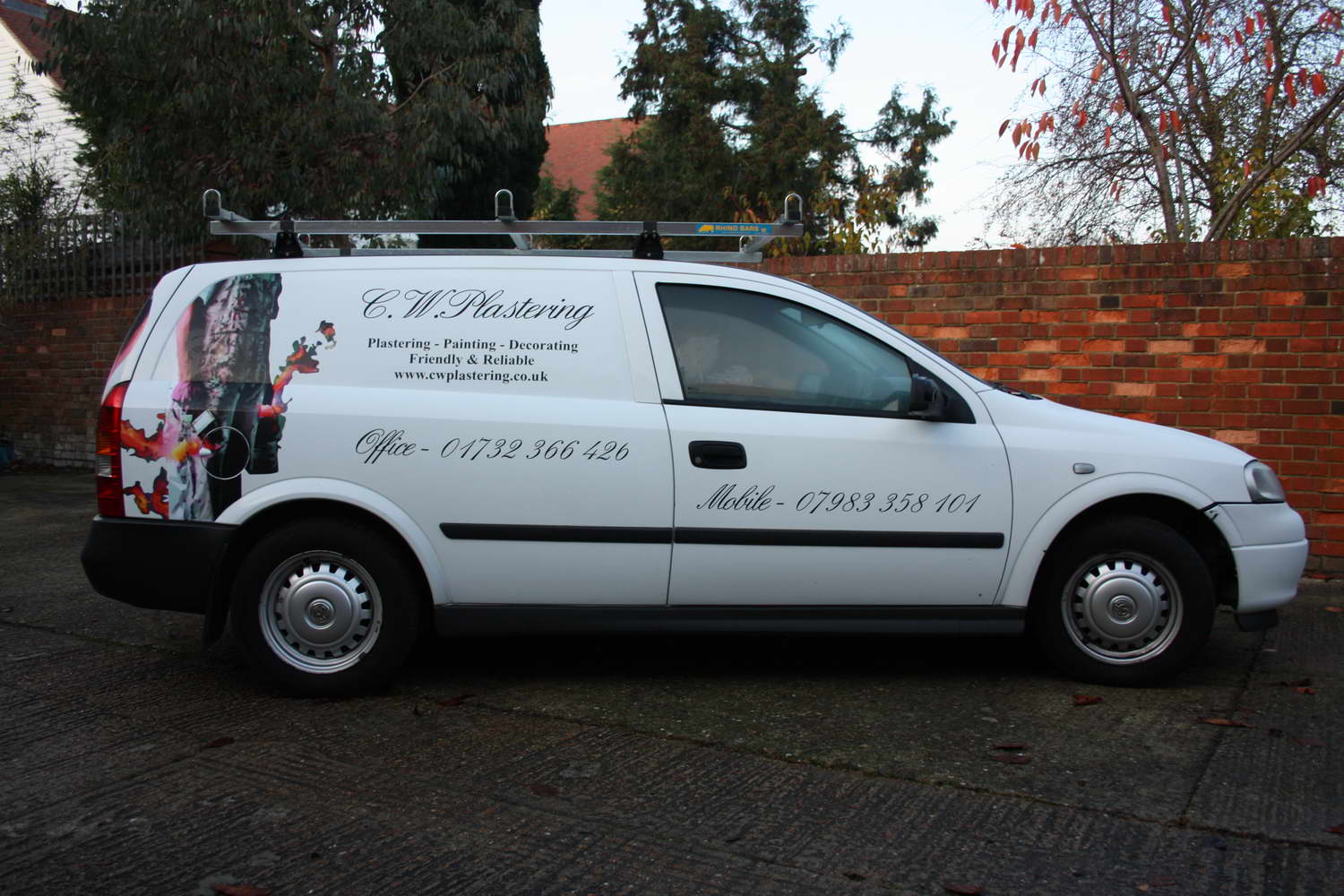
Posted by Mo Gillis-Coates on December 14, 2011 at 3:44 pmI never really put much here, I’m not quite in the same league as some of you guys and gals but I have taken a sharp intake of breath and I’m going to post something I have done recently, pop a hard hat on and sit back and wait for the fall out……
Hope you like it, customer was chuffed and I had to work through the night to complete it in time…. I’m pleased enough to risk posting it
**GULP!**
BigMo
Attachments:

 David Rowland replied 12 years, 4 months ago 9 Members · 11 Replies
 -
11 Replies
-

Looks like a nicely applied job there mo, personally im not a fan of the script font particularly for this type of trade but hey what do I know 😀
Well done 😀
-
 quote John Harding:personally im not a fan of the script font particularly for this type of trade
I absolutely agree with that, but sadly he had one of those tacky vistanobby business card, letterhead, etc etc done in the same style so I had to work from that. I couldn’t talk him out of it, I did try tho!
-
 quote :I couldn’t talk him out of it, I did try tho!
You can always say ‘No, sorry I’m not doing it like that’.
While it never good to work away, it’s your work/reputation that’s on show so why do something that you don’t like.
John
-
 quote John Hughes:You can always say ‘No, sorry I’m not doing it like that’.
While it never good to work away, it’s your work/reputation that’s on show so why do something that you don’t like.
John
While I do agree to some extent John it’s still hard to turn work away at the present time. To be honest ‘Joe Bloggs’ wouldn’t see what we see and there’s the option of not putting your own label on there.
Overall it looks goods Mo, I’m not a big fan of this script either but again it’s a head, wall and bang scenario.
You could always buy a few Letterhead or DNA scripts and dump these crappy computer scripts.
I’d try and avoid putting lettering over colourful images too as they tend to merge in to each other but I see you’ve put an outline around the lettering so that helps.
Thanks for posting tho Mo and lets see some more 😀 -
Let’s see some more Mo. I hate doing astra vans. Trying to get it straight on the sides can be a nightmare. 😉
-

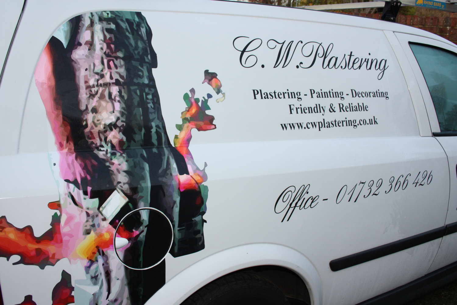
I had to stare at the logo for at least a minute before I worked out what it was.
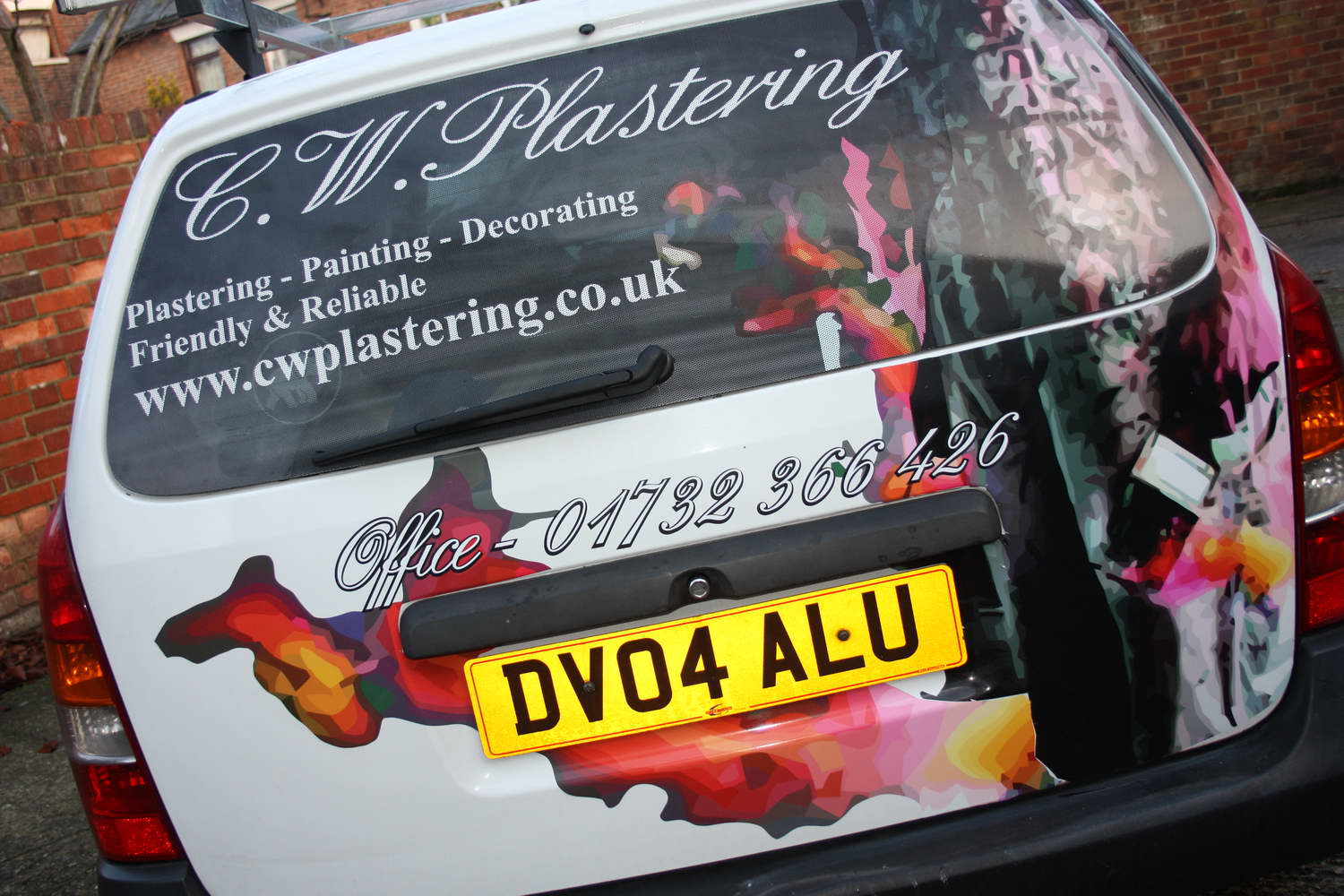
The lettering on the rear window is too close to the edges so throws the balance out. Font is very feminine for such a butch trade.
Doesn’t do it for me sorry but it is a yardstick for you for future improvements. All in, as long as the customer was happy and you get paid is what counts.
In this sort of case I would have done an alternate design to show him the error of his way! -

This is one of my favourite types of job. A combination of digital print and cut along with cut vinyl lettering which allows you to create something that approaches the type of effect you would get with a wrap at a fraction of the work and cost.
As Karl says – Astras are really difficult to get the lettering looking level but you have managed it so well done 😀
I think the graphic would have worked better if you hadn’t cut his head off, but I appreciate this may have been done deliberately if the picture wasn’t of the actual owner of the vehicle/business.
I’m sure we can all see room for improvement in every job we do, so please don’t take any of the constructive criticism offered up so far in a negative way.
Good work
-
Phil-Mike, thanks for the constructive criticism, very useful.
The image I had to work from didn’t have a head on it, and actually thats not the final window. I saw what you saw and did it again, it’s contra vision so its an expensive mistake. That was corrected but I forgot to take a picture.
As for the script, well needs must, I did actually change the whole design for the client and charged him extra because the original would have looked odd. When I do a design, I often print out one side on my wide format inkjet, low res on really cheap paper and stick it on the side of the van to see what it will look like when my customer comes in for the consultation. I can show him different options then
We did that and ended up changing it but he was set on the script although I did show him various options I had printed out also.
Thanks again guys, its great to get feedback
-

I would have lowered the pic on the driver’s side so that the gas cap was more strategic.
😀
Love….Jill -
quote Jill Marie Welsh:I would have lowered the pic on the driver’s side so that the gas cap was more strategic.
😀
Love….Jilllololol
Log in to reply.
