Activity Feed › Forums › Sign Making Discussions › Graphic Design Help › Struggling with my own Logo
-
Struggling with my own Logo
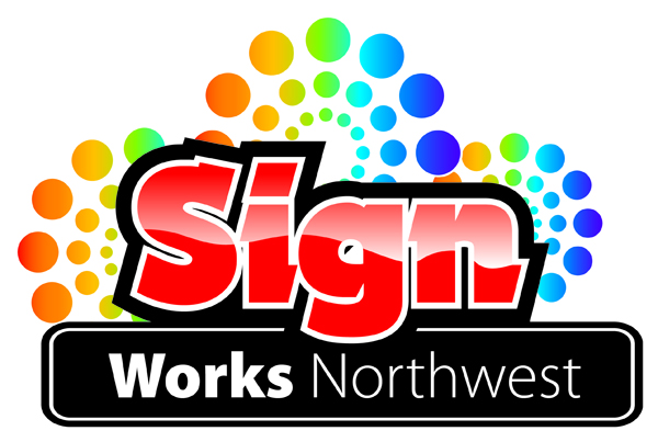
Posted by Matt Hammond on September 6, 2009 at 4:38 pmHi guys and Girls i Have been struggling with the dreaded own logo design for ages now, why is it so difficult to do your own logos and vans etc…
This is probably the only one i have liked so far, just hoping you guys and girls could give me some comments and suggestions on it or even better something nicer.
Thanks
Matt
Attachments:
 Chris Wool replied 14 years, 7 months ago 13 Members · 28 Replies
 -
28 Replies
-

works for me – although the background circles make it a tad complicated
john
-

Hi Matt,
I like it but there are a couple of things that I would personally do different
I think the ‘Works’ needs to tie in with the ‘Sign’ ……as it is it looks more like just part of the address where it is now
I like the effect you’ve done on the word ‘Sign’ but I think it’s a little too harsh…..i.e, it makes me want to turn it back into the light to be able to read it properly if you know what I mean?
Any chance of putting an EPS up so we could have a play?
-

Your logo is popular, 714 views 😮
Agree with Glenn plus how are you going to reproduce it? Do you have a printer?
-
Thanks guys i know what you mean about it being complicated I did not want it to be as such, but so far is the only way i can get it to the stage where I like the look in general
I did have the Works tied in with the Sign but again I just could not get it to look right lol
Thanks Glenn I have attached a Illustrator eps
Neil yes I have a Uniform Cadet Printer
Thanks
Matt -
It’s down to your own preference mate. I like it…..very smart and to the point. 😉
-
Hi Matt,
sorry, I can’t open it in Corel
Downloaded 71 times already 😮 😮 😮
-
Thanks Glenn Dam I dont have Corel will corel not open any Illustrator files or Exports?
Thanks Karl I like it, i think its just I know that technically its not really right, I think like Glenn Said the word Works should really tie in more with Sign
Thanks
Matt -

I would be a little bit cautious about what you design as your logo. Bear in mind that it will feature on letterheads and business cards which are not generally printed in full colour. So try and tweak your design to look good in black and white as well as in full colour before commiting.
-
Good point Phill I started out in B & W when designing it and it did look pretty sharp also using tints of the black for the Circles
-

207 downloads?
Something fishy going on?
Idont think that many people have been logged in all day.
Basic design look good , but agree with glen about the "works"
peter
N -
 quote Matt Hammond:What could cause all that downloading peter?
i know and i hope the person watching knows what will come of it if it persists. you have been warned. 😉
-

Rob fill me in mate whats the point of downloading this logo loads of times
Rich -
quote Richard Urquhart:Rob fill me in mate whats the point of downloading this logo loads of times
Richprobably an attempt to overload the signboards server, it just dropped out a couple of times for me.
dont know if I am correct though,
Peter
-
Rob would it help to remove the logo or post feel free to if it stops someone messing about?
Thanks
Matt -
Hi
i think you need to put the word ‘works’ next to ‘sign’ in the same font as you have ‘sign’ and then ‘northwest’ underneath as you have it. I think then it would work well in black and white if you took the colour blend away and just had that area in white.Liam
-
And i think you should get rid of the background circles totally, as someone else mentioned they make it a bit too busy.
Liam
-
Move the word "sign" over to the right a fraction, as it is not centred and looks a bit odd.
Having said that, at 1102 downloads it looks like everyone will have the same logo.
-
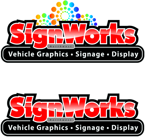
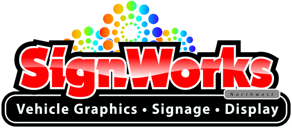
Thanks guys, Made a few adjustments so hope this is a better with or without circles
Thanks
Matt
Attachments:
-

love the top one apart from the position of the place name.
same design but over the word display.
my 2p worth.chris
-
yep i could live with that for a while (not saying how long a while is)
😀
-
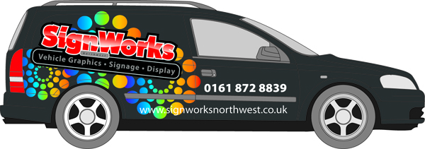
😀 it looks better like that just got to transfer it onto the van i have been having a play around with it but again still hard to like what i have done on the van
-
Matt,
I think it’s looking good now….
I personally think the black keyline around SignWorks is a touch heavy……I think I would like to see it the same weight as the white one but that could just be me
I agree with Chris that the positioning odf Northwest looks better over to the right
Nice looking Logo though 😀
-
Chris its a Vauxhall Astra van in White
My idea after playing with it was to wrap it in Very Dark grey Matt
Then apply Gloss Graphics over that maybe?The logo should be angled more
Attachments:
-

I find the highlight through the name a bit strong and actually makes the name a little harder to read, I would soften the white area a bit more, just a bit so you keep the effect but a little more subtle.
JMO
Cheers
Warren
-
nice point warren.
in real life the logo can not flow down over the bulging waist band as it would distort to much.
very much like the mat gloss idea.i have put domed clear letters on to mat and looks very up market. unlike me.
chris
Log in to reply.
