Activity Feed › Forums › Sign Making Discussions › Graphic Design Help › Straight text on a curved bonnet
-
Straight text on a curved bonnet
Posted by Martin Gray on May 11, 2009 at 9:38 pmHi folks
Hopeful you can help me with this problem.
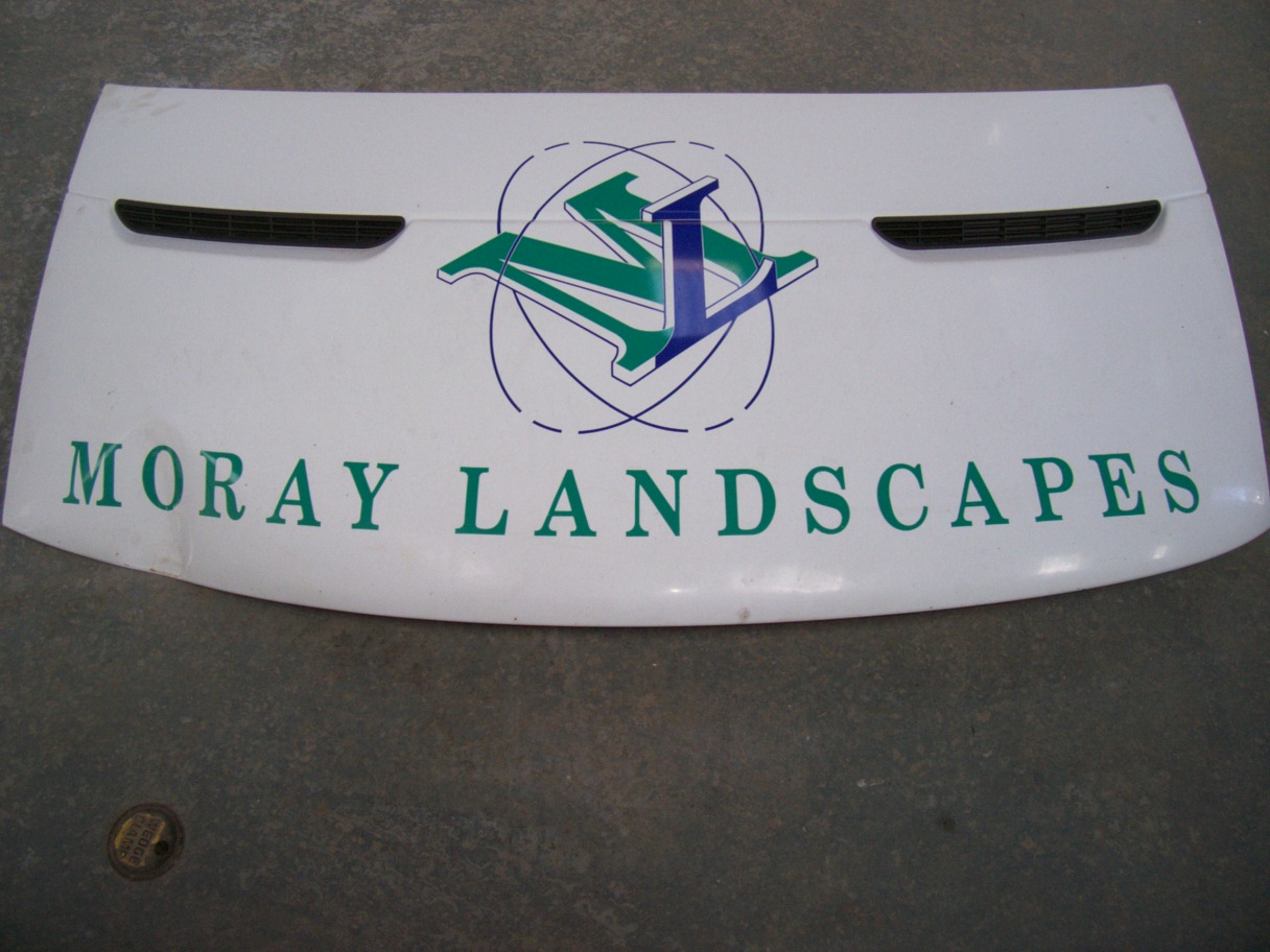
I had to apply a line of text plus logo on to a bonnet the day the text looks straight but as bonnet curves up i have to curve the text to make it look straight hope this makes sense 😕
Impact cd shows the bonnet straight i know it’s just a 2d image someone must of come a cross this problem? I can go to fit text to arch and bend it to a curve in signlab 8 but how much how do you measure it?? I have a photo i can post to make more sense of what am trying to say want the best forum to post it in??
Thanks
Martin
mod-edit please post topics in correct forum
Attachments:
 Guy Bartle replied 14 years, 11 months ago 10 Members · 13 Replies
 -
13 Replies
-

Martin
you can do this several ways
BUT
if you make the text look straight from the front, it will look "bent" from a 3/4 view.you can do it to a radius in signlab, or cut it straight, and create the curve or line when you apply, by hinging the top or bottom of the graphic in a straight line, then applying single letters.
sorry not good at explaining,
but generally speaking if the text "smiles" then its ok 😀Peter
-

Tell em – if they want it straight – get a flat bonnet… and not to drag you out of the pub again unless it’s really important 😕
-
 quote Phill:Tell em – if they want it straight – get a flat bonnet… and not to drag you out of the pub again unless it’s really important 😕
You never fail to deliver Phil :lol1: :lol1: :lol1:
-
quote Neil Speirs:quote Phill:Tell em – if they want it straight – get a flat bonnet… and not to drag you out of the pub again unless it’s really important 😕
You never fail to deliver Phil :lol1: :lol1: :lol1:
I wish I could speak to my customers the way Phill reckons he does…
Peter
-

Its Monday boys! Am still hangover fae the weekend. 😳
Thanks Peter wasn’t sure if there wasn’t just i quick way to work out the curve on the bonnet
-
 quote Phill:It’s called “banter” Peter – they love the “banter” 😕
true
i only do straight on a Thursday and that’s my day off.
martin
put a strip of fomex across the bonnet where the lettering is going and notice how much to bend the text to smile.
it may look to much when you weed it but will probably be ok.chris
-

Tip: Depending on the curve of the bonnet I sometimes cut the line of text into sections and position them section by section to level it out.
Sometimes arching your text can make it look too distorted.
-

I always give the line of text a slight bend downwards using SL’s transform tool. Corel’s envelope tool can do a similar thing.
Alan D -

Honest opinion ? leave it as it is because it looks fine.
If you fit something straight to a curved surface, it will only ever look straight when viewed from one position – stand anywhere else and it will look curved.
You can pre-curve the line of text so it looks straight on your photo, and will look straight when viewed on the bonnet from the same position your photo was taken, but view it from anywhere else and it will look wrong.
-

I always just eyeball it.
Like Peter says, use the distortion tool in yer sign program to make it smile.
Not a big cheesy smile, more like a grin.
Love….Jill -

Maybe not necessary for the bonnet but for using the distort function in software to try and get an eyeballed straight line on a curved surface you can guesstimate the amount of curve distort required quite accurately first time.
Lay a straight rectangle of vinyl or simply non-stretchable tape of some sort along the surface to which you’ll apply your line of lettering. It will curve up/down from the centre so start with the centre at the height required and work outwards.
Next, hold a rigid straightedge like a steel rule against the surface , starting at the centre again and then "rocking" it (a spirit level helps but only if you’re working to a perfect horizontal surface which never happens) along the surface keeping it level till you reach one end of the proposed lettering line. You can only do one end at once as the other end will automatically be lifted away from the curved surface like a see-saw. Try and keep the straightedge along the visual "straight" path required. A second person eyeballing from a distance can help if a spirit level is no use. You’ll have to repeat it a few times to get a reasonably accurate idea of where the end of the lettering should be (ie where the straightedge lands at the ends of your proposed lettering line). Mark this line at both ends (and a few places along the length as you rock the straightedge if it’s a long run or a varying curve).
Measure the vertical distance from the marks at either end to the edge of the tape/vinyl you laid first. If you’ve been fairly accurate you should get the same distance at either end if it’s a symmetrically curved surface
Work to this value when applying the curve to your lettering in your software application. i.e. Bend the lettering until the ends of the line have moved the measured distance. You want to curve the lettering in the opposite direction to the measured distance so that it cancels out the curve of the surface and comes out straight.
On a simple, symmetrical curve this works surprisingly well, you can do the letter-by-letter application as described in the other posts for fine adjustment.
If you work to intermediate distances along the line of the lettering you can apply lettering along uneven curves (if your software has more complex envelope warping) too but this gets more hit and miss and time-consuming.
As everyone has said, there is only going to be one viewing angle that looks straight, you’ll see distortion from every other angle so most times this sort of messing around won’t be necessary for you as signmakers. I had to do it all the time airbrushing race helmets.
Apologies for the poor explanation, if you try it, it will hopefully make more sense and is a much quicker and simpler process to do than to describe. You’re just looking to measure how far out the ends of a straight line of tape diverge from the line you want your lettering to follow, and then compensating for this by curving your lettering the other way before cutting.
One final tip, although it seems counter-intuitive, using the "arc" style of distortion curve where the ends of a bent rectangle start to lean in or out towards the radius of the curve will give a less distorted look to a line of lettering than the "arch" style of curve which keeps the ends vertical.
Log in to reply.
