Activity Feed › Forums › Sign Making Discussions › Graphic Design Help › Signwriting my Classic Mini Pickup
-
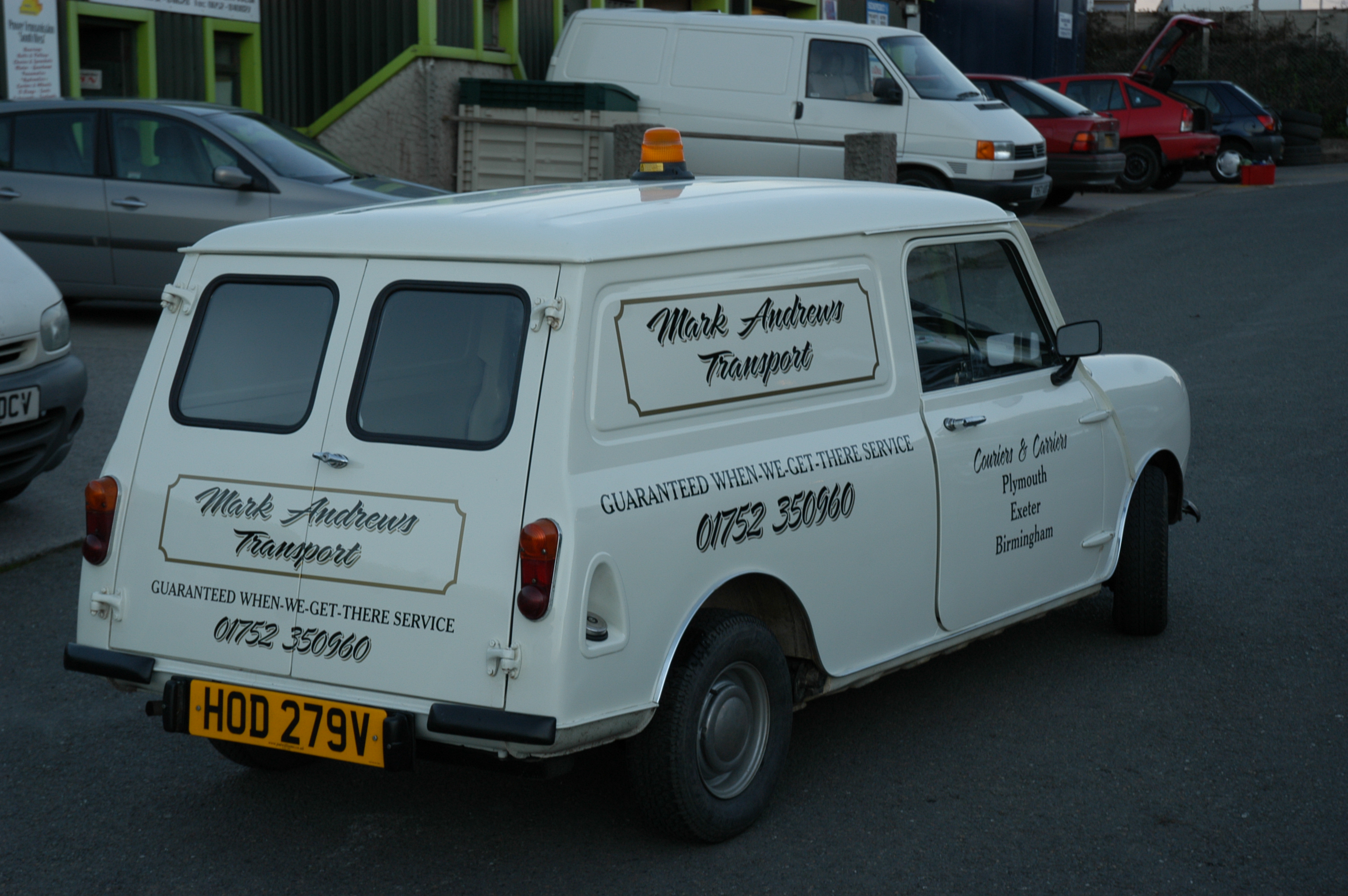
Signwriting my Classic Mini Pickup
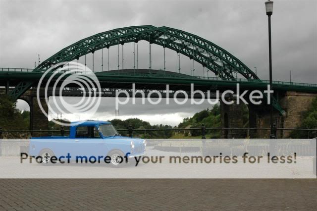
Posted by Paul Humble on January 11, 2009 at 2:00 pmIm looking for some inspiration from you guys. I have decided to sign write the doors of my Mini Pickup (shown below). I have previously opted not to do this but as the car attracts so much attention it seems silly not to do it.
I want it to be just the doors and most importantly it must look period. I was thinking of using a gold lettering in a a half moon shape, possibly with "Sign Writing" on the top of the arc, my phone number on the flat edge at the bottom and my logo in the middle.
Does anyone have any old photos of vintage or classic vehicle sign writing that I can have a look at to get some inspiration? I dont want it to look modern as it will look odd.
 Dave Bruce replied 15 years, 3 months ago 8 Members · 15 Replies
 -
15 Replies
-

Im not sure I want to do anything other than the doors and maybe tailgate but the font in the pic has put me on the right track.
-

you can probs get this done by morning 😀
John
Attachments:
-

Have a look a the design gallery here, may give you some inspiration, nice car.
I’ve almost finished my Spitfire – dropping the seats up to Coventry tomorrow for re-assembly and recovering, we are painting in cellulose when it gets a bit warmer and then wrapping the whole thing, can’t wait.Jason
-
quote Jason Davies:Have a look a the design gallery here, may give you some inspiration, nice car.
I’ve almost finished my Spitfire – dropping the seats up to Coventry tomorrow for re-assembly and recovering, we are painting in cellulose when it gets a bit warmer and then wrapping the whole thing, can’t wait.Jason
Remember to get them docs sorted for the pressed plated Jason.
-
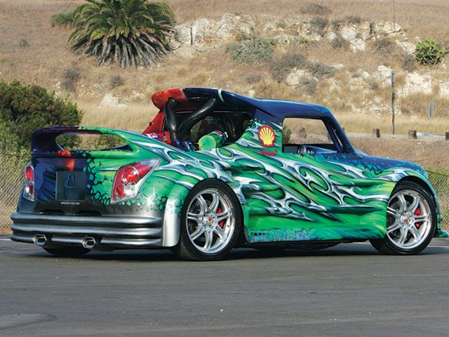
quote John Hughes:you can probs get this done by morning 😀
John
Thats one nasty looking car! lol
-

Firstly, I would definitely go for some purchased fonts from LHF or Sign DNA because I guess your not going to brush letter it.
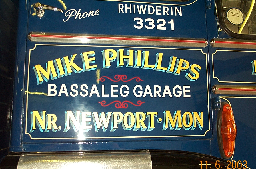
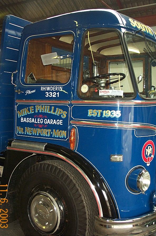
Here’s some I’ve painted……might give you some ideas…….the Mike Phillips truck is all paint including gold leaf.
I’ll try and dig some more photos out for you
Neil
Attachments:

-
Neil, those look fantastic and the Mike Phillips truck is similar to what I ad in mind.
Ill be buying a script font in of some sort, ill be using gold for the main lettering and not sure on the shadow colour.
-

Sorry…I’m no help for what you want Paul but I was curious about the background in the photo – is that Websters Ropery or near to it?
-
quote Mark Jahn:Sorry…I’m no help for what you want Paul but I was curious about the background in the photo – is that Websters Ropery or near to it?
No mate, The Ropery is under the Queen Alex Bridge. That pic is under the Wearmouth Bridge. Are you from up here? Its a bit tricky to get to the area if you dont know the place though.
-
Yes – we’re in Consett Paul, after 12 years in Gateshead. I think I know where you mean now though. For some reason I always confuse the QA with the Wearmouth and vice versa!
-

Scroll about halfway down this page:
http://www.buckssigns.co.uk/Signs.html
There is an example of van lettering, Dave White I think.
Arthur Vanson is one of my absolute favorite designers and you can buy his alphabets via Letterhead fonts.
Talk about traditional, he has been signwriting since the year I was born!
Love….Jill
PS
Cute little truck! -
Its a great location for pics (not if your a Mag I suppose though) lol.
-

Nice Mini Paul, I am selling mine now as I don’t have time to get it back on the road, so if you know anyone interested 😀
Look forward to seeing the final result of yours.
Cheers
Dave
Log in to reply.
